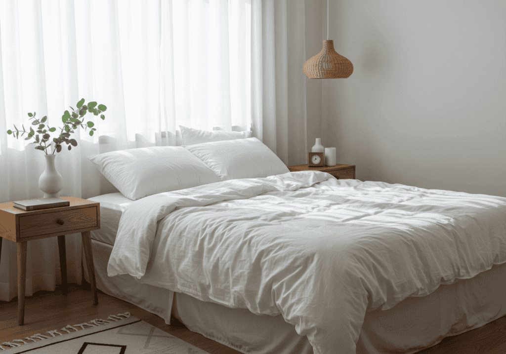
There’s something magical about stepping into a Scandinavian-inspired bedroom. The way soft light dances across clean white walls, how natural textures invite you to unwind, and the gentle color harmony that seems to whisper “rest here” – it’s no wonder this design philosophy has captured hearts worldwide.
Creating your own peaceful retreat doesn’t require a complete room overhaul. Sometimes, the right color palette is all you need to transform your space into a sanctuary that promotes better sleep and genuine relaxation. These 13 carefully curated Scandinavian bedroom color palettes will help you discover the perfect combination of soft neutral tones and calming color schemes for your personal haven.
Whether you’re drawn to the classic all-white aesthetic or prefer warmer undertones, each palette offers a unique path to achieving that coveted Nordic serenity in your own home.
1. Classic Nordic White with Natural Wood Accents
Pure white walls form the foundation of this timeless palette, creating an airy backdrop that maximizes natural light. The magic happens when you introduce warm wood tones through furniture pieces like a simple platform bed or floating nightstands. This combination feels fresh yet grounded, never sterile or cold.
The beauty lies in the subtle variations of white – from cool snow white on the walls to warmer cream tones in textiles. Natural wood grain adds organic warmth that prevents the space from feeling too clinical. Think light oak, birch, or pine finishes that complement rather than compete with the pristine white backdrop.
Small touches of living greenery, like a single succulent or trailing pothos, complete this palette perfectly. The contrast between crisp white, honey-colored wood, and fresh green creates a harmonious triangle of colors that feels both sophisticated and welcoming.
2. Soft Sage Green with Cream Undertones
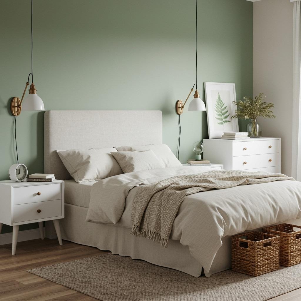
Sage green brings a whisper of nature indoors without overwhelming the senses. This muted, grayish-green works beautifully as an accent wall behind your headboard, creating a focal point that remains soothing rather than bold. The key is choosing a sage with gray undertones rather than yellow ones.
Cream-colored bedding and textiles warm up this palette, preventing it from feeling too cool or distant. The combination creates depth while maintaining the light, airy quality essential to bedroom color combinations that promote rest. Natural materials like jute rugs or woven baskets enhance this earthy yet refined aesthetic.
This palette works exceptionally well in bedrooms with limited natural light, as the sage green adds interest without making the space feel darker. It’s like bringing a gentle piece of the forest into your sleeping space.
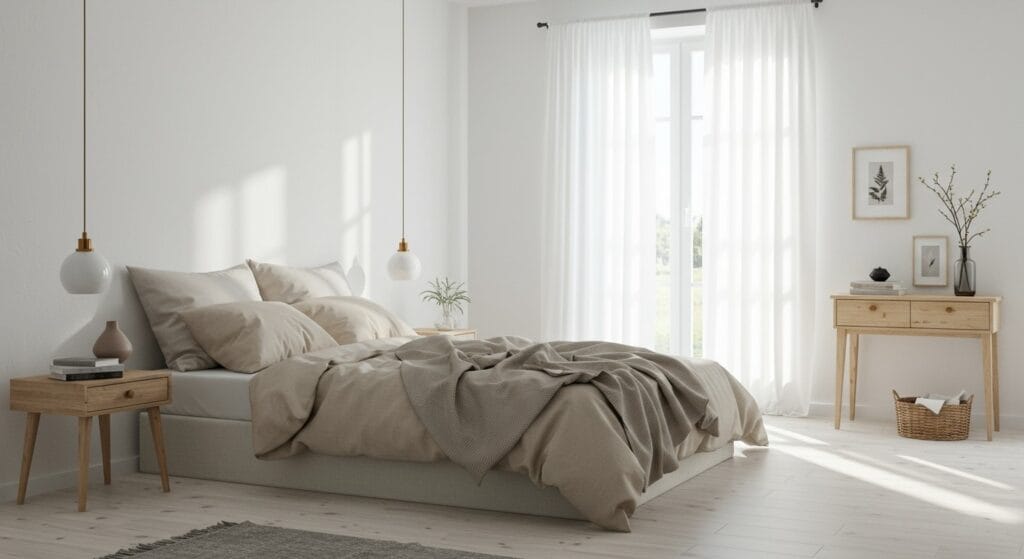
3. Warm Beige and Soft Taupe Harmony
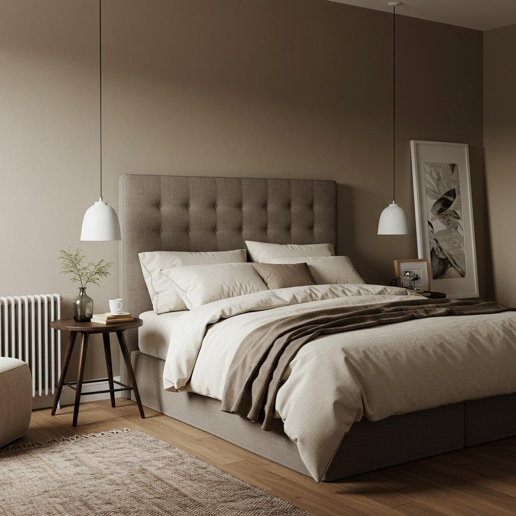
Beige gets unfairly dismissed as boring, but when done right, it creates the most embracing and comfortable bedroom atmosphere. The secret is layering different shades of beige and taupe to create depth and visual interest. Start with warm beige walls that have subtle undertones of pink or yellow.
Layer in taupe through larger furniture pieces like an upholstered headboard or reading chair. This creates a sophisticated gradient effect that feels intentional and refined. The warmth of these colors makes any bedroom feel like a cozy retreat, especially during colder months.
Natural textures become even more important in this palette – think linen curtains, wool throws, and wooden accessories. These elements prevent the monochromatic scheme from feeling flat while maintaining the serene, cozy minimal bedroom aesthetic that defines Scandinavian design.
4. Dusty Pink and Soft Gray Combination
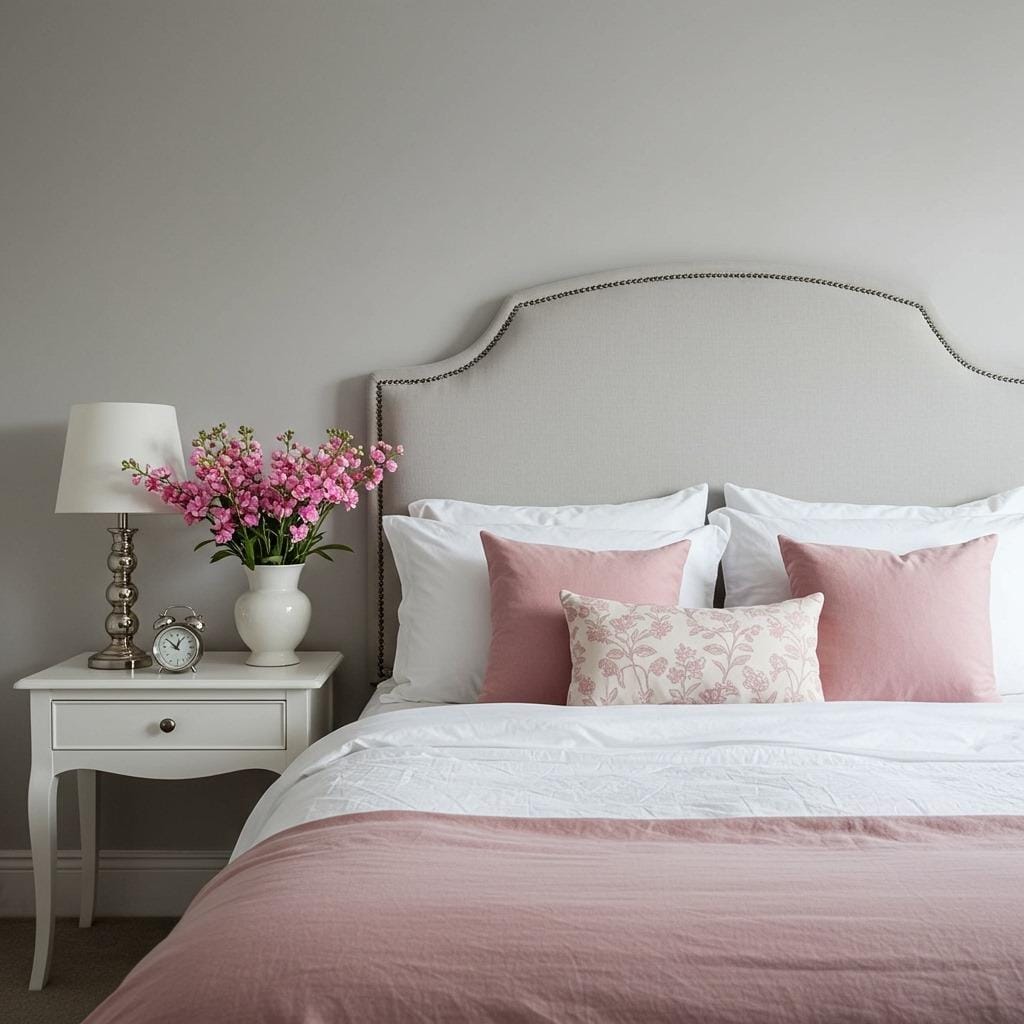
This palette brings subtle romance to the Scandinavian aesthetic without sacrificing its calming qualities. Dusty pink – think faded rose petals rather than bright fuchsia – adds warmth and softness when used sparingly. The trick is balance: let gray dominate while pink provides gentle accents.
Soft gray walls create a sophisticated backdrop that makes dusty pink accessories pop without overwhelming the space. This could be throw pillows, a reading chair, or even fresh flowers. The combination feels both modern and timeless, appealing to those who want personality without sacrificing serenity.
This palette works particularly well in bedrooms with good natural light, as the pink undertones become more apparent and lovely throughout the day. Color psychology experts suggest, soft pink tones can promote feelings of comfort and nurturing – perfect for a bedroom retreat.
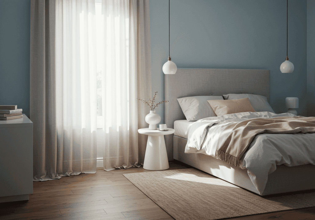
5. Creamy White with Subtle Blue-Gray Accents
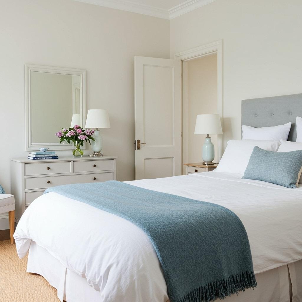
Creamy white serves as a warmer alternative to stark white, creating a more inviting foundation for your bedroom. The addition of blue-gray accents – perhaps through bedding, artwork, or a single accent pillow – introduces just enough color to create visual interest without disrupting the peaceful atmosphere.
This palette captures the essence of a misty Scandinavian morning, where cool blues meet warm whites in perfect harmony. The blue-gray should be muted and soft, almost like the color of weathered driftwood or morning fog. It’s subtle enough to promote relaxation while preventing the all-white room from feeling too monotonous.
The key to success with this palette is restraint. Use blue-gray sparingly, perhaps in no more than 10-15% of your color scheme, allowing the creamy white to remain the star while the blue-gray adds sophisticated depth.
6. Mushroom Gray with Natural Linen Textures
Mushroom gray offers a sophisticated alternative to standard gray tones, with warm brown undertones that prevent it from feeling cold or institutional. This color creates an enveloping, cocoon-like atmosphere that’s perfect for a modern minimalist bedroom decor approach.
Natural linen textures become crucial in this palette, adding softness and preventing the room from feeling too serious. Layer different weights and weaves of linen – from crisp bed sheets to relaxed throw blankets. The natural variations in linen create subtle color differences that add depth to the monochromatic scheme.
This palette works beautifully in rooms with architectural interest, as the mushroom gray enhances rather than competes with features like exposed beams or interesting angles. It’s a grown-up color choice that still maintains the simplicity and calm of Scandinavian design principles.
7. Soft Lavender and Pale Gray Blend
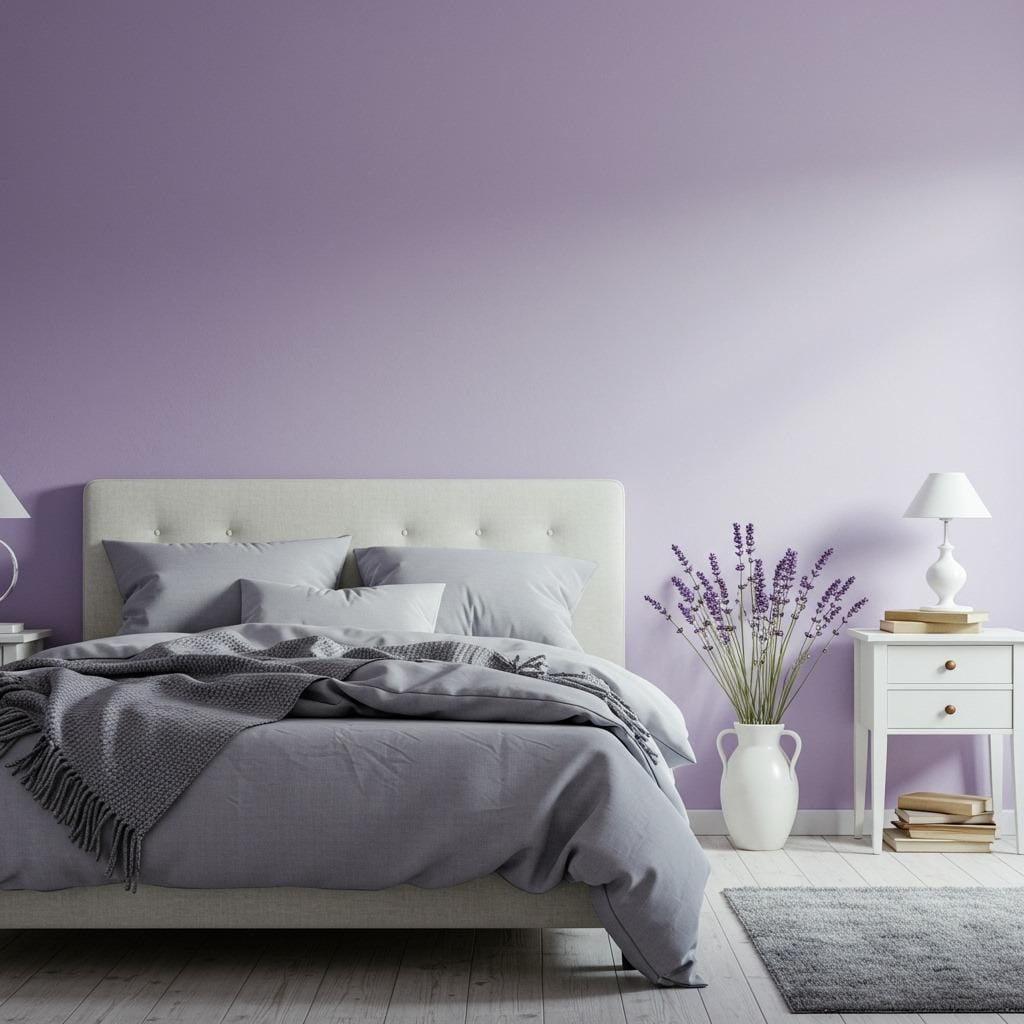
Lavender might seem like an unexpected choice for Scandinavian design, but when kept pale and muted, it adds a dreamy quality that enhances relaxation. The key is choosing a lavender that’s more gray than purple, creating a sophisticated rather than juvenile feel. This works particularly well as an accent wall or in smaller doses through textiles.
Pale gray grounds the lavender, preventing it from feeling too whimsical while maintaining the calm atmosphere essential to good sleep. The combination creates a cocoon-like environment that feels both peaceful and subtly luxurious. Natural light plays beautifully with these tones, creating different moods throughout the day.
This palette appeals to those who want to incorporate color without sacrificing the serene qualities of traditional Scandinavian design. It’s particularly effective in bedrooms used primarily for sleep and relaxation rather than other activities.
8. Warm Ivory with Soft Peach Undertones
Ivory brings warmth to the classic white Scandinavian palette, while subtle peach undertones add just enough color to create interest without disrupting the peaceful mood. This combination feels like a gentle sunrise – warm, optimistic, and inherently calming. The peach should be so subtle it’s almost imperceptible, more of a whisper than a statement.
This palette works exceptionally well in bedrooms with eastern exposure, where morning light can enhance the warm undertones. The combination creates a naturally welcoming environment that makes it easy to both wake up peacefully and wind down in the evening.
Layer in natural textures through woven baskets, wooden picture frames, or linen curtains to enhance the organic, comfortable feel. This palette proves that Scandinavian design doesn’t have to be stark or cold – it can be embracing and nurturing while maintaining its characteristic simplicity.
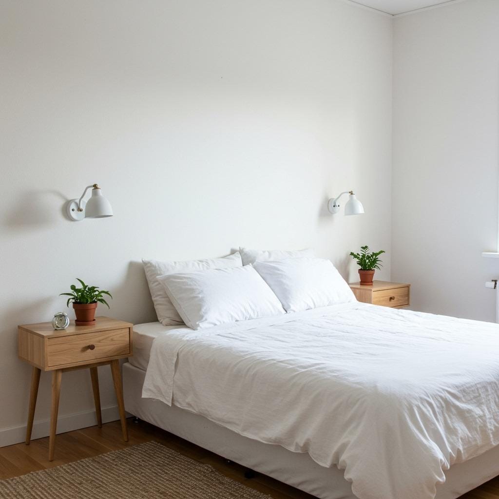
9. Cool Gray with Crisp White Details
Cool gray creates a sophisticated, hotel-like atmosphere when paired with crisp white details. This palette appeals to those who prefer a more contemporary interpretation of Scandinavian design. The gray should be true gray without warm undertones, creating a clean, fresh feeling that’s both calming and energizing.
Crisp white bedding, furniture, and trim create sharp contrast that keeps the space from feeling dull or heavy. The interplay between these two neutrals creates visual interest through contrast rather than color, maintaining the minimalist aesthetic while preventing monotony.
This palette works particularly well in modern homes with clean architectural lines. It’s perfect for creating a contemporary living room feel that extends into the bedroom, especially in open-plan spaces where visual continuity matters.
10. Soft Butter Yellow with White Balance
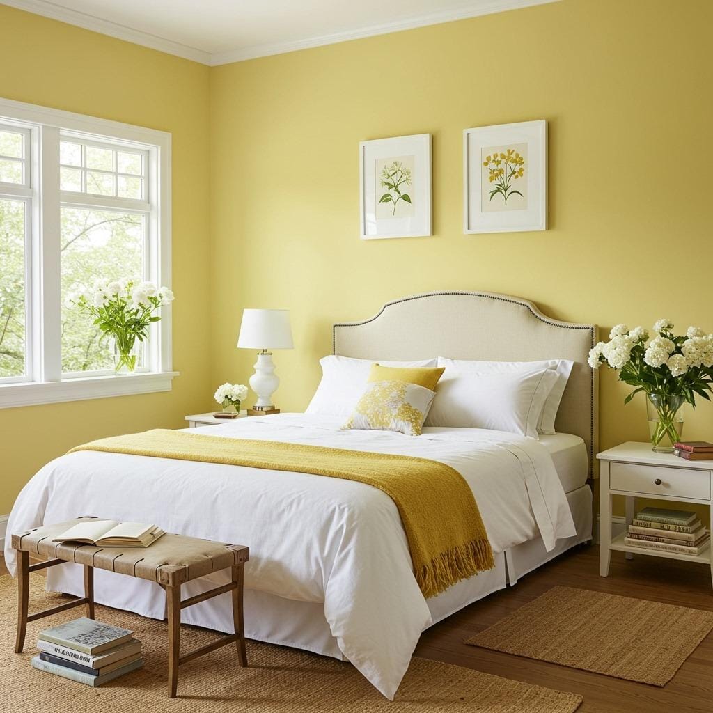
Butter yellow, when kept pale and soft, brings sunshine into your bedroom without overwhelming the senses. This color should be whisper-light, more like morning sunlight filtering through sheer curtains than bright yellow paint. It creates an inherently optimistic atmosphere that can help improve mood and energy levels.
White balance is crucial with this palette – use plenty of white in bedding, furniture, and accessories to prevent the yellow from becoming too dominant. The goal is to create a subtle warmth that enhances rather than competes with the peaceful Scandinavian aesthetic.
This palette works beautifully in rooms with northern exposure or limited natural light, as the yellow helps compensate for the lack of warm sunlight. It’s particularly effective in guest bedrooms where you want to create a welcoming, cheerful atmosphere.
11. Muted Teal with Cream Softness
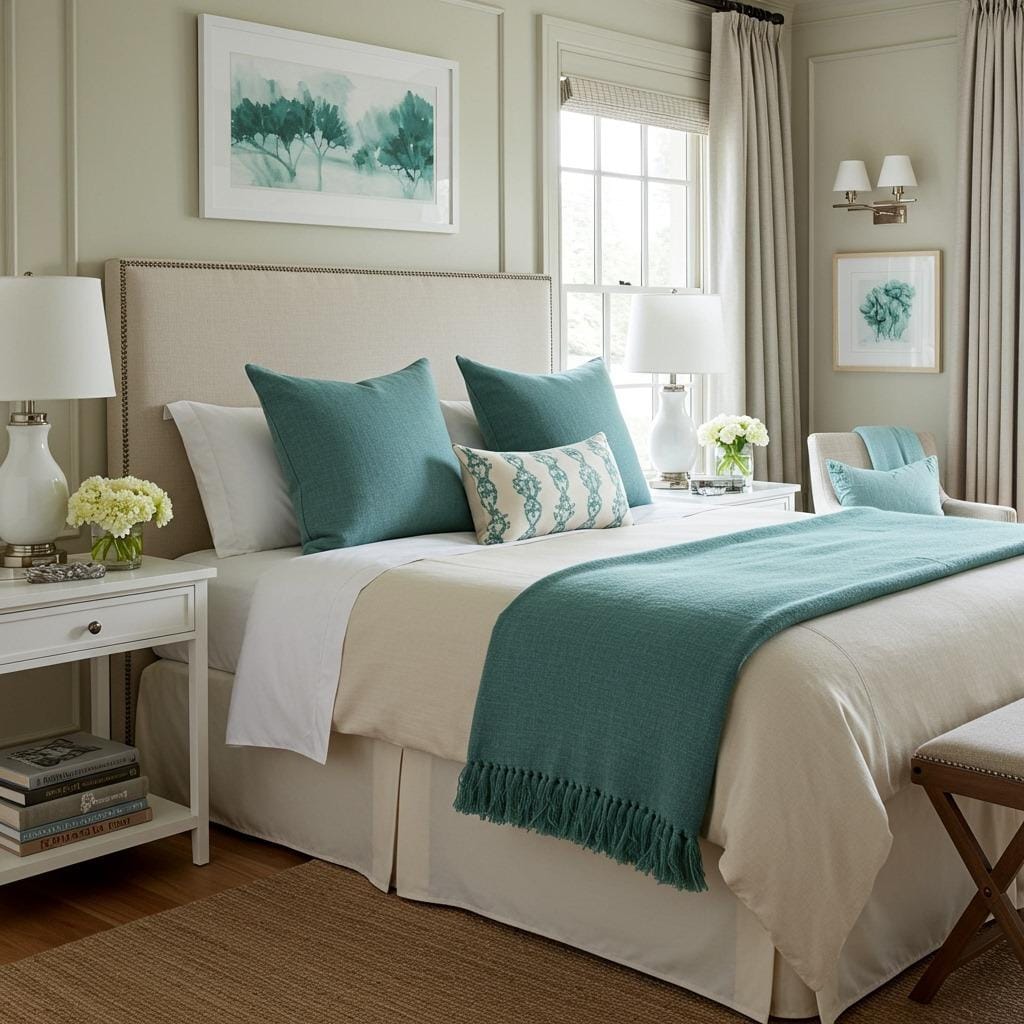
Muted teal brings the calming qualities of water into your bedroom palette while maintaining the sophisticated restraint of Scandinavian design. The key is choosing a teal that’s more gray than blue or green, creating a sophisticated rather than tropical feel. This works beautifully as an accent color through pillows, artwork, or a single piece of furniture.
Cream softens the coolness of teal while maintaining the light, airy quality essential to peaceful bedroom design. The combination creates depth and interest while remaining inherently calming – like a misty morning by a northern lake. This palette can make even small bedrooms feel more spacious and serene.
Natural textures become particularly important with this palette, helping to ground the colors and prevent them from feeling too ethereal. Consider incorporating elements from your storage and organization ideas in matching tones to maintain cohesion throughout the space.
12. Stone Gray with Warm Wood Undertones
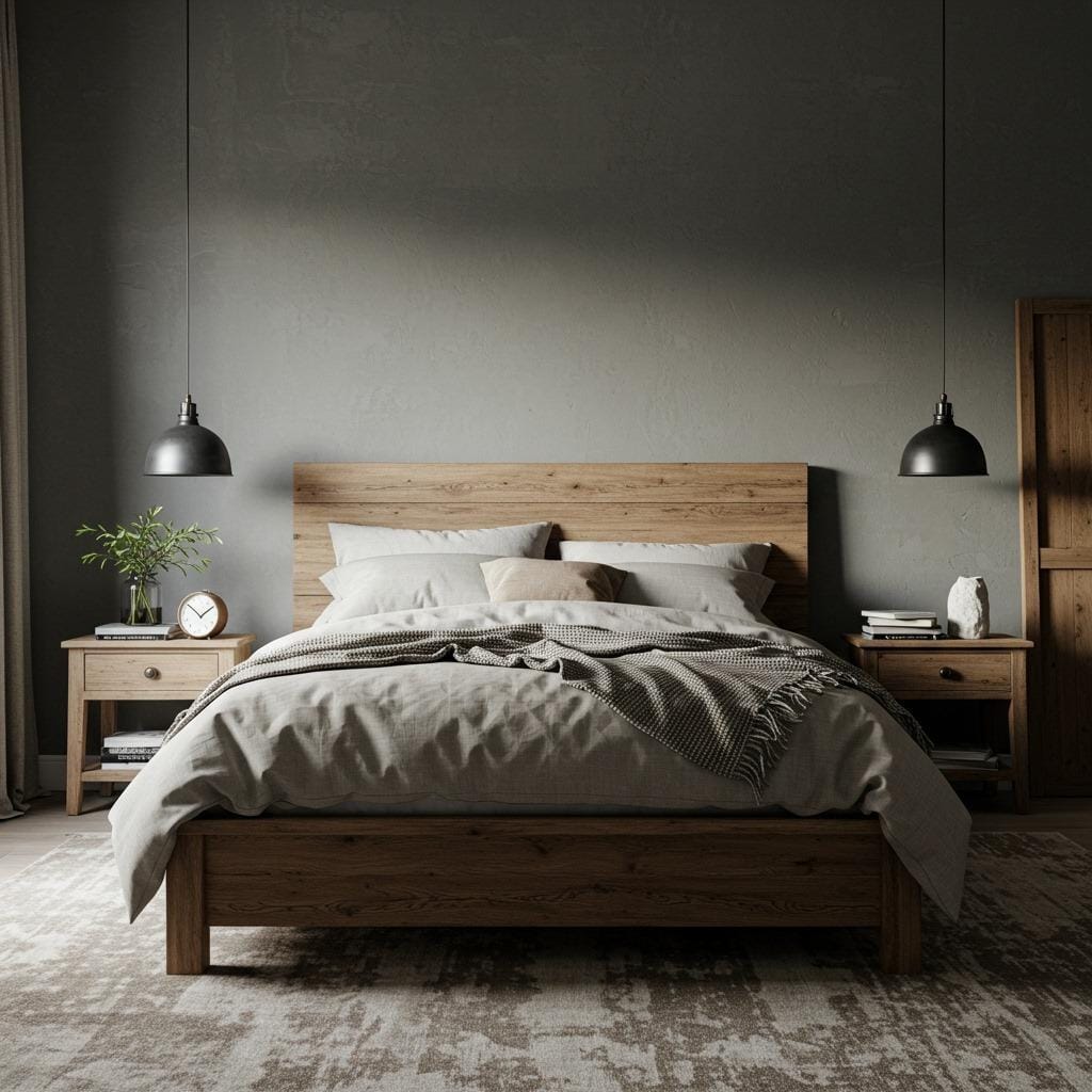
Stone gray captures the essence of weathered Scandinavian architecture, bringing a sense of permanence and grounding to your bedroom. This color has subtle brown and beige undertones that prevent it from feeling cold, while warm wood furniture creates a beautiful contrast that feels both rustic and refined.
The combination of stone gray and warm wood creates a palette that feels deeply connected to nature without being overtly rustic. It’s sophisticated enough for modern homes while maintaining the organic, honest materials philosophy of traditional Scandinavian design.
This palette works exceptionally well in bedrooms with interesting architectural features, as the stone gray enhances rather than competes with elements like exposed beams or brick walls. It creates a cocoon-like atmosphere that promotes deep, restful sleep.
13. Soft Mint with Pure White Freshness
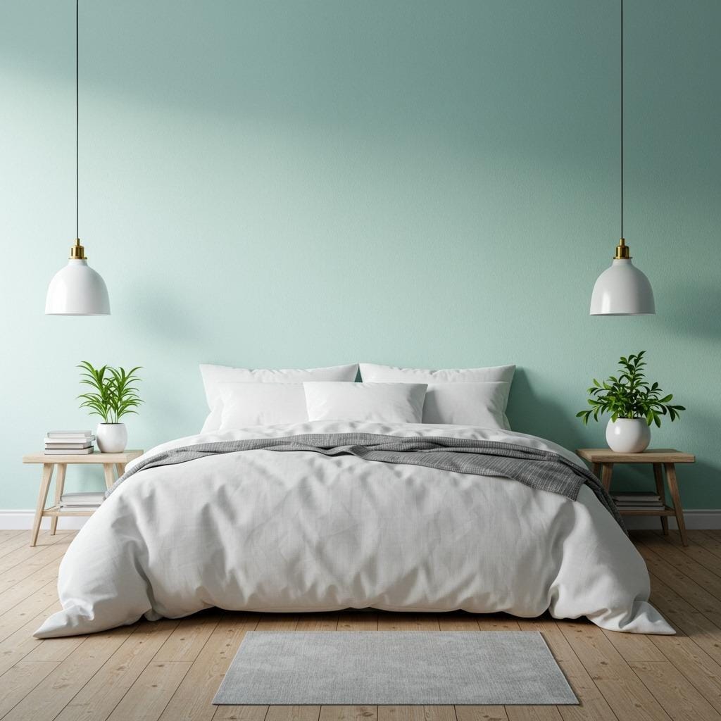
Soft mint green brings a breath of fresh air to the bedroom while maintaining the clean, uncluttered aesthetic of Scandinavian design. This color should be pale and muted, more like sea glass than fresh mint leaves. It creates an inherently refreshing atmosphere that can help you wake up feeling energized and renewed.
Pure white balances the mint beautifully, preventing it from becoming too dominant while maintaining the bright, airy quality essential to good bedroom design. The combination feels spa-like and rejuvenating, perfect for creating a retreat-like atmosphere in your own home.
This palette pairs beautifully with living plants, creating a connection to nature that enhances the peaceful, organic feel. Consider incorporating ideas from swedish bedroom design inspiration to fully embrace this fresh, natural aesthetic.
Creating Your Perfect Scandinavian Retreat
Choosing the right color palette is just the beginning of creating your peaceful bedroom retreat. The beauty of Scandinavian design lies in its simplicity and functionality, allowing these carefully chosen colors to create the serene atmosphere you’re seeking.
Remember that lighting plays a crucial role in how these palettes will look and feel in your space. Natural light enhances the subtle variations and undertones in each color combination, while artificial lighting should be warm and gentle to maintain the cozy atmosphere essential to good sleep.
The textures you choose – from soft linens to natural wood grains – will bring these palettes to life and create the tactile comfort that makes a bedroom truly restful. Don’t forget to consider your existing bedroom lighting ideas when implementing these color schemes, as proper lighting will make all the difference in achieving that perfect Scandinavian ambiance.
Start with one palette that speaks to you, begin with paint or bedding, and gradually build your peaceful retreat one thoughtful choice at a time. Your future well-rested self will thank you for creating this beautiful, calming sanctuary.
Sanjai creates easy, affordable home decor ideas that anyone can try. Through simple tips and curated finds, he helps you style rooms you’ll love coming home to.