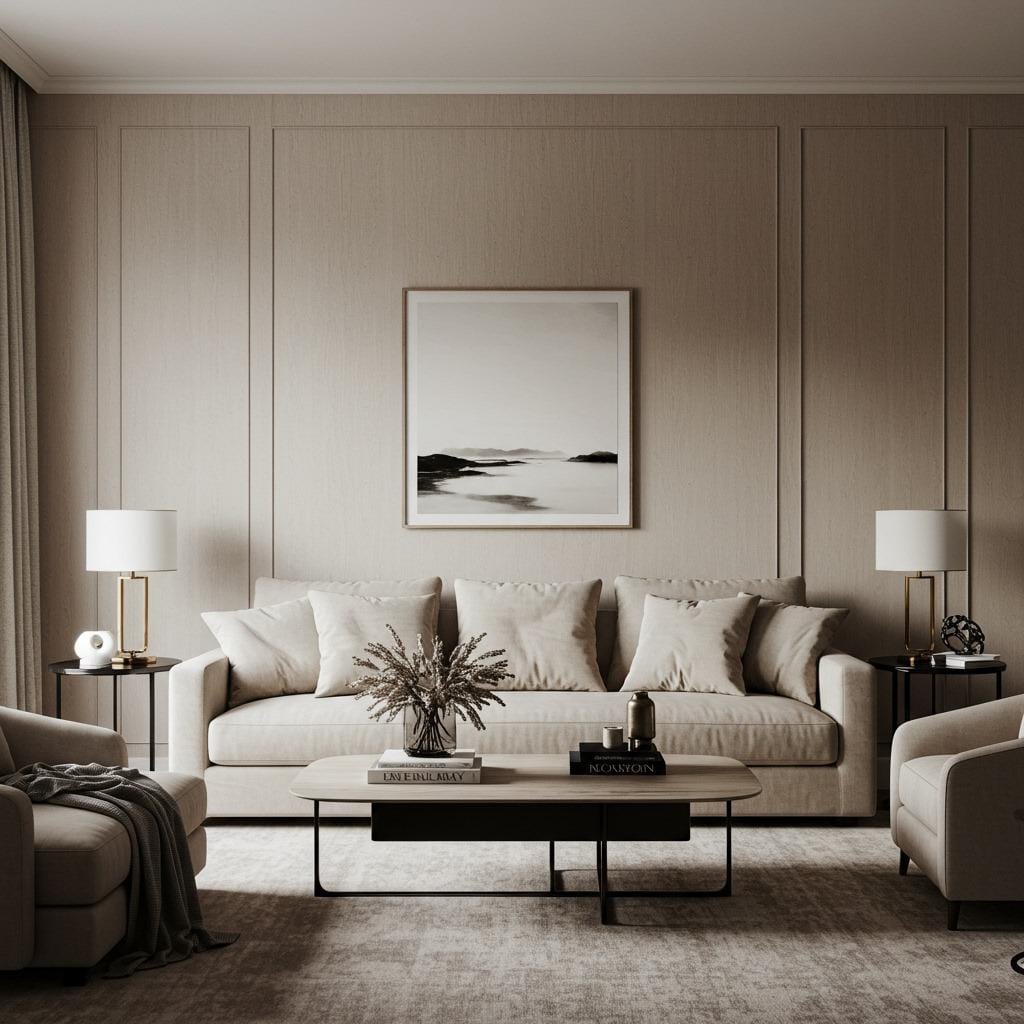
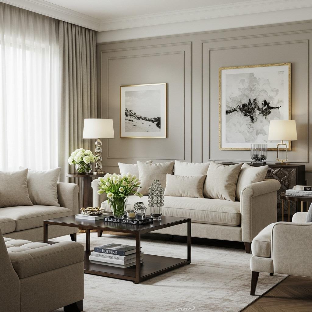
Your living room should feel like the warmest embrace after a long day. The colors you choose set the entire mood of your space, and nothing creates that sense of comfort quite like warm neutral living room colors. These hues wrap your space in a gentle cocoon of tranquility while maintaining enough personality to keep things interesting.
I’ve spent years helping homeowners discover the magic of neutral palettes, and I’m constantly amazed by how transformative the right warm tones can be. Whether you’re working with a tiny apartment or a sprawling family room, these 13 color ideas will help you create a space that feels both sophisticated and incredibly welcoming.
The beauty of warm neutrals lies in their versatility. They provide the perfect backdrop for seasonal decorating, work seamlessly with both modern and traditional furniture, and create a timeless foundation that won’t feel dated in a few years.
Why Warm Neutrals Work So Well in Living Rooms
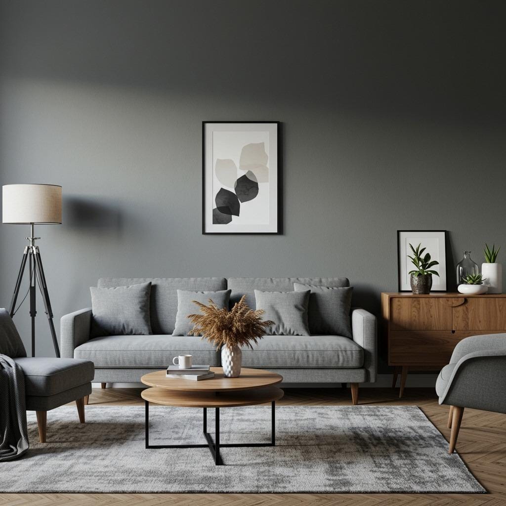
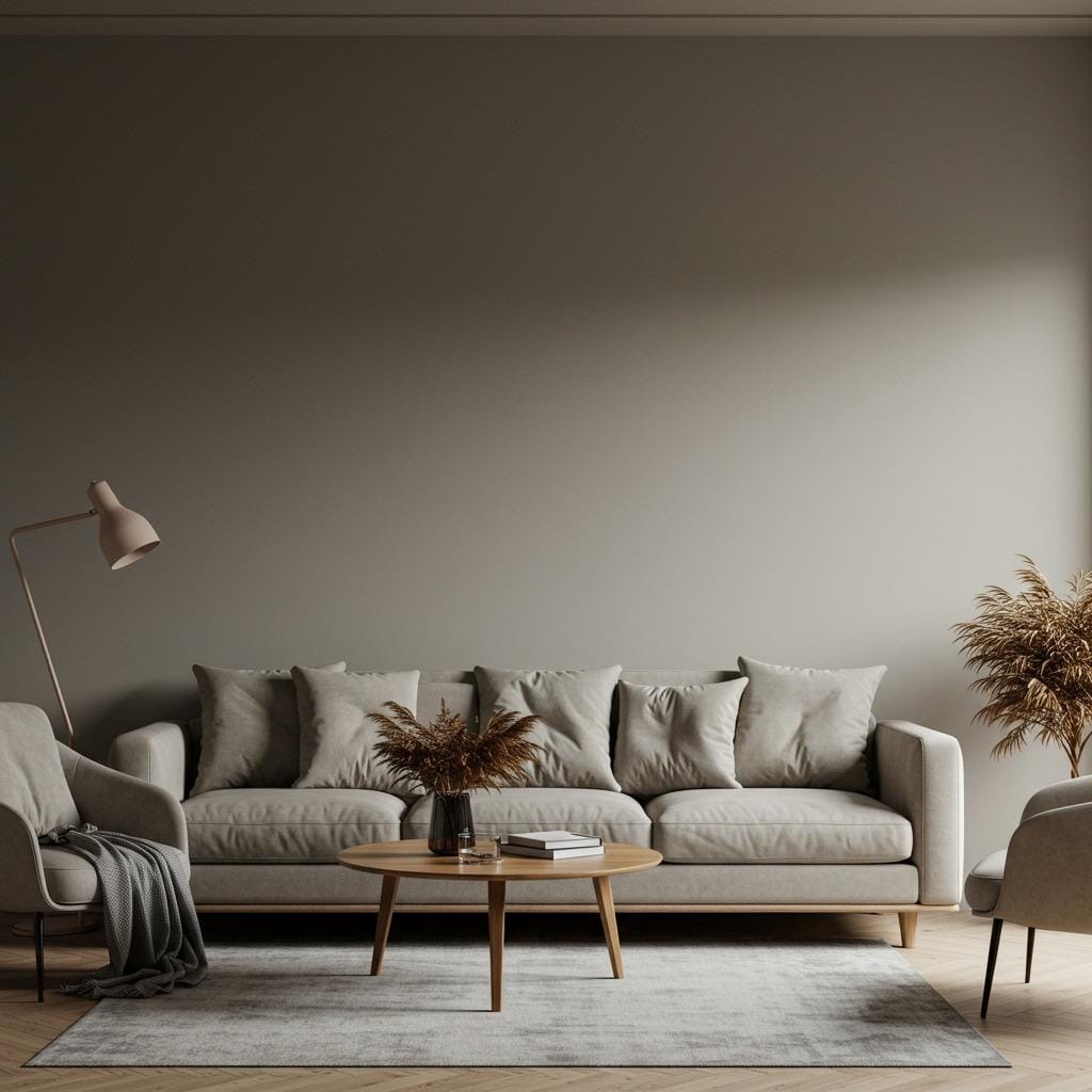
Warm neutrals have this incredible ability to make any space feel larger and more inviting. Unlike stark whites or cool grays that can sometimes feel clinical, these colors have underlying undertones that add depth and richness to your walls.
These soft living room hues also reflect light beautifully, which is especially important in spaces where you spend most of your relaxing time. They create a gentle glow that’s flattering for both people and furniture, making your entire room look more expensive and well-designed.
The psychological impact of warm neutrals shouldn’t be underestimated either. Colors like beige, taupe, and cream naturally lower stress levels and promote relaxation – exactly what you want in your primary gathering space.
Creating the Perfect Foundation with Paint Colors
1. Accessible Beige by Sherwin Williams
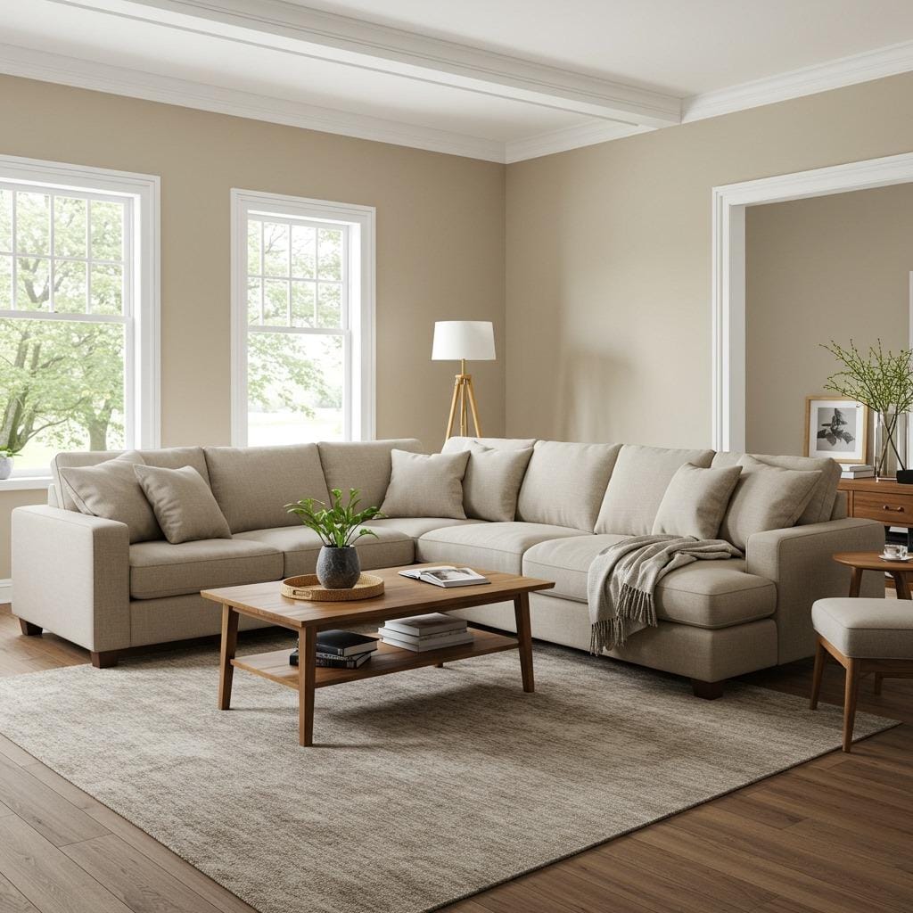
This gorgeous greige has become a favorite among interior designers for good reason. Accessible Beige perfectly balances gray and beige undertones, creating a sophisticated backdrop that works with virtually any decorating style.
The color shifts throughout the day, appearing more beige in morning light and showing its gray undertones in the evening. This chameleon-like quality keeps your room visually interesting without being overwhelming.
Pair this shade with crisp white trim and you’ll have a classic combination that feels both timeless and current. It’s particularly stunning in open concept living rooms where you need colors that flow seamlessly from space to space.
2. Agreeable Gray with Warm Undertones
Don’t let the name fool you – this popular Sherwin Williams color leans decidedly warm thanks to its beige undertones. It’s the perfect choice if you want the sophistication of gray without the coldness that sometimes comes with cooler tones.
This shade works beautifully in rooms with limited natural light, as it never appears flat or dull. The warm undertones add just enough richness to keep the space feeling cozy and inviting.
Consider this color for your main walls if you love the idea of a neutral living room accent wall in a deeper tone. The subtle warmth provides the perfect base for layering in richer accent colors.
3. Creamy Off-White with Golden Undertones

Sometimes the most impactful choice is the subtlest one. A creamy off-white with golden undertones creates an incredibly serene atmosphere while still feeling warm and welcoming.
This type of soft living room hue works especially well in spaces with beautiful architectural details you want to highlight. The gentle warmth of the color enhances crown molding, built-ins, and other features without competing with them.
The key is choosing an off-white with enough depth to avoid that stark, sterile feeling. Look for colors that have names like “antique white” or “linen white” – these typically have the warm undertones you’re after.
4. Mushroom Gray with Taupe Elements
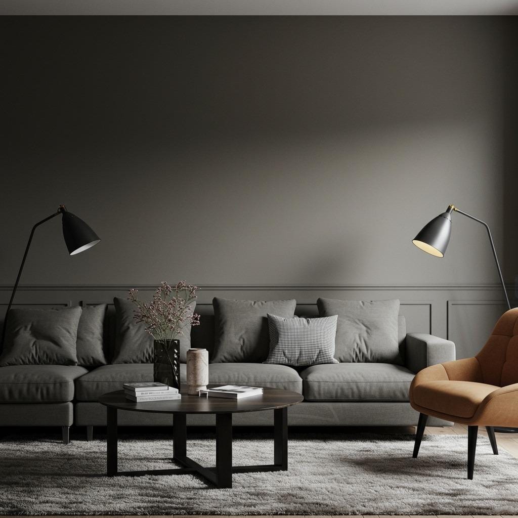
This sophisticated blend creates one of the most versatile backdrops for any living room. Mushroom gray combines the earthiness of taupe with the contemporary appeal of gray, resulting in a color that feels both current and timeless.
The beauty of this shade lies in its ability to work with both warm and cool accent colors. You can easily switch your throw pillows and accessories seasonally without worrying about clashing with your wall color.
This works particularly well in contemporary living rooms where you want sophistication without stark minimalism. The warmth keeps the space feeling lived-in and comfortable.
Incorporating Beige and Taupe Decor Elements
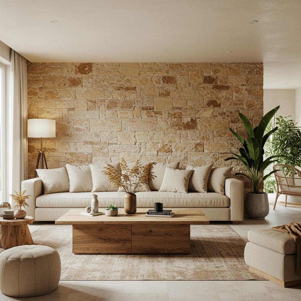
5. Rich Taupe as an Accent Wall
Creating a feature wall in rich taupe adds instant depth and drama to your space without overwhelming it. This approach works especially well behind your sofa or fireplace, creating a natural focal point that grounds the entire room.
The key to success with this technique is ensuring your taupe has warm undertones that complement your main wall color. Cool-toned taupes can create an awkward contrast that feels disconnected from the rest of your palette.
Balance is crucial when working with deeper neutrals. Keep your furniture and accessories lighter to prevent the room from feeling too heavy or dark. This creates a beautiful layered effect that adds visual interest.
6. Layered Beige Textures
One of the most effective ways to create visual interest with neutral colors is through texture layering. Combine different shades of beige in various materials – think linen curtains, wool rugs, and leather furniture all in complementary beige tones.
This approach prevents the dreaded “beige blob” effect that some people worry about with neutral decorating. Each different texture catches light differently, creating subtle variations in color that keep your eye engaged.
Consider incorporating materials like jute, linen, wool, and cotton in various beige shades. The natural variation in these materials adds depth while maintaining that cohesive, calming color palette you’re after.
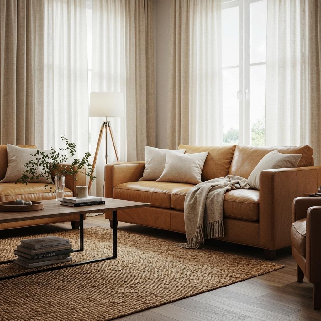
7. Warm Stone and Sand Combinations
Drawing inspiration from nature always results in the most harmonious color palettes. Warm stone and sand tones create a sophisticated earthy foundation that feels both grounding and serene.
These colors work particularly well if your living room opens to outdoor spaces. The natural tones create a seamless transition between indoor and outdoor living, making your space feel more connected to its surroundings.
The beauty of stone and sand tones lies in their subtle complexity. They’re not flat beiges but have depth and variation that mimics the natural materials they’re inspired by. This creates a more sophisticated and interesting neutral palette.
Working with Calming Color Palettes
8. Cream and Soft Gray Combination
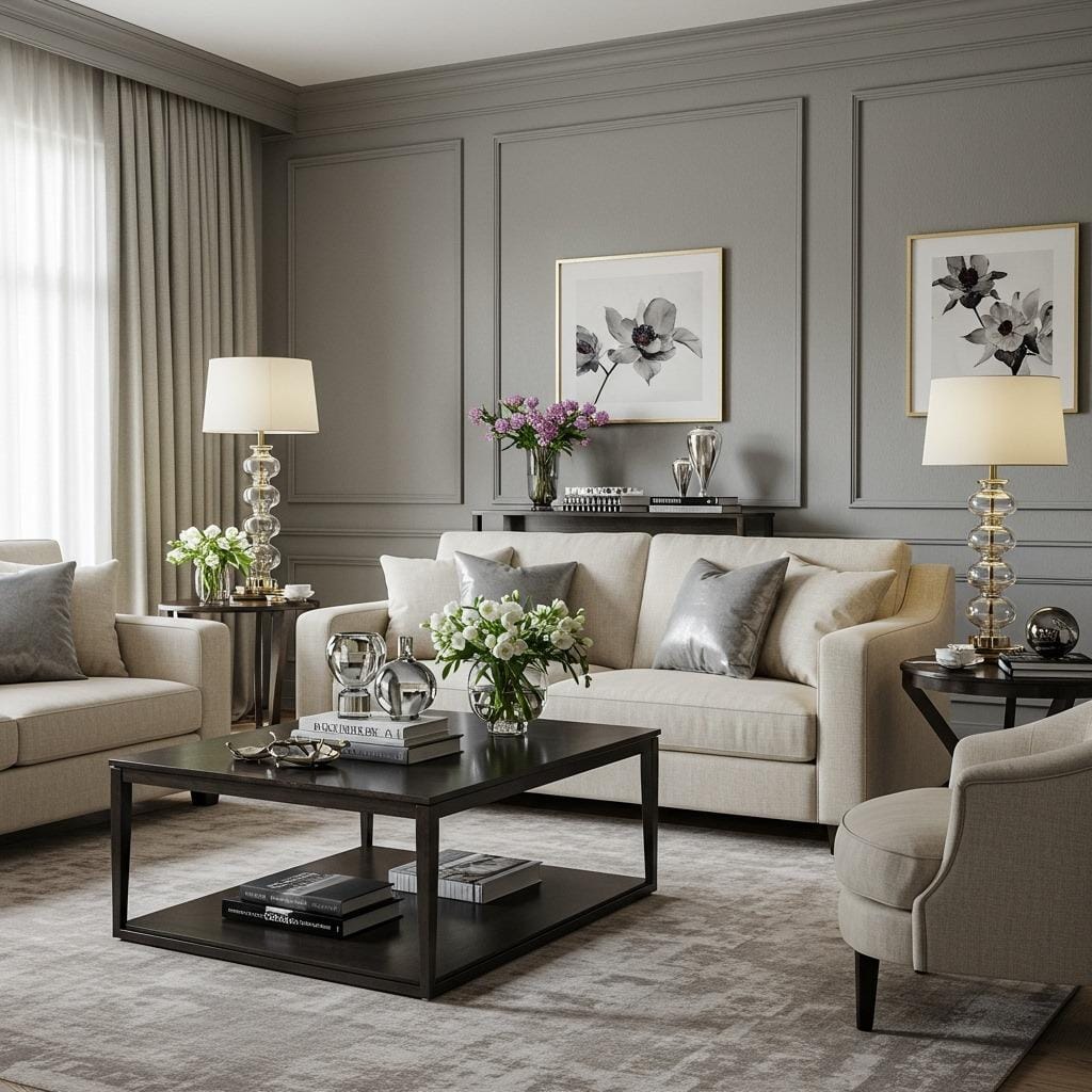
This classic pairing never goes out of style because it strikes the perfect balance between warm and cool tones. Cream provides the warmth and comfort while soft gray adds sophistication and contemporary appeal.
The key to making this combination work is getting the undertones right. Your cream should have warm undertones (think vanilla rather than stark white) and your gray should lean slightly warm rather than cool.
This palette works beautifully in beautiful living room layouts of any size. The light colors help smaller spaces feel larger while providing enough sophistication for grander rooms.
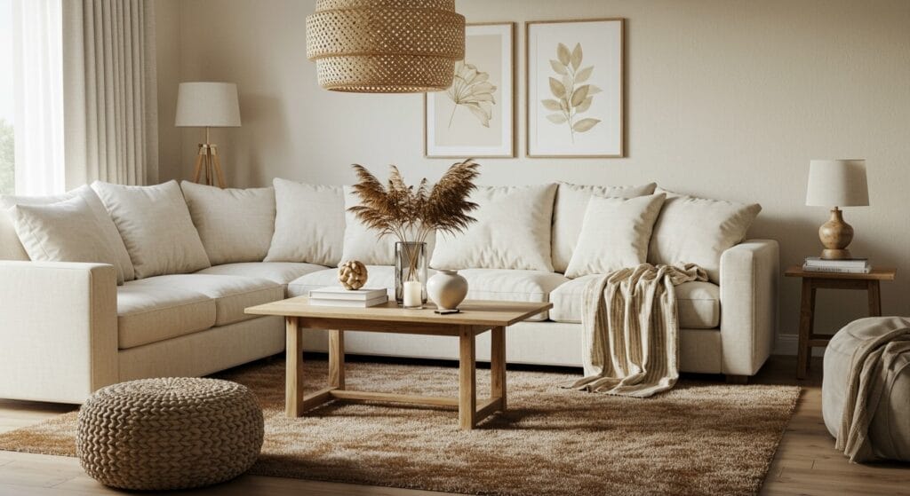
9. Oatmeal and Natural Linen Tones
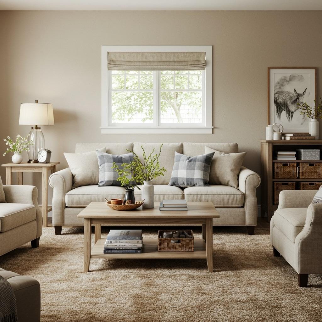
Nothing says comfort quite like the warm, organic feel of oatmeal and linen tones. These colors have an inherent coziness that makes any space feel like home immediately.
These shades work particularly well in family-focused living rooms where comfort is the top priority. They’re forgiving colors that don’t show every speck of dust or pet hair, making them practical choices for busy households.
The slightly textured quality inherent in these color names translates to visual interest on your walls. Even in flat paint, oatmeal and linen tones have enough complexity to avoid looking bland or boring.
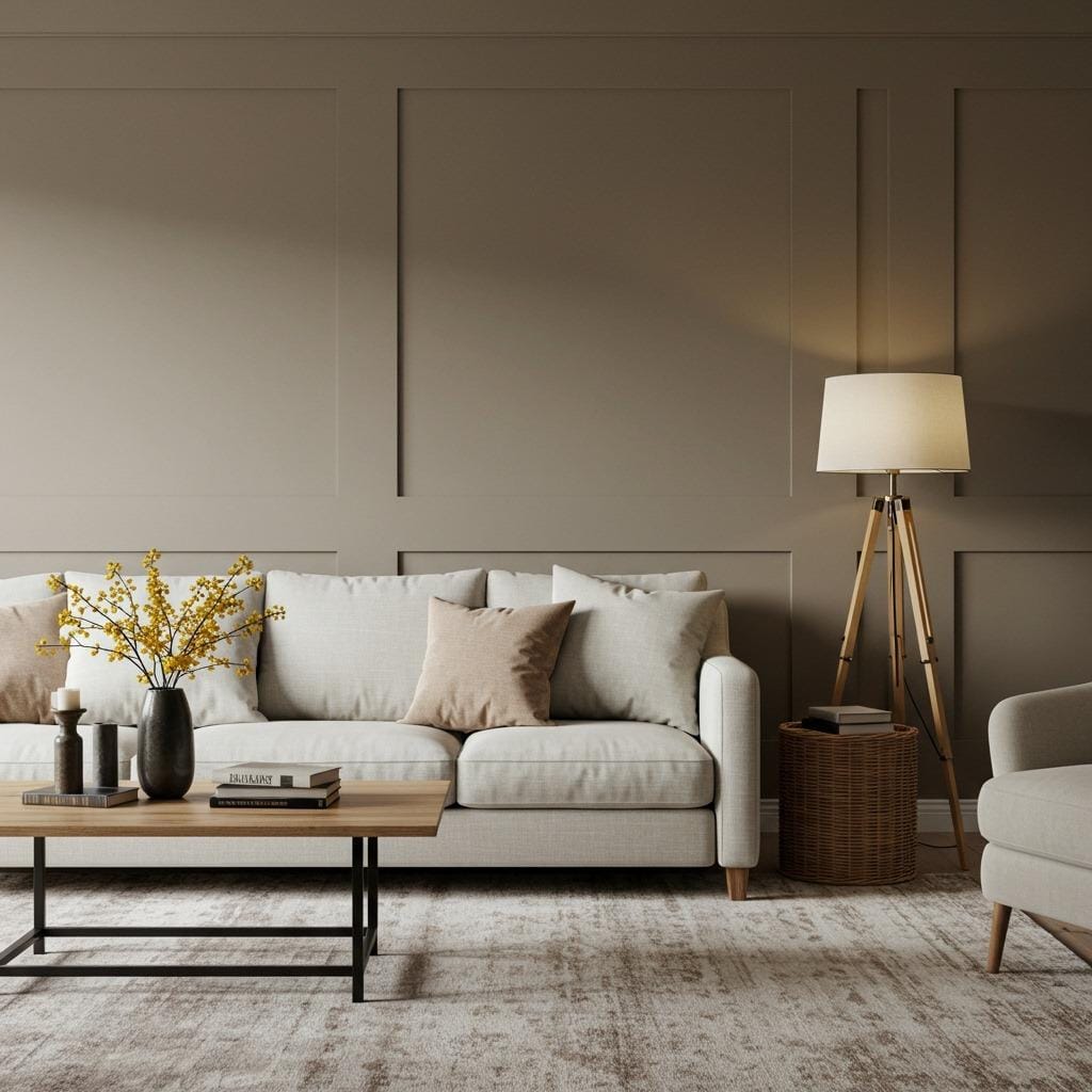
10. Warm Putty with Cream Accents
Putty might not sound glamorous, but this sophisticated neutral is incredibly versatile and calming. When paired with cream accents, it creates a refined palette that’s perfect for both casual and formal living spaces.
This combination works particularly well if you have existing wood furniture in warm tones. The putty provides a neutral backdrop that enhances rather than competes with beautiful wood grains and warm hardware.
Consider using this palette if you’re working with living room furniture arrangement challenges. The light, neutral colors won’t visually break up your space, allowing furniture placement to take precedence.
Advanced Color Techniques with Warm Neutrals
11. Monochromatic Beige Scheme
Creating a monochromatic scheme using various shades of beige might seem risky, but when done correctly, it’s incredibly sophisticated and calming. The key is incorporating enough tonal variation to create visual interest.
Start with your lightest beige on the walls, then layer in progressively deeper beiges in your furniture, rugs, and accessories. This creates a graduated effect that’s soothing to the eye while maintaining visual complexity.
Texture becomes crucial in monochromatic schemes. Without color variation to create interest, you’ll rely on different materials and finishes to prevent the space from feeling flat or boring.
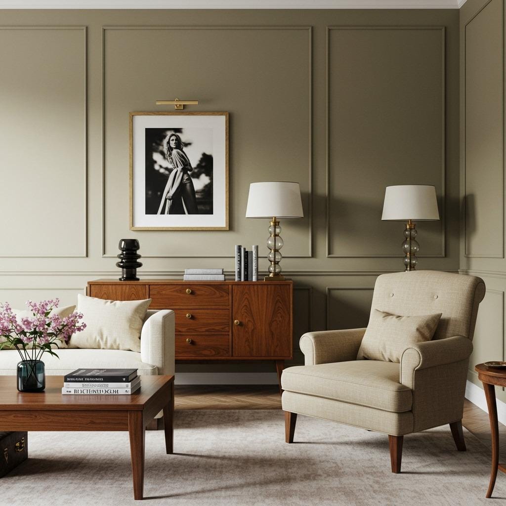
12. Greige with Natural Wood Warmth
Greige – that perfect blend of gray and beige – becomes even more welcoming when paired with natural wood elements. The wood adds warmth that prevents the greige from feeling too cool or sterile.
This combination is perfect for those who love the sophistication of gray but want to maintain a cozy, livable feel in their space. The wood elements can be incorporated through furniture, flooring, or architectural details.
Consider this approach if you’re working on winter living room decor that needs to feel warm and inviting during the colder months. The natural wood provides that essential warmth factor.
13. Soft Taupe with Ivory Highlights
This sophisticated combination creates one of the most timeless and elegant neutral palettes possible. Soft taupe provides depth and richness while ivory highlights add brightness and sophistication.
Use the taupe as your main color and incorporate ivory in your trim, furniture, and key accessories. This creates a layered look that’s both interesting and cohesive.
This palette works exceptionally well in earthy tones living room designs where you want sophistication with natural appeal. The combination feels both current and classic.
Making Your Warm Neutral Palette Work
The secret to successful neutral decorating lies in the details. Your lighting choices can make or break a neutral palette – warm LED bulbs enhance the cozy feeling while cool fluorescents can make everything look washed out.
Don’t forget about the fifth wall – your ceiling. Painting it in a slightly lighter version of your wall color creates cohesion and makes the room feel more intimate and finished.
Pattern and texture become your best friends when working with neutral palettes. Since you’re not relying on bold colors for interest, you’ll need to incorporate visual variety through materials, patterns, and finishes instead.
Styling Tips for Long-Term Success
Choose furniture in colors that complement rather than match your neutral walls exactly. This prevents that catalog look while ensuring everything works together harmoniously.
Invest in quality paint – the subtle differences in warm neutral colors are most apparent with high-quality finishes that have depth and richness. Cheap paint often looks flat and lifeless in neutral tones.
Remember that warm neutral living room colors are meant to be a backdrop for your life. They should enhance your furniture, artwork, and personal collections rather than competing with them for attention.
These 13 warm neutral color ideas provide endless possibilities for creating the cozy, welcoming living room you’ve been dreaming of. The beauty of working with these calming color palettes lies in their flexibility – you can easily update your look with new accessories and textiles without needing to repaint.
Whether you choose a single color for a serene monochromatic look or combine several warm neutrals for added depth, you’re creating a foundation that will serve you well for years to come. The timeless appeal of beige and taupe decor ensures your investment in paint and neutral furnishings won’t feel dated as trends come and go.
Your living room should be your sanctuary, and these soft living room hues provide the perfect starting point for creating a space that truly feels like home.
Sanjai creates easy, affordable home decor ideas that anyone can try. Through simple tips and curated finds, he helps you style rooms you’ll love coming home to.