There’s something magical about walking into a kitchen that feels both alive and grounded. Bold and earthy kitchen color palettes strike that perfect balance – they’re sophisticated without being cold, distinctive without being overwhelming.
I’ve spent years watching kitchen trends come and go, but these natural tones paired with confident pops of color? They have real staying power. Unlike the stark all-white kitchens that dominated the past decade, these palettes bring warmth back into what should be the heart of your home. They work whether you’re renovating from scratch or just looking to refresh your space with new paint.
What I love most is how forgiving these combinations are. The earthy base colors hide everyday wear beautifully, while those bold accents let your personality shine through. You’re not stuck with boring beige, but you’re also not committing to a turquoise kitchen you might regret in two years. It’s that sweet spot between safe and exciting.
1. Terracotta and Sage Green
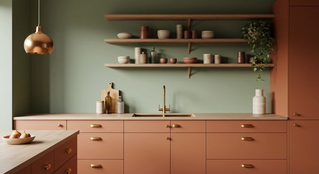
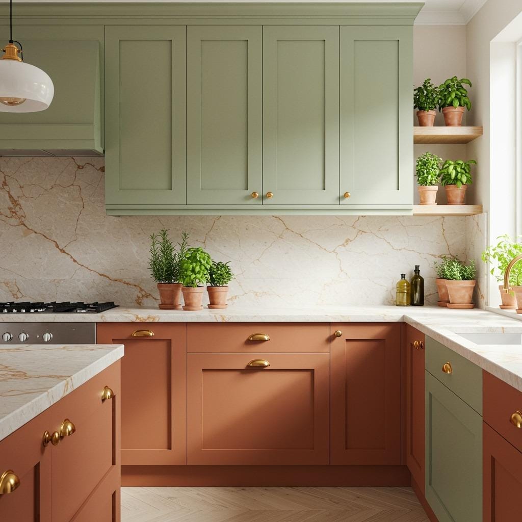
This combination feels like bringing the Mediterranean countryside into your cooking space. The warmth of terracotta cabinets paired with soft sage green walls creates an environment that’s both energizing and calming.
I’ve seen this palette transform kitchens from sterile to soul-filled. The terracotta adds that sun-baked earthiness, while sage green introduces a botanical freshness that never feels trendy in a fleeting way. It’s the kind of kitchen color palette that looks stunning with both brass and matte black hardware.
The beauty here is versatility. You can go bold with terracotta on all your cabinets, or use it as an accent on a kitchen island while keeping upper cabinets in a softer cream. Adding natural wood open shelving ties everything together and gives you space to display earthenware and plants that echo these tones.
2. Deep Forest Green and Warm Walnut
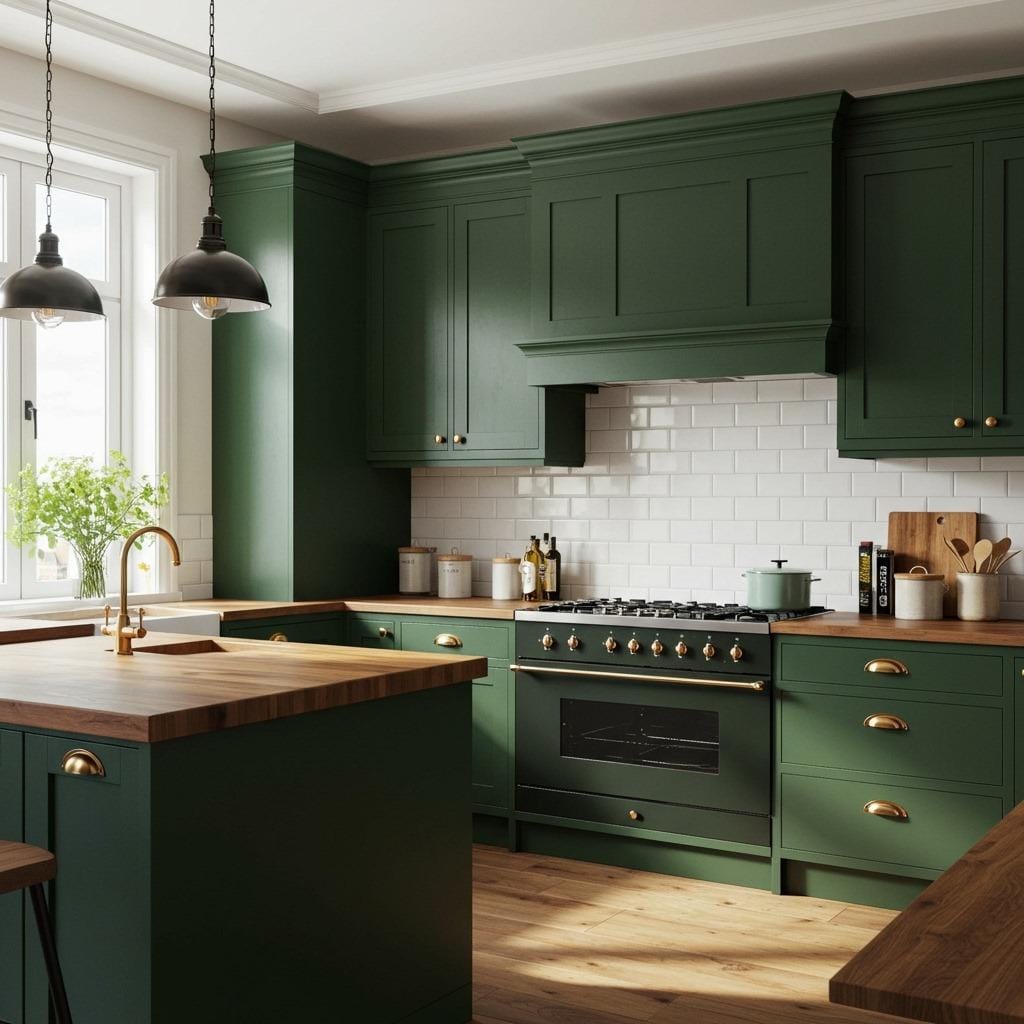
Forest green has become incredibly popular in kitchen and dining ideas, and for good reason. When you pair it with rich walnut wood tones, you get a combination that feels both luxurious and organic.
This palette works particularly well in kitchens with good natural light. The deep green absorbs light beautifully without making the space feel dark, while walnut countertops or butcher block islands add warmth that prevents the green from reading too cool. I always recommend this combination for people who want their kitchen to feel like a sophisticated retreat.
Consider painting your lower cabinets in forest green while keeping upper cabinets in a warm off-white or cream. This creates visual weight at the bottom and keeps the space from feeling closed in. Walnut floating shelves against a cream backsplash add dimension and practical storage for your everyday dishes.
3. Ochre Yellow and Charcoal Gray
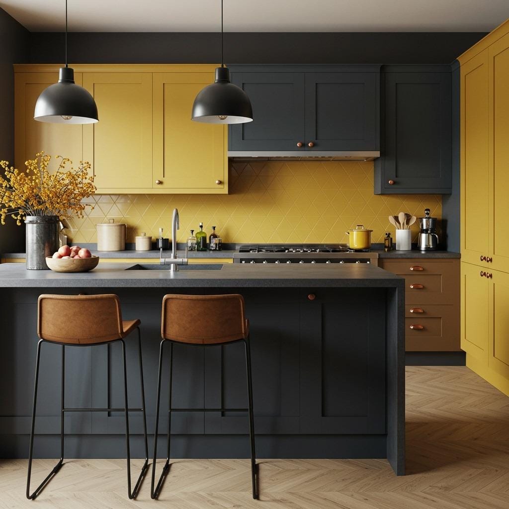
Here’s a combination that sounds risky but delivers every time. Ochre yellow brings that earthy, golden warmth while charcoal gray grounds everything with modern sophistication. It’s bold without screaming for attention.
I love how this palette adapts to different kitchen styles. In a modern farmhouse kitchen, ochre cabinets with charcoal gray walls create striking contrast. For something more subtle, try charcoal cabinets with ochre accents in your backsplash tiles or in a painted ceiling.
The key is balancing proportions. Too much ochre can feel overwhelming, while too much charcoal might read as heavy. A 60-40 split usually works well, with plenty of natural wood and brass elements to bridge the two colors. Concrete or soapstone countertops look incredible with this palette.
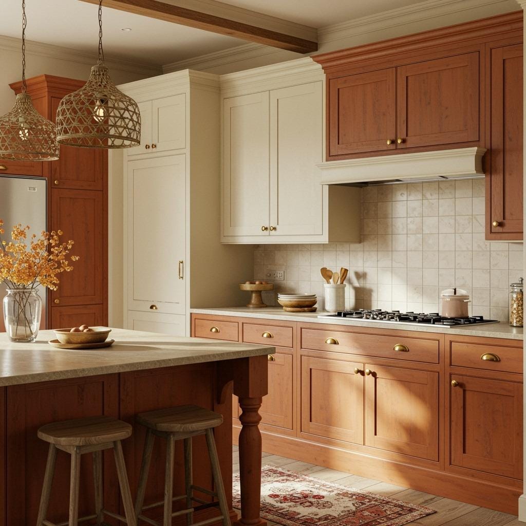
4. Rust Orange and Cream
Rust orange is having a moment, and when you pair it with soft cream tones, you create a kitchen that feels both current and timeless. This combination has that vintage appeal without feeling dated.
The warmth of rust orange cabinets against cream walls creates a cozy envelope that makes everyone want to gather in your kitchen. This palette particularly shines in simple kitchen styling where the colors themselves become the main design feature. You don’t need elaborate decor when your color scheme does the heavy lifting.
I’ve found that brass or copper fixtures are non-negotiable with this palette. They echo the warmth of the rust tones and add that finishing touch that makes everything feel intentional. Natural stone countertops in beige or light brown tones complete the look without competing with your cabinet colors.
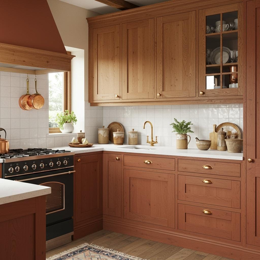
5. Clay Red and Natural Oak
Clay red brings immediate personality to a kitchen without being as intense as a true red. When balanced with natural oak wood tones, you get a palette that feels earthy, warm, and surprisingly sophisticated.
This combination works beautifully in kitchens where you want to highlight architectural details. Clay red painted on lower cabinets with natural oak uppers creates visual interest while keeping things from feeling too heavy. The wood grain adds texture and movement that prevents the red from dominating.
What makes this palette special is how it changes throughout the day. Morning light brings out the warm undertones in both colors, while evening light makes the space feel cozier. Adding plants and greenery creates a beautiful contrast against the red tones.
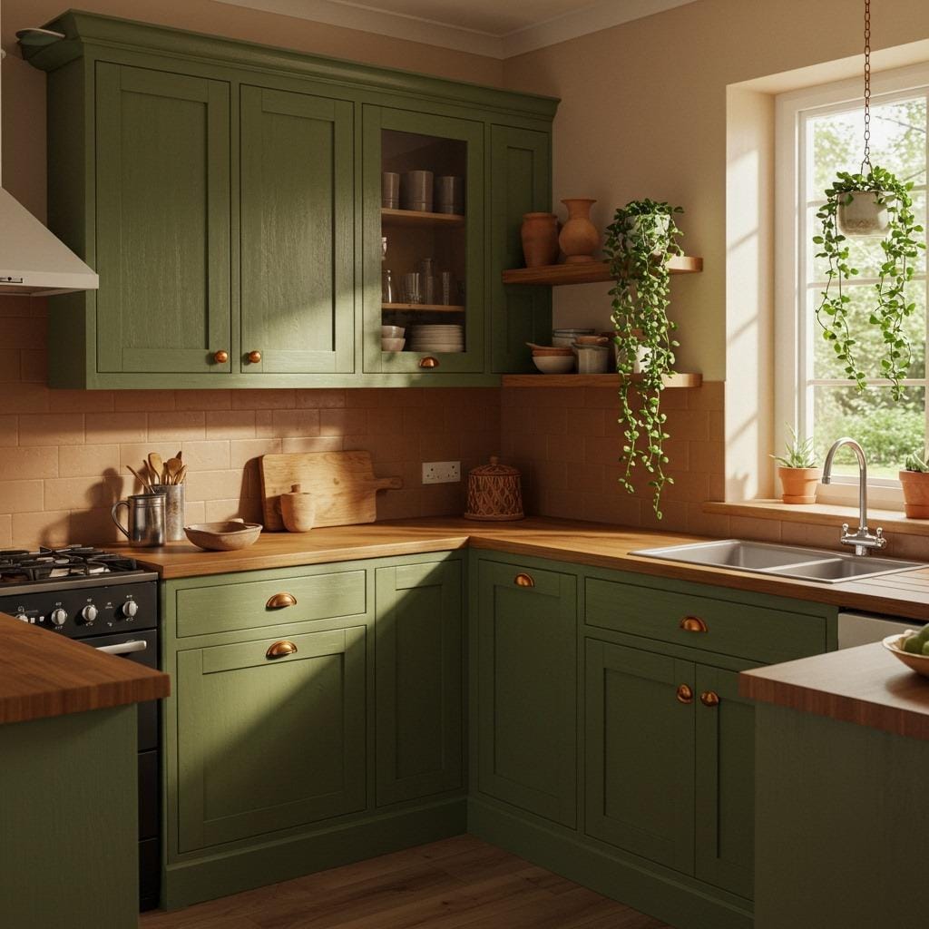
6. Olive Green and Warm Beige
Olive green is one of those colors that photographs beautifully and feels even better in person. Paired with warm beige tones, it creates a kitchen environment that’s sophisticated but never stuffy.
I recommend this palette for anyone drawn to scandinavian kitchen decor but wanting something with more depth. The olive brings in that natural, botanical element while beige keeps everything feeling light and airy. It’s a combination that works across seasons and never feels out of place.
Try olive green on your cabinets with beige or tan walls, or flip it for a different effect. Natural linen textures, rattan elements, and light wood tones all enhance this palette. Black iron hardware provides just enough contrast without disrupting the earthy flow.
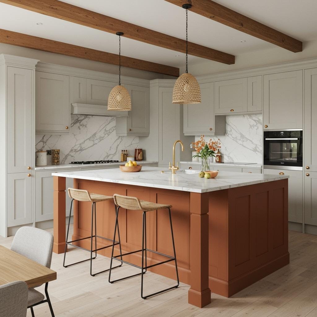
7. Burnt Sienna and Soft Gray
Burnt sienna has that perfect balance of orange and brown that reads as warm without being overwhelming. Against soft gray walls or cabinets, it creates dimension and visual interest that basic neutrals just can’t achieve.
This palette feels especially at home in open concept spaces where your kitchen flows into living areas. The burnt sienna adds personality to the kitchen zone while soft grays help it blend seamlessly with adjacent rooms. It’s bold enough to define the space but harmonious enough to maintain flow.
Consider using burnt sienna on a focal point like your kitchen island or on open shelving against gray cabinetry. Marble or quartz countertops with gray veining tie everything together beautifully. Warm-toned wood floors keep the space from feeling too cool.
8. Moss Green and Caramel Brown
Moss green brings the outdoors in without being too literal about it. When you combine it with rich caramel brown wood tones, you create a kitchen that feels grounded and organic in the best possible way.
This palette works particularly well if you’re incorporating sustainable kitchen materials into your renovation. The natural color scheme complements bamboo, reclaimed wood, and natural stone beautifully. It’s a palette that feels environmentally conscious without trying too hard.
I love seeing moss green painted cabinets with caramel-toned butcher block countertops or open shelving. The combination feels fresh but established, modern but comfortable. Brass or bronze hardware adds that finishing layer of warmth. Plants with darker foliage look stunning against this backdrop.
9. Dusty Pink and Charcoal
Yes, pink in the kitchen can work. Dusty pink brings warmth and personality without reading as too sweet or feminine, especially when balanced against charcoal gray elements. It’s an unexpectedly sophisticated combination.
This palette needs confidence to pull off, but the results are worth it. Dusty pink lower cabinets with charcoal upper cabinets or a charcoal bold kitchen backsplash create a kitchen that people remember. It’s definitely a conversation starter, but in the best way possible.
The key is using the right shade of pink – think terracotta rose rather than bubblegum. White or light gray countertops provide a neutral break between the two colors. Gold or brass hardware adds warmth, while matte black fixtures lean into the modern edge of this palette.
10. Amber and Ivory
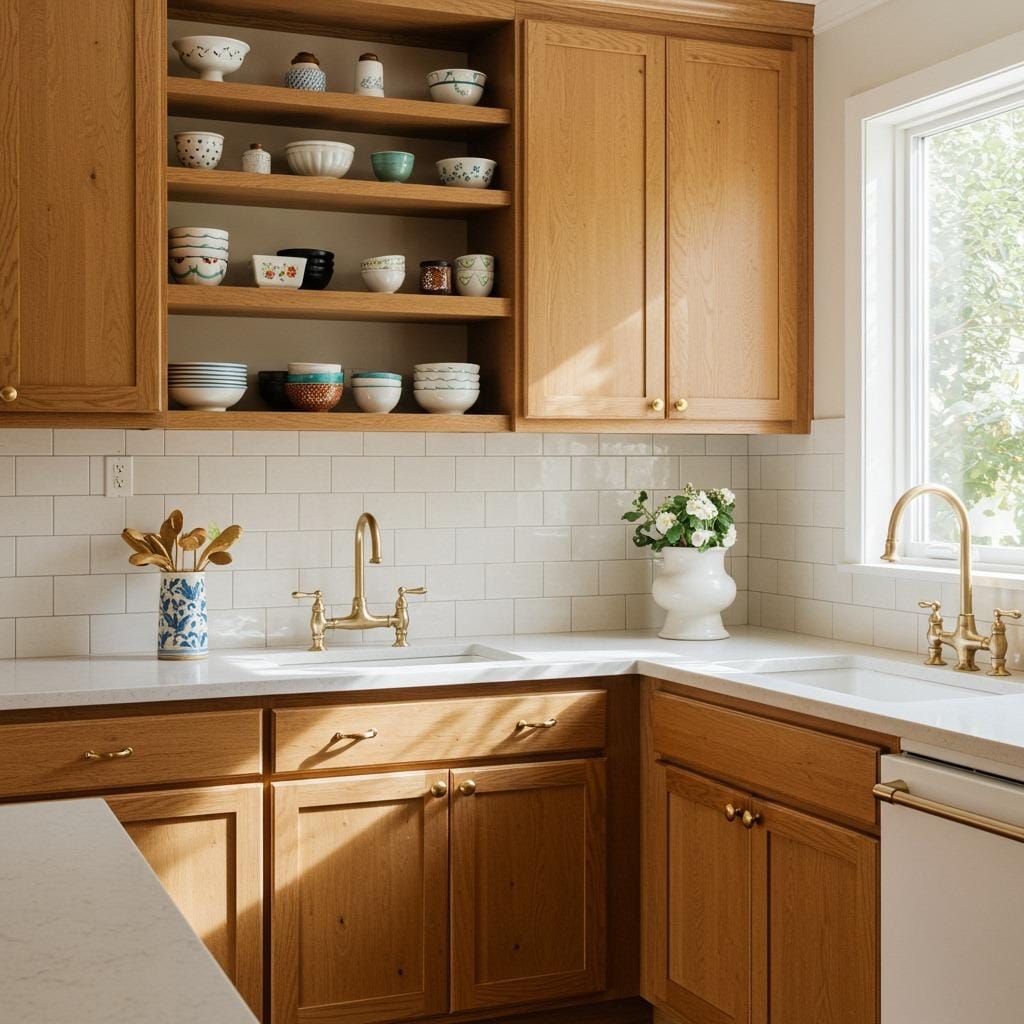
Amber tones bring that honey-golden warmth that makes a kitchen feel inviting from the moment you walk in. Against ivory backgrounds, amber creates a soft, glowing effect that’s both elegant and approachable.
This combination works beautifully in kitchens with layered lighting because it responds so well to different light sources. Under-cabinet lights make amber cabinets glow, while natural light brings out the creaminess of ivory walls and backsplashes. It’s a palette that literally brightens your day.
Try amber-stained wood cabinets with ivory painted uppers, or go bold with amber lacquered cabinets throughout. Natural stone countertops in neutral tones with subtle veining complement without competing. This is also an excellent palette for displaying colorful pottery and dishes since it provides such a warm neutral backdrop.
11. Chocolate Brown and Sage
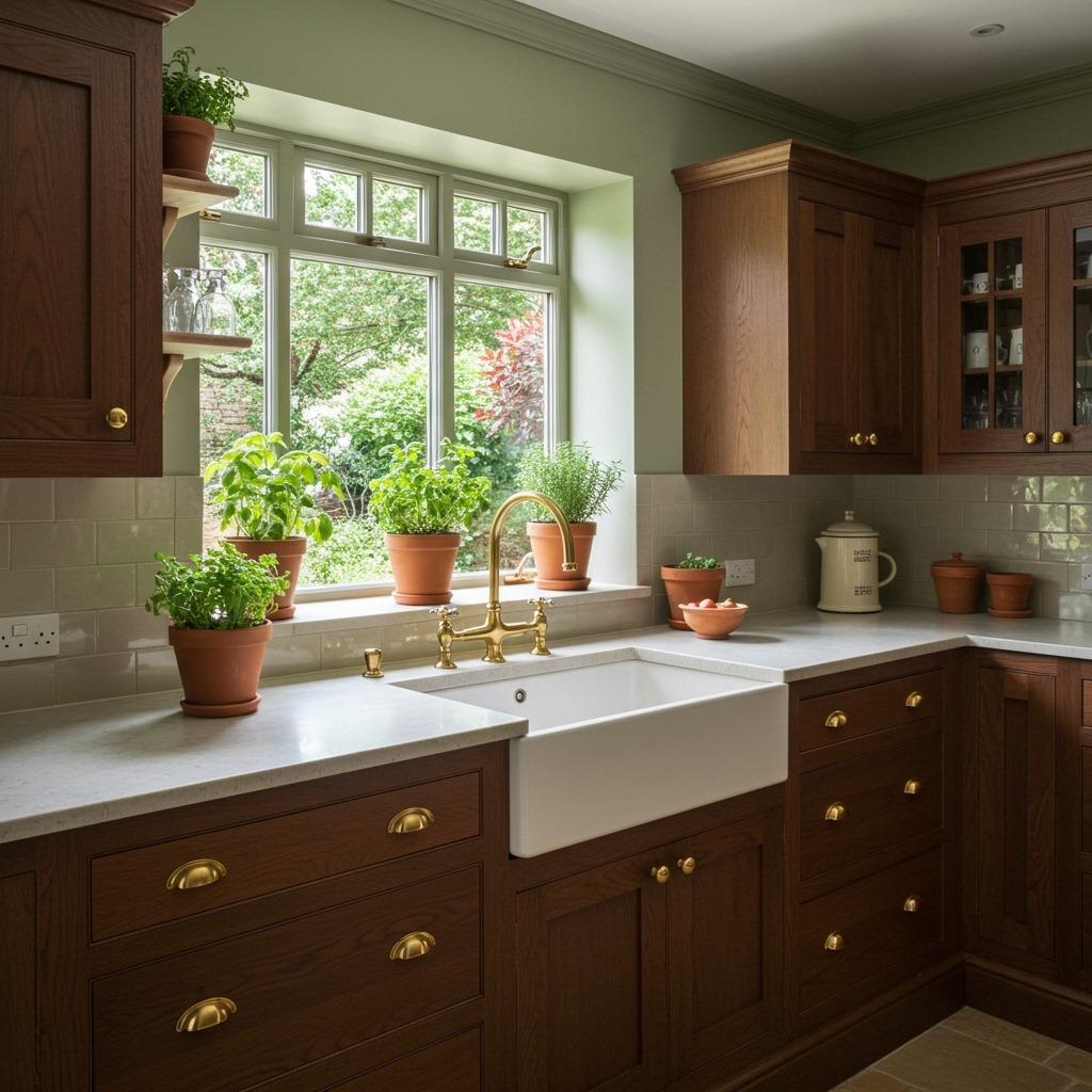
Chocolate brown cabinetry might sound dated, but when paired with fresh sage green accents, it becomes something entirely current. This combination brings depth and richness while staying firmly in the natural tones family.
I’ve seen this palette transform older kitchens into sophisticated spaces without requiring complete cabinet replacement. Sometimes a fresh coat of chocolate brown stain or paint on existing cabinets, combined with sage green walls or a green tile backsplash, is all you need. It’s budget-friendly and impactful.
The chocolate provides grounding weight while sage keeps things from feeling too heavy or dark. Light countertops in cream or white maintain brightness. Natural wood cutting boards, brass utensil holders, and plants in terracotta pots all enhance this earthy palette beautifully.
12. Brick Red and Warm White
Brick red brings instant character and warmth without being as intense as true red. Against crisp warm white elements, it creates a kitchen that feels both energetic and clean – a balance that’s surprisingly hard to achieve.
This palette works across multiple kitchen styles. In a farmhouse kitchen, brick red cabinets with white subway tiles feel classic. In a more contemporary space, brick red lacquered cabinets against white walls lean modern. The versatility is what makes it such a strong choice for vibrant kitchen decor.
Natural wood tones and woven textures soften the contrast between red and white. Consider a natural wood island or butcher block countertops to bridge the two colors. Black accents in hardware and light fixtures add definition without competing with your main palette.
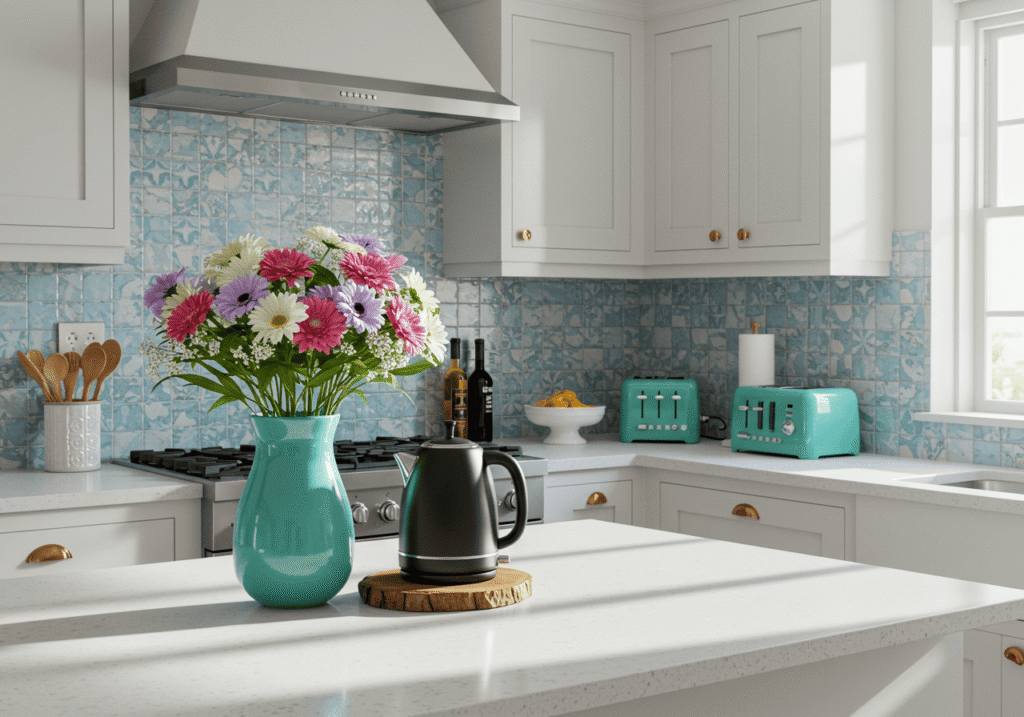
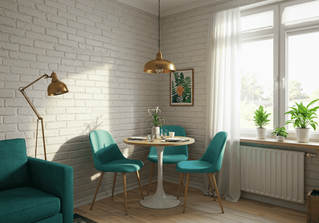
13. Teal and Walnut
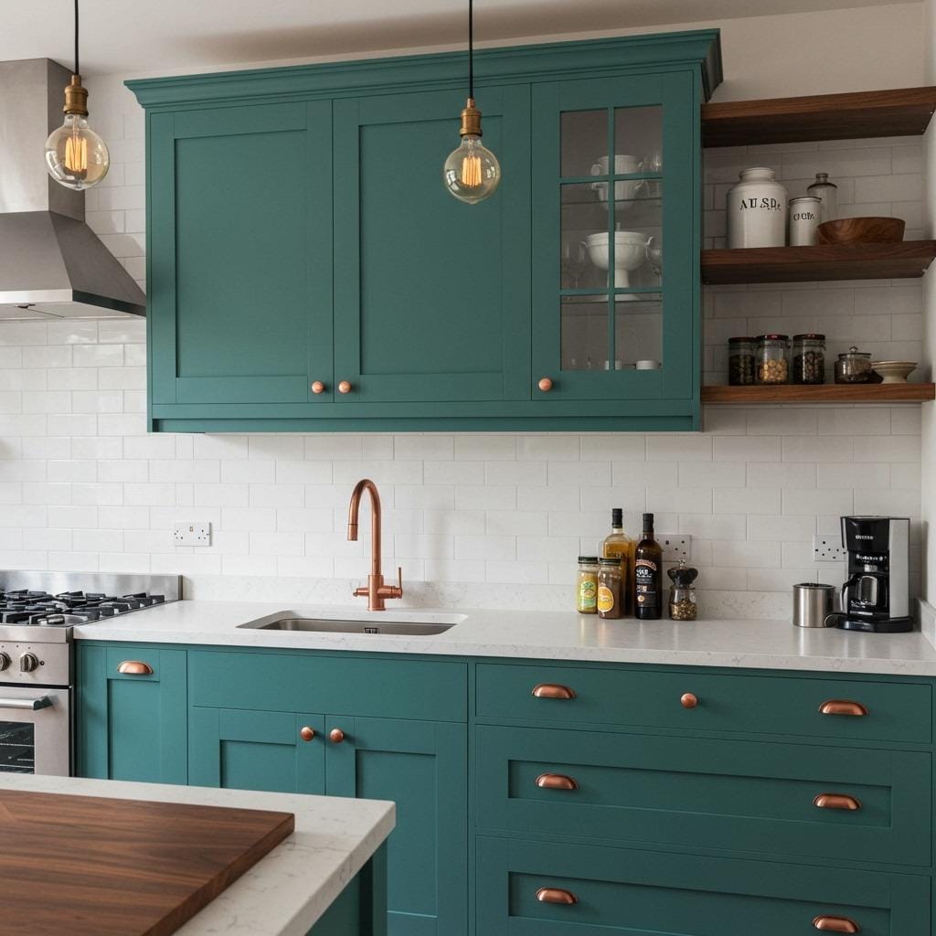
Teal sits right at that intersection of blue and green, bringing calm and depth while still feeling earthy and natural. Combined with rich walnut wood tones, it creates a kitchen that’s both striking and livable.
What I appreciate about this combination is how it handles trends. Teal has been popular for a while now, but anchored by walnut’s timeless warmth, it never feels like you’re chasing a trend. The wood tones mature and deepen over time, which only makes the palette more beautiful.
Try teal cabinets with walnut open shelving or butcher block countertops. White or cream walls keep the space bright while letting these two rich tones shine. Copper or bronze hardware picks up the warm undertones in both colors. This palette also looks stunning with kitchen lighting ideas that include warm LED bulbs rather than cool white.
14. Taupe and Burnt Orange
Taupe is the ultimate neutral that actually has personality. It’s warm without being yellow, gray without being cold. Add burnt orange accents and you have a kitchen color scheme that’s current, sophisticated, and endlessly flexible.
This combination is perfect for anyone nervous about going too bold. Taupe cabinets provide a neutral foundation that will never feel dated, while burnt orange brings in warmth through smaller elements like bar stools, window treatments, or even small appliances. You can dial the boldness up or down based on your comfort level.
Natural stone countertops with warm veining look incredible with this palette. So do light wood floors in natural oak or maple tones. The beauty of starting with taupe is that you can shift your accent colors over time if you want a refresh without repainting cabinets. Check out more ways to incorporate warm tones through kitchen counter decorating ideas.
15. Mustard Yellow and Gray-Green
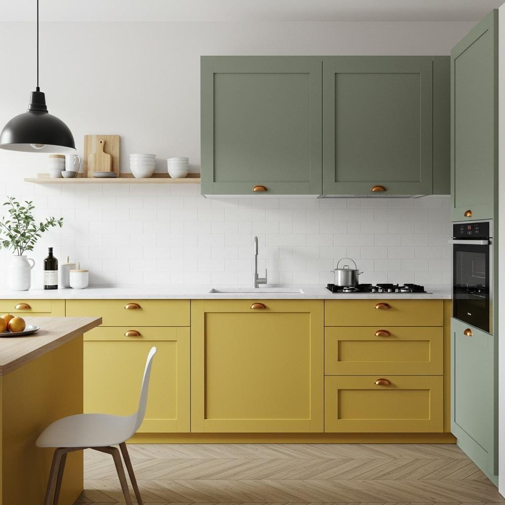
Mustard yellow might seem bold, but it’s actually quite grounded – it has brown and earth tones mixed in that keep it from being too bright. Paired with gray-green, it creates a palette that’s warm, interesting, and surprisingly easy to live with.
I love this combination for kitchens that don’t get a ton of natural light. The mustard brings sunshine into the space while gray-green prevents it from feeling too intense. It’s cheerful without being overwhelming. This palette works beautifully in minimalist kitchen decor where clean lines let the colors take center stage.
Consider mustard on lower cabinets with gray-green uppers, or vice versa depending on your ceiling height and natural light. White or very light gray countertops provide breathing room between the two colors. Natural wood elements and plants help tie everything together.
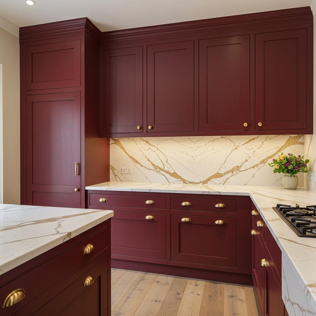
16. Burgundy and Cream
Burgundy brings richness and depth that few other colors can match. It’s bold, yes, but it’s also sophisticated in a way that works beautifully in kitchen spaces. Against cream backgrounds, burgundy creates a look that’s both warm and elegant.
This palette feels particularly at home in traditional or transitional kitchen styles, though I’ve seen it work in more modern spaces too. The key is balancing the intensity of burgundy with enough cream to keep things from feeling heavy. Burgundy cabinets with cream walls and backsplash create drama, while the reverse offers something more subtle.
Natural wood floors in medium tones complement this palette beautifully. So do brass or antique bronze hardware. Lighting matters here – warm bulbs bring out the richness of burgundy, while cool lighting can make it feel flat. This is a palette that rewards attention to detail.
Choosing the Right Palette for Your Kitchen
Picking the perfect bold and earthy kitchen color palette isn’t just about what looks good in photos. You need to consider your existing home’s style, the amount of natural light your kitchen receives, and honestly, what colors make you happy when you’re making your morning coffee.
Start by looking at the colors already present in adjacent rooms if you have an open floor plan. Your kitchen palette should complement, not clash with, your living room ideas and overall home aesthetic. I always recommend testing paint samples on large poster boards that you can move around your kitchen at different times of day. Colors behave differently in morning versus evening light.
Think about the undertones in your existing finishes too. If you have warm-toned wood floors, you’ll want warm kitchen colors to complement them. Cool-toned tile or stone floors might pair better with palettes that lean slightly cooler. These details make the difference between a kitchen that feels cohesive and one that feels slightly off, even if you can’t quite pinpoint why.
Don’t forget about maintenance and practicality. Lighter earthy tones might show wear more readily than deeper colors, though they can make small kitchens feel more spacious. Darker bold colors hide everyday mess better but can make compact spaces feel enclosed. There’s no perfect answer – it’s about knowing your own lifestyle and cleaning habits.
Making Bold Colors Work Long-Term
One concern I hear constantly is whether bold kitchen colors will still look good in five or ten years. The truth? Earthy bold tones age much better than trendy pastels or bright primary colors because they’re rooted in nature, and nature never really goes out of style.
That said, there are ways to build in flexibility. If you’re nervous about commitment, use your boldest colors on elements that are easier to change – paint rather than tile, movable islands rather than permanent cabinetry. Save your bigger investments for neutral foundations that won’t dictate your entire palette.
I also recommend the 60-30-10 rule: 60% neutral or soft earthy tone, 30% bolder earthy color, and 10% accent. This creates balance and prevents bold colors from overwhelming your space. You can always add more bold elements through accessories and decor as you get comfortable with the palette.
These warm kitchen colors and natural tones create spaces that actually improve with age. They develop character, show less wear than stark whites, and photographs of your kitchen in five years will still make you happy. That’s what we’re really after, isn’t it?
Sanjai creates easy, affordable home decor ideas that anyone can try. Through simple tips and curated finds, he helps you style rooms you’ll love coming home to.
