Creating the perfect bedroom sanctuary starts with one powerful decision – choosing the right color palette. Your bedroom walls don’t just define your space; they actively influence your stress levels, sleep quality, and overall well-being. The colors surrounding you as you drift off to sleep can either support deep relaxation or keep your mind buzzing with energy.
Color psychology reveals fascinating insights about how different hues affect our nervous system. Cool tones naturally lower heart rate and blood pressure, while warm neutrals create a sense of security and comfort. The key is understanding which calming bedroom colors work best for your personal sleep needs and lifestyle.
Whether you’re dealing with insomnia, high stress levels, or simply want to create a more restful environment, the right color choices can make a remarkable difference. Let’s explore 17 scientifically-backed tranquil paint hues that will transform your bedroom into the peaceful retreat you’ve been dreaming of.
Understanding Bedroom Color Therapy
The science behind bedroom color therapy goes deeper than simple aesthetics. Research from the Sleep Foundation shows that certain colors can reduce cortisol levels by up to 25%, directly impacting how quickly you fall asleep and the quality of your rest. Your brain processes color information even with your eyes closed, making your bedroom’s color palette a 24/7 influence on your well-being.
Cool colors like blues and greens activate the parasympathetic nervous system, which governs your body’s rest-and-digest response. These hues naturally slow your heart rate and encourage the production of melatonin, your body’s natural sleep hormone. Warm neutrals, on the other hand, create psychological safety and comfort, which can be especially beneficial if you struggle with anxiety or racing thoughts at bedtime.

The timing of color exposure matters too. During evening hours, your bedroom colors should complement your circadian rhythm rather than disrupt it. This is why many bedroom lighting ideas focus on warm, dim lighting paired with calming wall colors to create the perfect pre-sleep environment.
The Science of Peaceful Color Palettes
Recent studies in environmental psychology have identified specific color temperatures and saturation levels that promote the deepest, most restorative sleep. Colors with lower chroma (less intense saturation) consistently outperform bright, vivid hues in sleep quality tests. The most effective peaceful color palettes typically feature colors with RGB values that fall within specific ranges proven to reduce neural activity in the brain’s alertness centers.
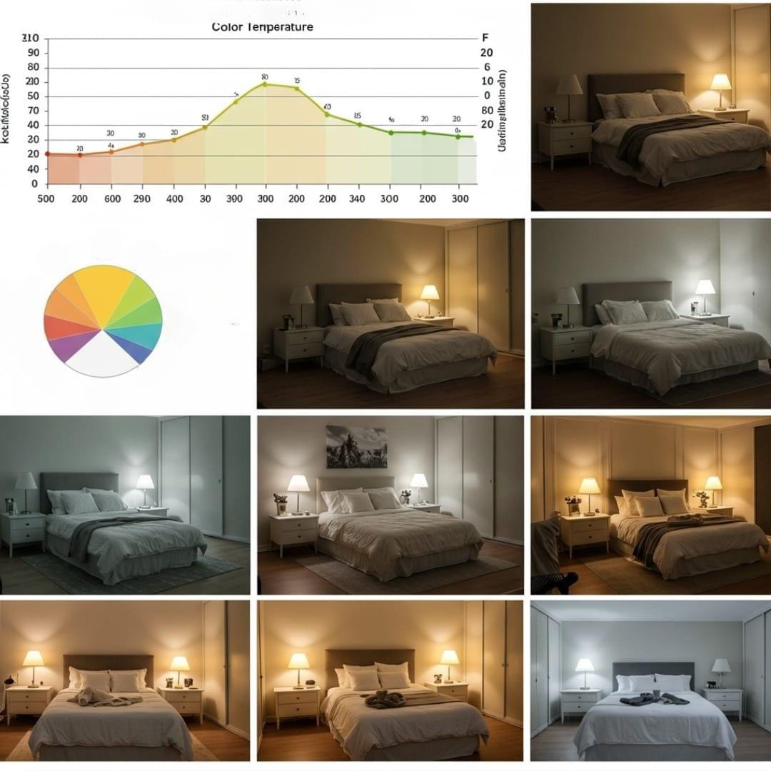
Temperature isn’t just about warm versus cool – it’s about finding the sweet spot where your nervous system feels both secure and relaxed. Colors that register between 2700K-3000K on the Kelvin scale (similar to candlelight) work harmoniously with your body’s natural wind-down process. This is why many spa facilities and luxury hotels choose very specific paint formulations designed to promote relaxation.
Understanding undertones becomes crucial when selecting your perfect shade. A blue with green undertones will feel more organic and grounding, while a blue with gray undertones creates sophisticated tranquility. These nuances can make the difference between a bedroom that feels merely pretty and one that actively supports your sleep health.
17 Calming Bedroom Colors for Ultimate Relaxation
1. Sage Green – Nature’s Tranquil Embrace
Sage green tops our list for good reason – it combines the calming properties of blue with the renewal energy of green, creating an incredibly balanced atmosphere. This muted green mimics the color of dried herbs and natural landscapes, instantly connecting your bedroom to the restorative power of nature. Sleep researchers consistently rank sage green among the top colors for reducing anxiety and promoting deeper sleep cycles.
The versatility of sage green makes it perfect for any bedroom size or style. In small bedroom storage solutions, sage walls can make the space feel larger while maintaining that cozy, cocoon-like feeling essential for good rest. Pair it with crisp white linens and natural wood furniture for a spa-like retreat that never feels clinical or cold.
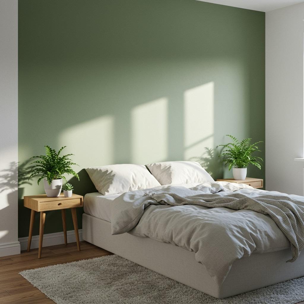
Consider painting just one accent wall in sage green if you’re hesitant about committing to color throughout the entire room. This approach allows you to experience the calming benefits while keeping the space feeling light and airy.
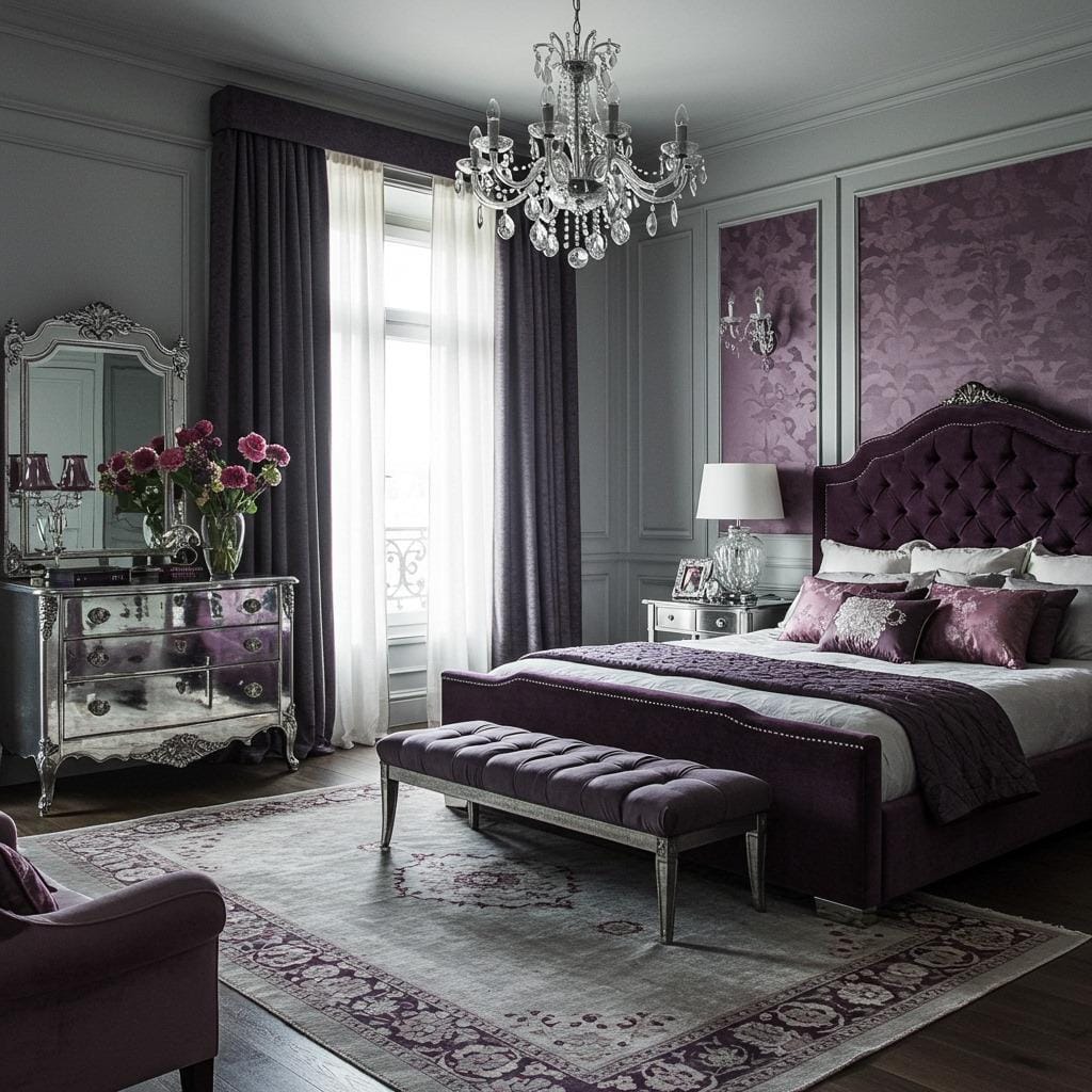
2. Soft Lavender – Aromatic Serenity
Soft lavender brings the proven stress-reducing benefits of its namesake herb directly into your bedroom design. This gentle purple has been shown to lower blood pressure and reduce anxiety levels, making it particularly effective for people who struggle with racing thoughts at bedtime. Unlike bold purples that can feel energizing, soft lavender maintains a whisper-quiet presence that supports relaxation.
The key to using lavender successfully lies in choosing the right tone. Look for lavenders with gray or blue undertones rather than pink undertones, which can feel too stimulating for sleep. This color works beautifully in cozy boho bedroom designs, paired with natural textures and warm lighting that enhance its dreamy qualities.
Lavender walls photograph beautifully in natural light, making your bedroom feel Instagram-worthy while serving your sleep needs. The color shifts subtly throughout the day, appearing more gray in morning light and more purple in evening hours.
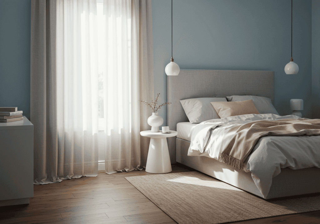
3. Dusty Blue – Celestial Calm
Dusty blue captures the serenity of twilight skies, creating an instant sense of peace and expansiveness in your bedroom. This sophisticated blue-gray hybrid combines the proven sleep benefits of blue with the grounding qualities of gray, resulting in a color that feels both celestial and cozy. Studies show that blue environments can reduce heart rate by up to 7 beats per minute, making dusty blue an excellent choice for high-stress lifestyles.
This versatile shade works particularly well in modern minimalist bedroom decor, where clean lines and uncluttered spaces amplify its tranquil effects. The color’s neutral qualities mean it pairs effortlessly with both warm and cool accent colors, giving you flexibility in your decor choices.
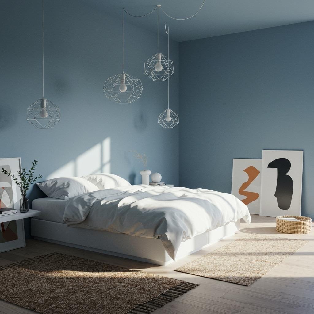
Dusty blue has the unique ability to make small bedrooms feel larger while maintaining intimacy. The color reflects light beautifully, creating depth and dimension that can visually expand your space without sacrificing the cozy factor essential for good sleep.
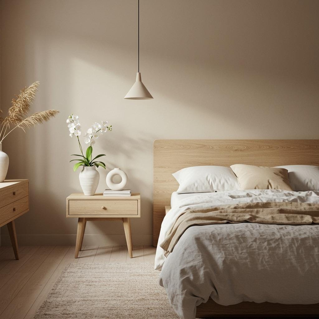
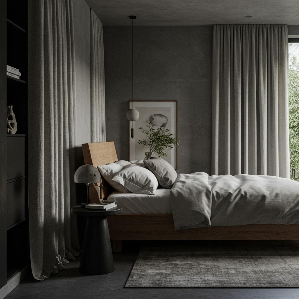
4. Warm Gray – Sophisticated Neutrality
Warm gray offers the perfect balance between sophistication and serenity, creating a bedroom environment that feels both luxurious and deeply restful. Unlike cool grays that can feel stark or institutional, warm grays contain subtle brown or beige undertones that add comfort and coziness. This makes them ideal for creating a hotel-like atmosphere in your own bedroom.
The psychological effects of warm gray are particularly interesting – the color promotes feelings of security and stability while remaining visually quiet enough not to stimulate the mind before sleep. In scandinavian bedroom color palettes, warm gray serves as the perfect backdrop for layering textures and natural materials that enhance the room’s cozy factor.
Warm gray’s neutrality makes it an excellent investment color – it won’t look dated in a few years and works with evolving decor styles. The color also serves as an ideal backdrop for artwork and decorative elements, allowing your personal style to shine while maintaining the room’s peaceful atmosphere.
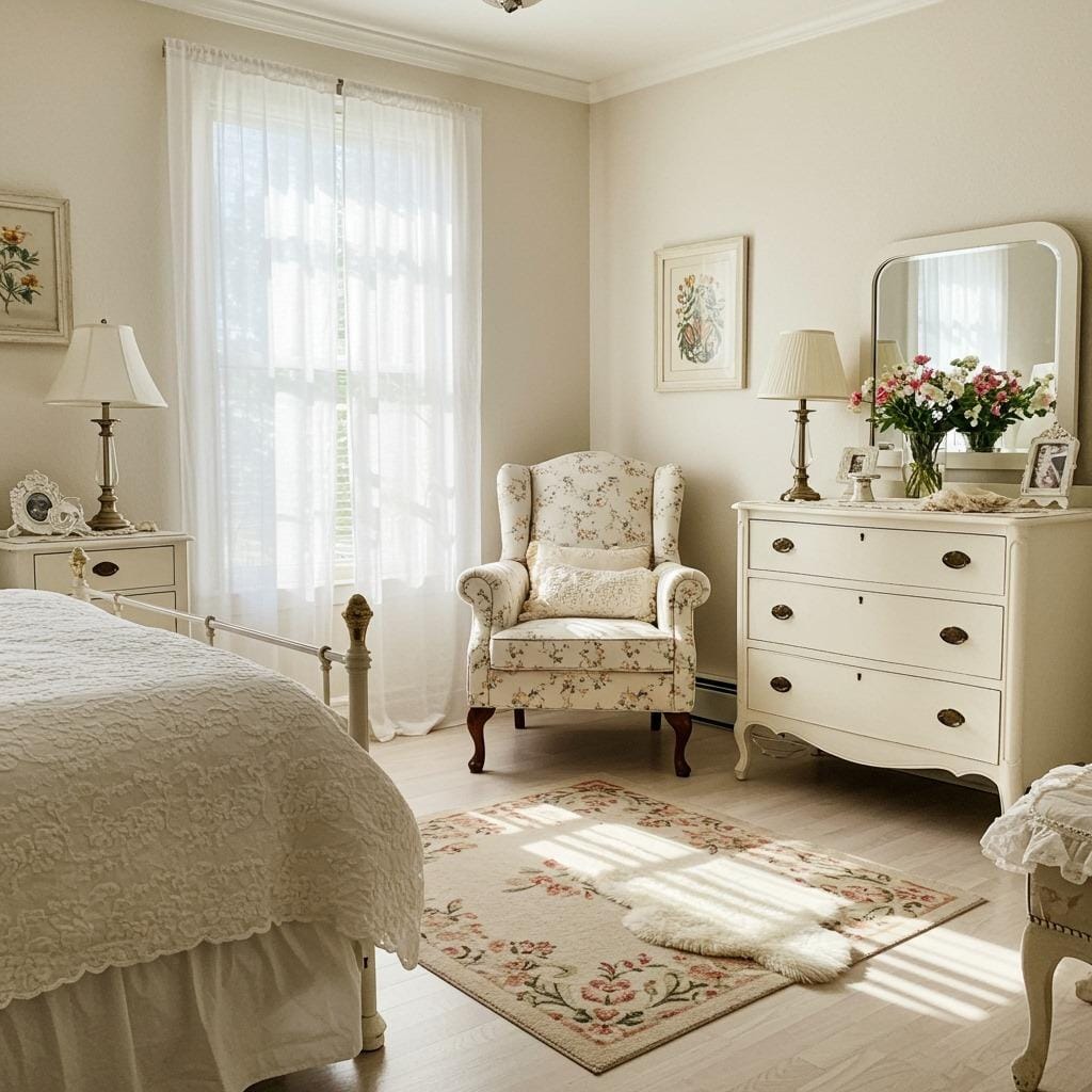
5. Cream White – Pure Tranquility
Cream white creates the ultimate in serene bedroom environments, offering the psychological benefits of white space while maintaining enough warmth to feel inviting rather than sterile. This soft neutral reflects light beautifully, making it perfect for bedrooms with limited natural light or smaller spaces that need to feel more open and airy.
The calming effects of cream white go beyond its visual impact. Light colors like cream have been shown to reduce eye strain and mental fatigue, which is particularly beneficial if you like to read in bed or use your bedroom as a multi-functional space. In bedroom color combinations, cream white serves as the perfect base for layering other calming colors through textiles and accessories.
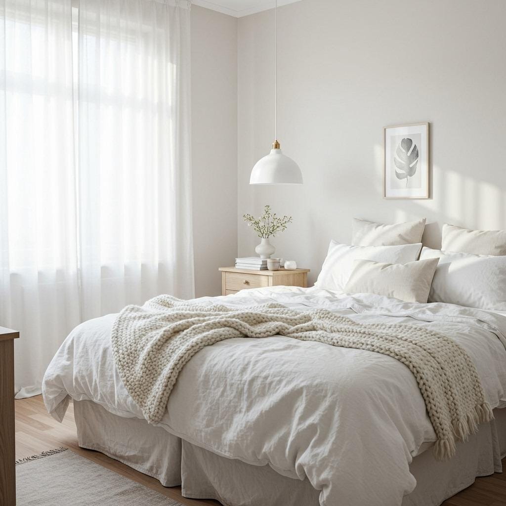
Cream white’s versatility makes it perfect for renters or those who prefer to change their decor frequently. You can completely transform the mood of a cream white bedroom simply by switching out pillows, throws, and artwork without repainting.
6. Soft Taupe – Earthy Comfort
Soft taupe brings the grounding energy of earth tones into your bedroom while maintaining the light, airy feeling essential for relaxation. This sophisticated neutral combines gray and brown undertones to create a color that feels both modern and timeless. Taupe’s natural warmth makes it particularly effective for creating a sense of security and comfort that supports deep, restorative sleep.
The psychological impact of earth tones like taupe connects us to our most basic need for shelter and safety. This primal response can be particularly beneficial for people who struggle with anxiety or feel unsettled at bedtime. Taupe works beautifully in rustic bedroom decor schemes, where natural materials and organic shapes enhance its earthy qualities.
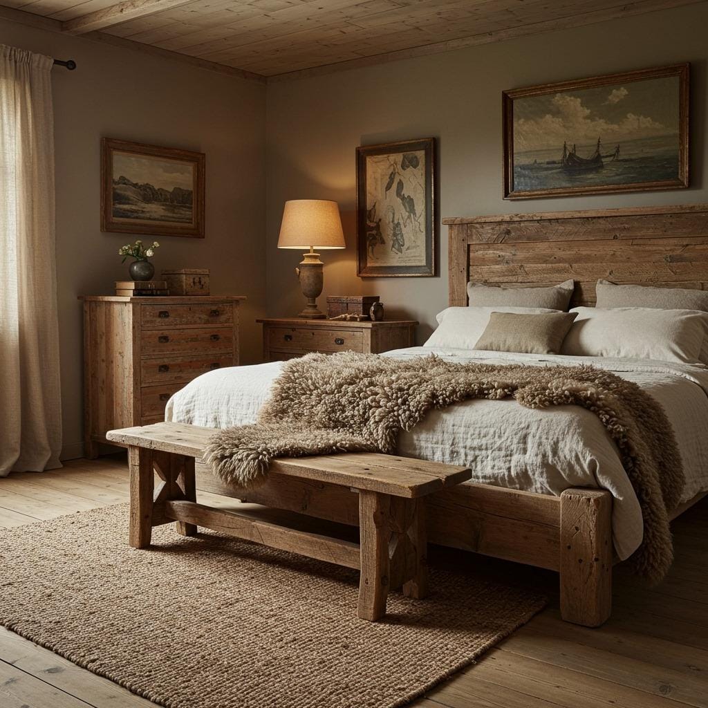
Taupe’s neutrality makes it an excellent choice for couples with different color preferences. The color feels neither distinctly masculine nor feminine, creating a space that feels equally welcoming to all occupants.
7. Pale Pink – Gentle Nurturing
Pale pink creates a sense of gentle nurturing that can be incredibly soothing for both adults and children. Unlike bright or hot pinks that can be stimulating, pale pink in its softest forms promotes feelings of love, comfort, and emotional healing. This makes it particularly beneficial for anyone recovering from illness or dealing with emotional stress.
The key to using pale pink successfully in adult bedrooms lies in balancing it with more sophisticated elements. In guest bedroom ideas, pale pink creates a welcoming atmosphere that makes visitors feel instantly at home. Pair it with rich textures like velvet or linen and metallic accents to create a look that feels mature and elegant.
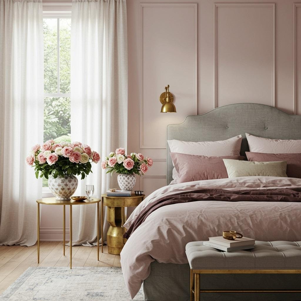
Pale pink has the unique ability to make everyone look better in bedroom lighting. The subtle warm undertones create a flattering glow that enhances skin tones, making it a favorite choice for master bedrooms.
8. Seafoam Green – Coastal Serenity
Seafoam green captures the tranquil essence of ocean waves, bringing a sense of coastal calm to any bedroom regardless of location. This blue-green hybrid combines the stress-reducing properties of blue with the renewal energy of green, creating a color that feels both refreshing and deeply peaceful. The association with water makes seafoam particularly effective for promoting the fluid, easy sleep cycles we crave.
This versatile shade works beautifully in coastal cottage bedroom designs, where natural textures and ocean-inspired accessories amplify its soothing effects. The color’s natural brightness means you can use it confidently in bedrooms with northern exposure or limited natural light without the space feeling cold or unwelcoming.
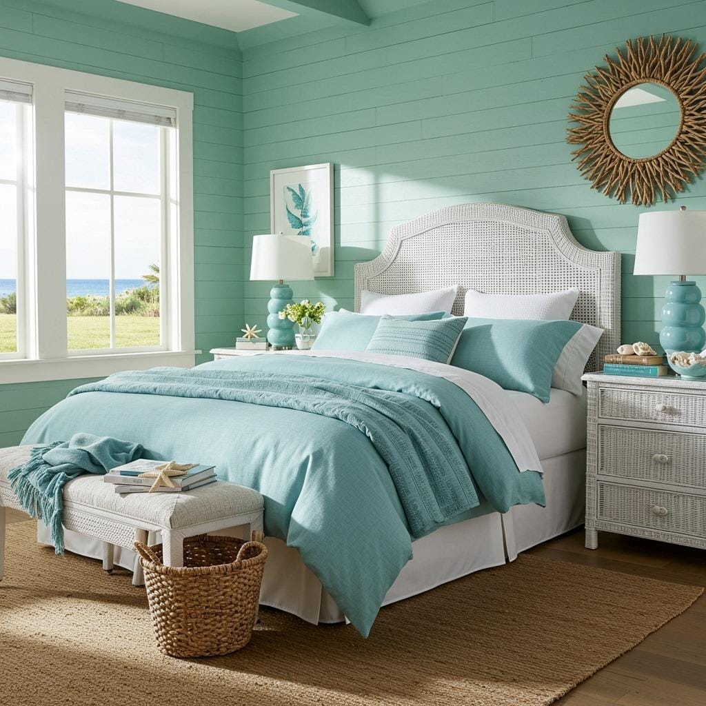
Seafoam green photographs beautifully in both natural and artificial light, making it perfect for bedrooms that serve double duty as home offices or creative spaces. The color’s association with vacation destinations can help create that “resort bedroom” feeling that makes every night feel like a mini retreat.
9. Mushroom Beige – Organic Warmth
Mushroom beige brings sophisticated earthiness to bedroom design while maintaining the light, spacious feeling essential for restful sleep. This complex neutral contains subtle gray and brown undertones that create depth and richness without overwhelming the space. The color’s connection to natural elements like mushrooms and tree bark makes it inherently calming and grounding.
The warming effects of mushroom beige make it particularly beneficial for bedrooms that receive limited natural light or face north. Unlike cooler beiges that can feel flat, mushroom beige has enough complexity to remain interesting while providing the visual quiet necessary for relaxation. It works exceptionally well in cozy minimal bedroom designs where every element is carefully chosen for both beauty and function.
Mushroom beige’s sophistication makes it perfect for creating a bedroom that feels distinctly adult and refined. The color provides an elegant backdrop for both modern and traditional furniture styles, making it a versatile choice for evolving tastes.
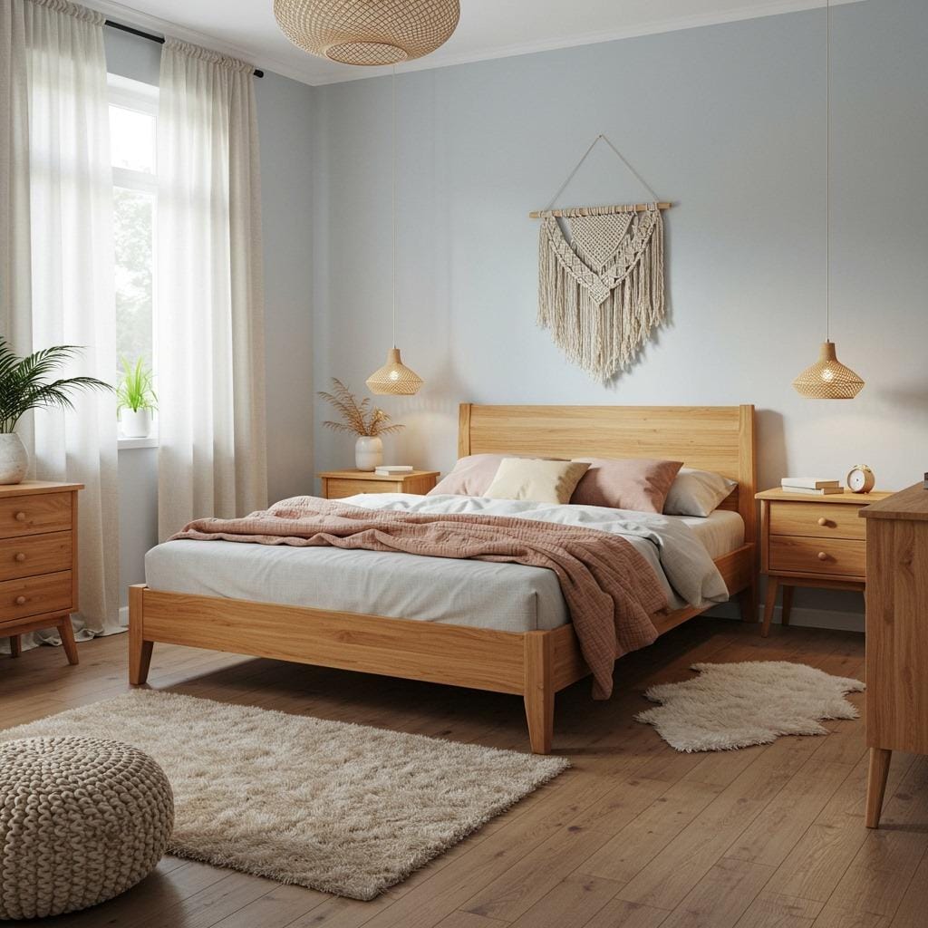
10. Powder Blue – Cloud-Like Softness
Powder blue creates the gentle, cloud-like atmosphere that many of us associate with perfect childhood sleep. This ultra-soft blue promotes feelings of safety and tranquility while maintaining enough brightness to keep the bedroom feeling fresh and airy. The color’s association with clear skies and peaceful days makes it naturally conducive to positive, restful thoughts.
Research shows that pale blues like powder blue can reduce both blood pressure and heart rate, making them particularly beneficial for people who struggle with stress-related sleep issues. In kids bedroom decor ideas, powder blue creates a gender-neutral environment that grows with children while promoting healthy sleep habits from an early age.
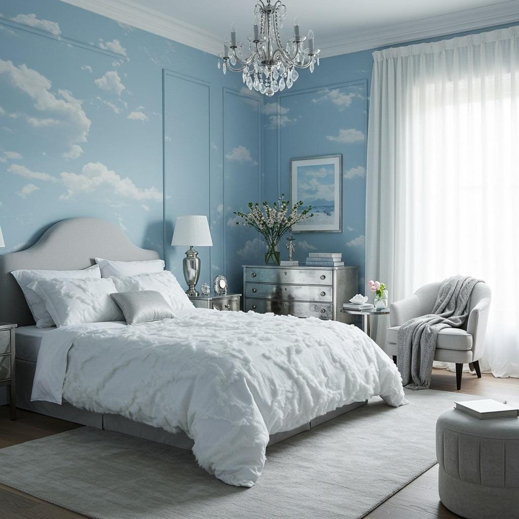
Powder blue’s timeless appeal means it won’t look dated as design trends change. The color works beautifully with both contemporary and traditional furnishing styles, making it a safe long-term choice for bedroom design.
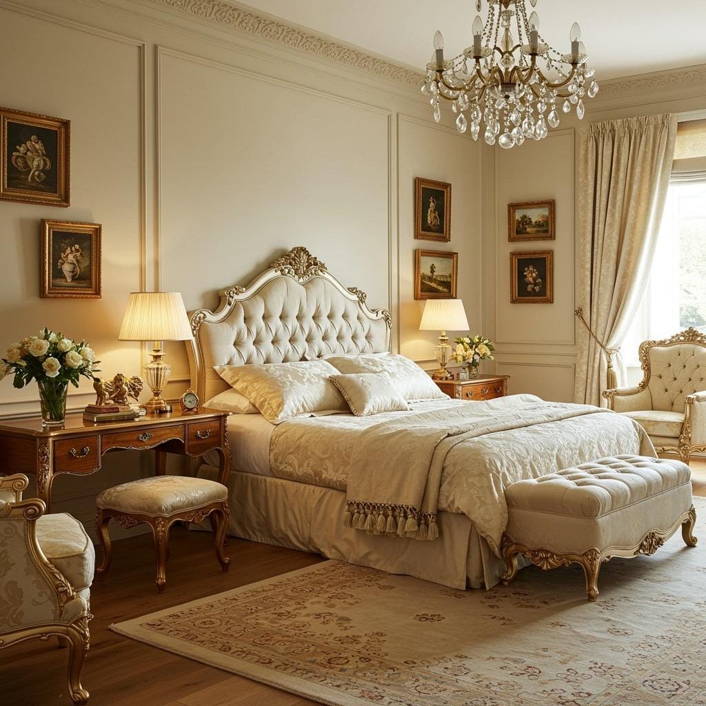
11. Ivory – Timeless Elegance
Ivory brings the sophistication of off-white with subtle warmth that prevents the sterile feeling sometimes associated with pure white bedrooms. This classic neutral creates a sense of luxury and cleanliness while maintaining enough visual softness to promote relaxation. Ivory’s timeless elegance makes it particularly appealing for master bedrooms where you want to create a hotel-like atmosphere.
The psychological effects of ivory are particularly interesting – the color promotes feelings of purity and new beginnings while remaining warm enough to feel welcoming and secure. This makes it perfect for anyone going through life transitions or seeking a fresh start. Ivory works beautifully in modern farmhouse bedroom designs where traditional charm meets contemporary comfort.
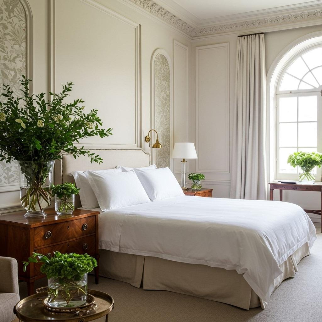
Ivory’s light-reflecting properties make it excellent for small bedrooms or spaces with limited natural light. The color can make any bedroom feel larger and more open while maintaining the cozy intimacy essential for good sleep.
12. Misty Gray – Cloudy Day Calm
Misty gray captures the peaceful atmosphere of a quiet, cloudy day, creating a bedroom environment that feels both sophisticated and deeply restful. This soft gray contains subtle blue undertones that prevent it from feeling flat or boring while maintaining the visual quiet essential for promoting sleep. The color’s association with peaceful, overcast skies naturally promotes feelings of calm and introspection.
The versatility of misty gray makes it perfect for bedrooms that need to function as multi-purpose spaces. The color provides a sophisticated backdrop that works equally well for sleeping, reading, or working from home. In bedroom reading nook corner designs, misty gray creates the perfect calm backdrop for both rest and contemplation.
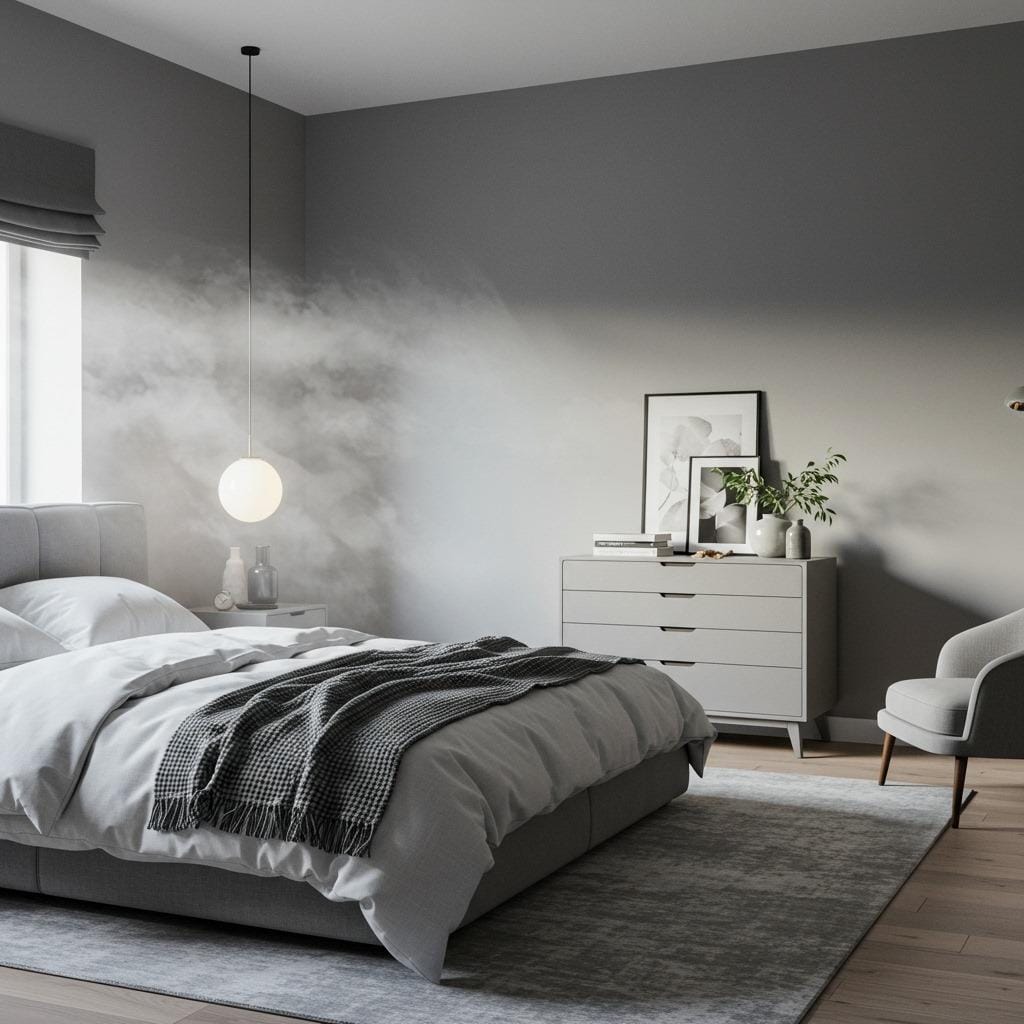
Misty gray’s neutrality makes it an excellent choice for couples with different style preferences. The color feels neither warm nor cool, masculine nor feminine, creating a space that appeals to a wide range of tastes and personalities.
13. Buttercream – Sunny Comfort
Buttercream brings gentle warmth and optimism to bedroom design without the potential sleep-disrupting effects of brighter yellows. This soft, creamy yellow promotes feelings of happiness and contentment while maintaining the subtle presence essential for restful sleep. The color’s association with comfort foods and cozy kitchens makes it inherently nurturing and welcoming.
Research shows that soft yellows like buttercream can help regulate circadian rhythms, particularly beneficial for people who struggle with seasonal affective disorder or work irregular schedules. The color works beautifully in farmhouse chic bedroom designs where vintage charm meets modern comfort needs.
Buttercream’s cheerful nature makes it particularly effective for guest bedrooms, where you want visitors to feel immediately welcome and comfortable. The color creates an instant sense of hospitality that makes any bedroom feel like a warm hug.
14. Stone Gray – Natural Strength
Stone gray brings the solid, grounding energy of natural rock formations into your bedroom design, creating a sense of stability and permanence that can be deeply comforting. This sophisticated neutral combines gray with subtle brown undertones that prevent it from feeling cold or institutional. The color’s association with enduring natural materials makes it inherently calming and trustworthy.
The psychological impact of stone-inspired colors connects us to feelings of safety and shelter, which can be particularly beneficial for anyone dealing with anxiety or uncertainty. Stone gray works exceptionally well in swedish bedroom design inspiration, where natural materials and clean lines amplify its sophisticated simplicity.
Stone gray’s sophisticated neutrality makes it perfect for creating a bedroom that feels distinctly mature and refined. The color provides an elegant backdrop that enhances rather than competes with beautiful furniture and architectural details.
15. Vanilla Cream – Sweet Serenity
Vanilla cream combines the psychological comfort of warm neutrals with subtle yellow undertones that promote feelings of happiness and contentment. This soft, nurturing color creates a sense of sweetness and comfort without being overly feminine or childlike. The color’s association with comfort and indulgence makes it naturally conducive to relaxation and self-care.
The warming effects of vanilla cream make it particularly beneficial for bedrooms that feel too cold or impersonal with cooler colors. The subtle yellow undertones can help regulate mood and energy levels, making it especially helpful for people who struggle with winter blues or low energy. Vanilla cream works beautifully with spa inspired bathroom decor ideas, creating a cohesive sense of luxury and self-care throughout your private spaces.
Vanilla cream’s versatility makes it an excellent choice for bedrooms that need to photograph well for social media or real estate purposes. The color is universally flattering and creates a sense of luxury that appeals to a wide range of viewers.
16. Dove Gray – Gentle Sophistication
Dove gray brings refined elegance to bedroom design while maintaining the soft, gentle quality essential for promoting restful sleep. This sophisticated neutral contains subtle purple undertones that prevent it from feeling flat or boring while remaining visually quiet enough not to stimulate the mind before sleep. The color’s association with peaceful doves naturally promotes feelings of calm and serenity.
The versatility of dove gray makes it perfect for creating a bedroom that feels both contemporary and timeless. The color works equally well with bold accent colors or soft, monochromatic schemes, giving you complete flexibility in your decorating choices. In scottish bedroom style ideas, dove gray provides the perfect sophisticated backdrop for traditional tartans and rich textures.
Dove gray’s sophisticated simplicity makes it an excellent choice for small bedrooms where you want to create a sense of spaciousness without sacrificing warmth or personality. The color reflects light beautifully while maintaining enough depth to feel interesting and layered.
17. Chamois – Desert Calm
Chamois brings the peaceful, sun-warmed feeling of desert landscapes into your bedroom design, creating a sense of warmth and tranquility that’s both exotic and deeply comforting. This soft, sandy neutral combines beige with subtle pink undertones that create warmth without feeling overly feminine or bold. The color’s connection to natural leather and desert sands makes it inherently organic and grounding.
The warming properties of chamois make it particularly effective for bedrooms that need to feel cozy and inviting despite large windows or high ceilings. The color’s subtle complexity means it remains interesting even in monochromatic schemes, while its neutrality makes it perfect for layering with other calming colors. Chamois works beautifully in desert-inspired or southwestern bedroom designs where natural textures and warm metals enhance its sophisticated earthiness.
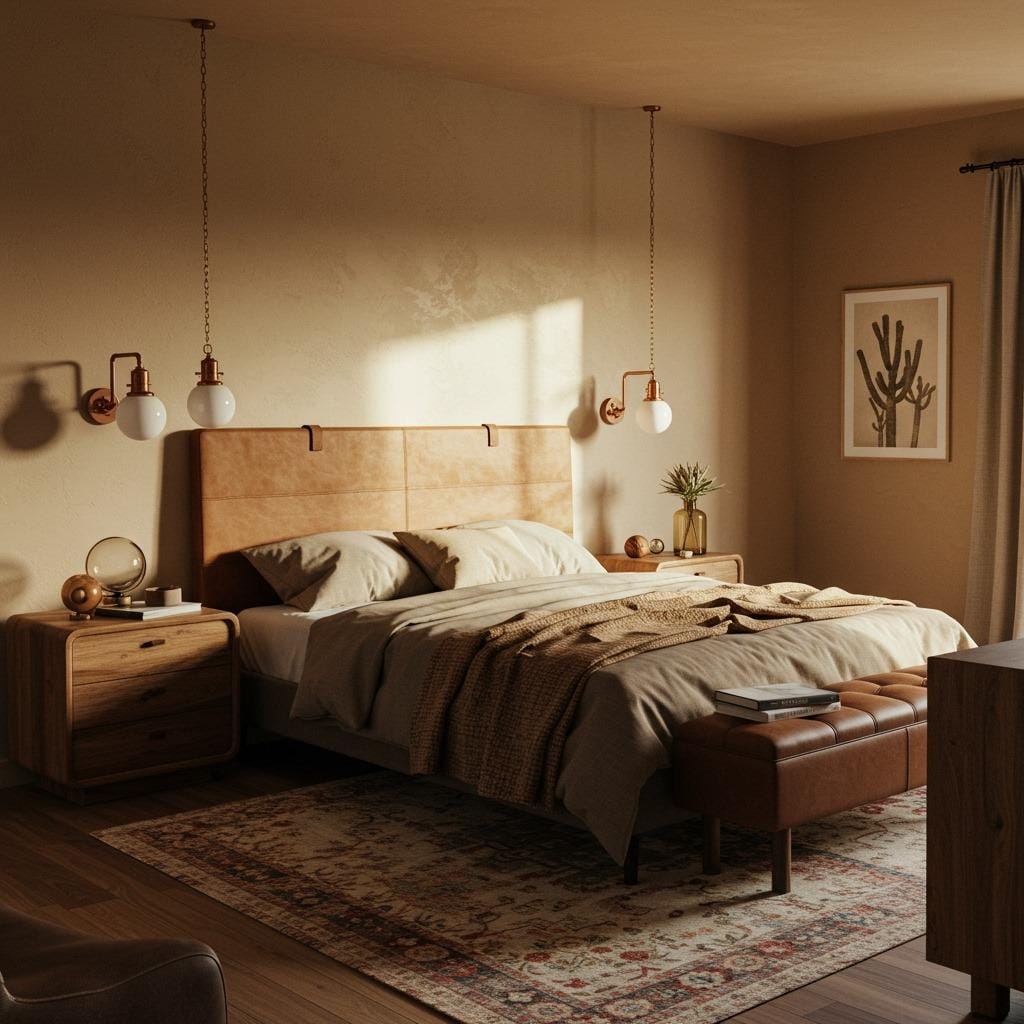
Chamois’ unique warmth makes it an excellent choice for anyone who finds typical cool grays or whites too cold for comfortable sleep. The color provides all the sophistication of designer neutrals while maintaining the comfort factor essential for truly restful bedrooms.
Creating Your Perfect Calming Color Scheme
Selecting the right calming bedroom color from our list is just the beginning – creating a cohesive color scheme that maximizes relaxation requires thoughtful planning and consideration of your space’s unique characteristics. Start by examining your bedroom’s natural light throughout the day, as this will significantly impact how any color appears and feels in your space.
Consider your bedroom’s size and architectural features when making your final decision. Lighter colors like cream white and ivory can make small bedrooms feel more spacious, while deeper neutrals like stone gray and mushroom beige can add sophistication to larger rooms without making them feel cavernous. The key is choosing colors that enhance your room’s best features while minimizing any challenging aspects.
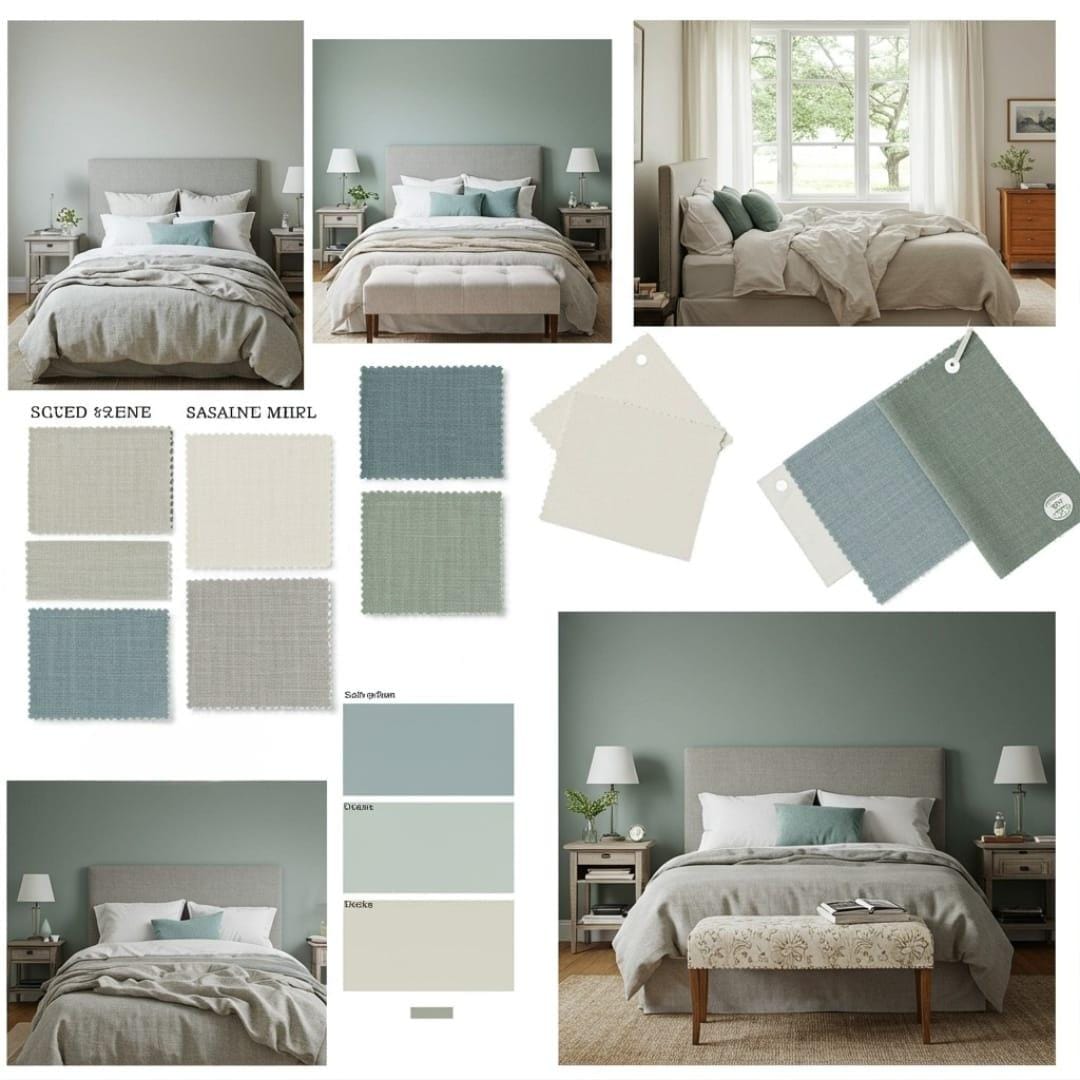
Don’t forget about the 60-30-10 rule when planning your peaceful color palette. Use your chosen calming color for 60% of the room (usually walls), a complementary neutral for 30% (bedding, curtains, larger furniture), and save the remaining 10% for accent colors in pillows, artwork, or decorative accessories. This approach ensures your calming bedroom colors remain the star while creating enough visual interest to keep the space engaging.
Tips for Choosing Your Perfect Shade
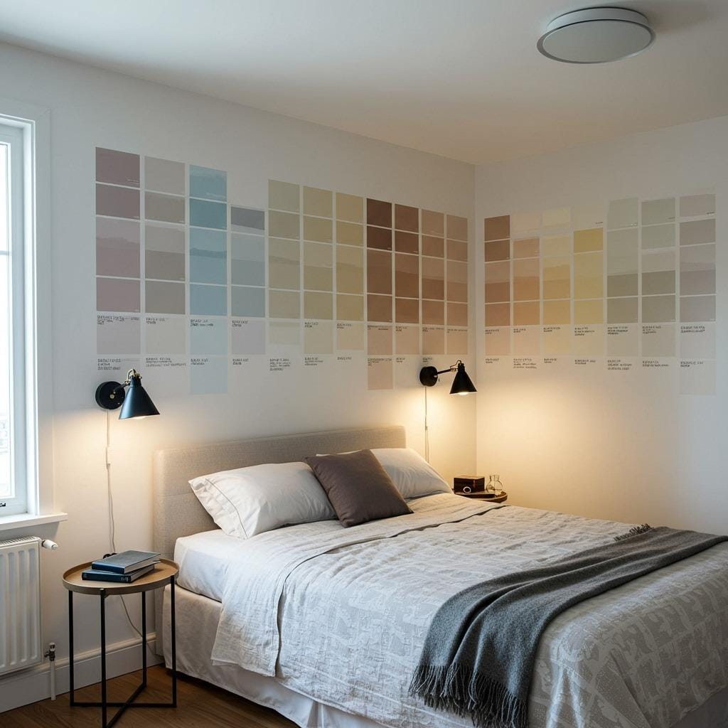
Testing paint colors in your actual bedroom is crucial for making the right choice. Paint large swatches (at least 2×2 feet) on different walls and observe them at various times of day and under different lighting conditions. Colors that look perfect in the morning might feel completely different in evening lamplight, so give yourself at least a few days to live with your test colors before committing.
Consider your bedroom’s function beyond just sleeping when selecting your calming bedroom color. If you read, work, or exercise in your bedroom, you’ll want to ensure your chosen color supports these activities without compromising its primary role in promoting rest. Some colors, like sage green and dusty blue, maintain their calming properties while providing enough brightness for other activities.
Your personal color associations matter more than general color psychology. If a particular shade triggers negative memories or simply doesn’t feel right to you, trust those instincts. The most scientifically perfect calming color won’t be effective if it doesn’t resonate with your personal preferences and experiences.
Complementary Elements for Maximum Calm
Once you’ve chosen your perfect calming bedroom color, selecting complementary elements becomes essential for creating a truly tranquil space. Natural materials like wood, stone, and organic cotton enhance the peaceful properties of any calming color by connecting your bedroom to nature’s inherent tranquility. These materials also add texture and visual interest without introducing stimulating patterns or bold contrasts.
Lighting plays a crucial role in maximizing the calming effects of your chosen color. Warm LED bulbs (2700K-3000K) work harmoniously with most calming bedroom colors, while harsh cool lighting can undermine even the most perfectly chosen peaceful paint. Consider installing dimmer switches to adjust lighting levels throughout the evening, supporting your body’s natural wind-down process.
The integration of plants can amplify the stress-reducing benefits of calming bedroom colors, particularly greens and earth tones. Low-maintenance options like snake plants or pothos thrive in bedroom conditions while improving air quality and adding organic shapes that soften the room’s geometry. Just be sure to choose plants that release oxygen at night rather than carbon dioxide to support your sleep quality.
Creating your perfect calming bedroom color scheme is one of the most impactful changes you can make for better sleep and reduced stress. Whether you choose the nature-inspired tranquility of sage green, the sophisticated calm of stone gray, or the gentle warmth of vanilla cream, remember that the best color is one that makes you feel instantly relaxed the moment you enter your bedroom. Take time to test your options, trust your instincts, and prepare to transform your bedroom into the peaceful sanctuary you deserve.
Sanjai creates easy, affordable home decor ideas that anyone can try. Through simple tips and curated finds, he helps you style rooms you’ll love coming home to.