There’s something inherently peaceful about earthy tones. They ground us, wrap us in comfort, and create that elusive feeling of being home. When you walk into a bedroom painted in muted shades of clay, sage, or warm sand, your shoulders drop a little. The day’s tension seems to dissolve.
I’ve always believed the bedroom should be a sanctuary, not just a place to sleep. And choosing the right color palette? That’s where the magic really begins. Earthy and muted bedroom color palettes offer something special – they’re never too loud, never too stark, just endlessly soothing. They work with natural light instead of fighting it, and they make everything from your morning coffee to your evening wind-down feel more intentional.
Whether you’re starting fresh with a complete bedroom makeover or simply want to shift the mood with new bedroom color combinations, these palettes will help you create a space that genuinely feels like a retreat. Let’s explore how to bring these calming hues into your own bedroom.
Why Earthy and Muted Tones Work So Well in Bedrooms
There’s actual science behind why these colors feel so restful. Earthy tones mimic the natural world – think forest floors, desert landscapes, misty mornings. Our brains are hardwired to find these colors calming because they’re literally what we evolved seeing every day. Unlike bright blues or energizing yellows, muted earth tones don’t stimulate; they settle.
Neutral bedroom colors also have this incredible flexibility. They’re never trendy in that fleeting way, so you won’t look at your walls in two years and cringe. Instead, they create this beautiful, timeless backdrop that lets you swap out textiles, art, or accessories whenever the mood strikes. I love that freedom.
What really makes these palettes shine is how they handle light. Soft tones absorb and reflect daylight in the gentlest way, creating depth and warmth without harsh shadows. Even north-facing bedrooms (which can feel cold) become cozy when dressed in warm taupes or clay shades. If you’re curious about other ways to make bedrooms feel peaceful, check out these calming bedroom colors that work similarly.
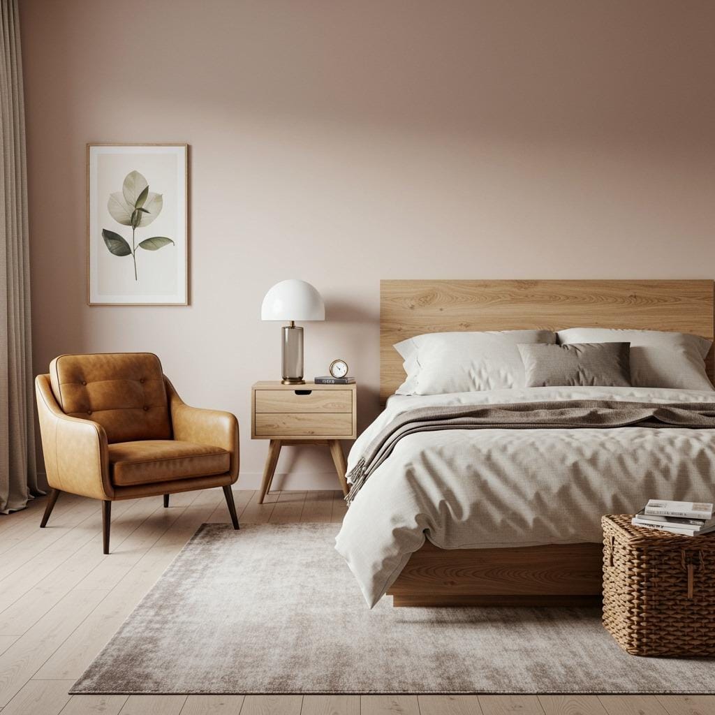
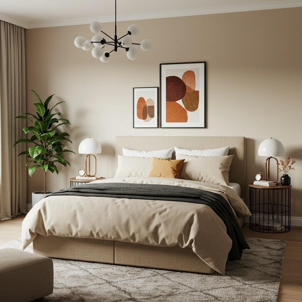
1. Warm Sand and Clay Palette
This combination feels like a desert sunrise. Warm sand tones on the walls create an instant sense of warmth, while clay accents add just enough richness to prevent the space from feeling flat. It’s earthy without being dark, cozy without being heavy.
I particularly love using sandy beige as the primary wall color. It’s one of those chameleon shades that shifts throughout the day – peachy in morning light, golden in the afternoon, soft and glowing at night. Pair it with terracotta or burnt sienna in your bedding, curtains, or a statement chair, and you’ve got instant warmth.
The beauty of this palette is its versatility with materials. Natural linen, woven baskets, ceramic pottery – everything feels at home here. Add some dried pampas grass or eucalyptus, and the whole room breathes. This approach mirrors the warmth you’ll find in earthy bedroom ideas that embrace natural materials.
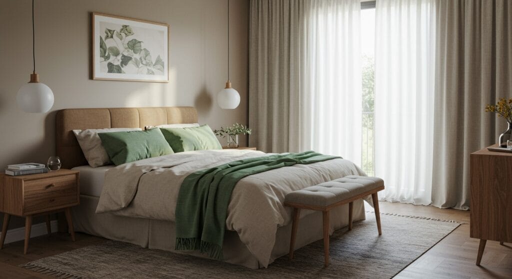
2. Soft Sage and Cream Palette
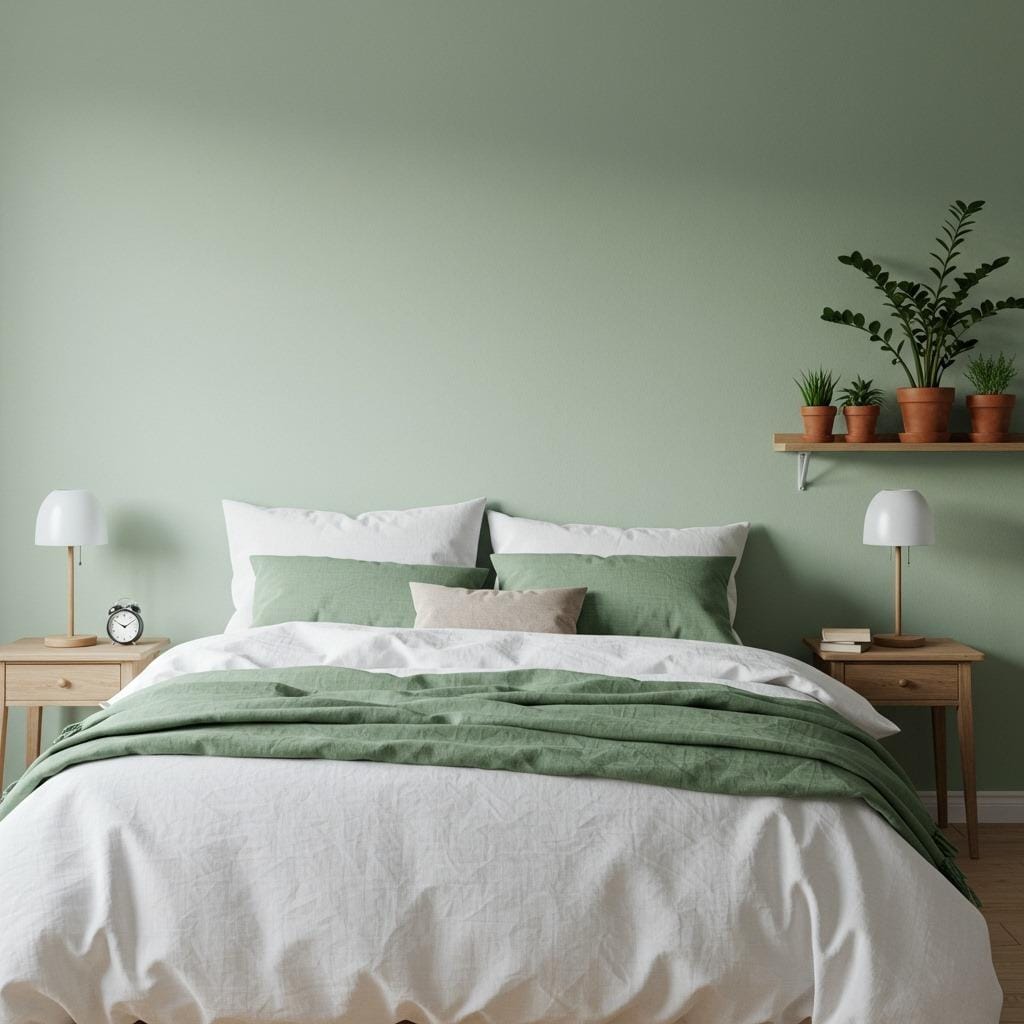
If you want something that feels fresh but still grounded, sage and cream is your answer. Sage green has this incredible ability to feel both cool and warm at the same time – it’s the perfect neutral that isn’t beige. When you pair it with creamy whites and natural wood, you get something that feels organic and alive.
I’ve seen this palette work beautifully in smaller bedrooms where deeper colors might feel too enclosing. The soft sage provides color and personality without overwhelming, while cream keeps things light and airy. It’s subtly botanical without being overly themed.
Consider using sage as an accent wall behind your bed, then carrying that tone through in smaller doses – throw pillows, a quilt, maybe even painted furniture. The cream acts as your breathing room, giving the eye places to rest. Plants become natural extensions of this palette rather than add-ons. For more plant-friendly bedroom inspiration, explore nature inspired bedroom designs.
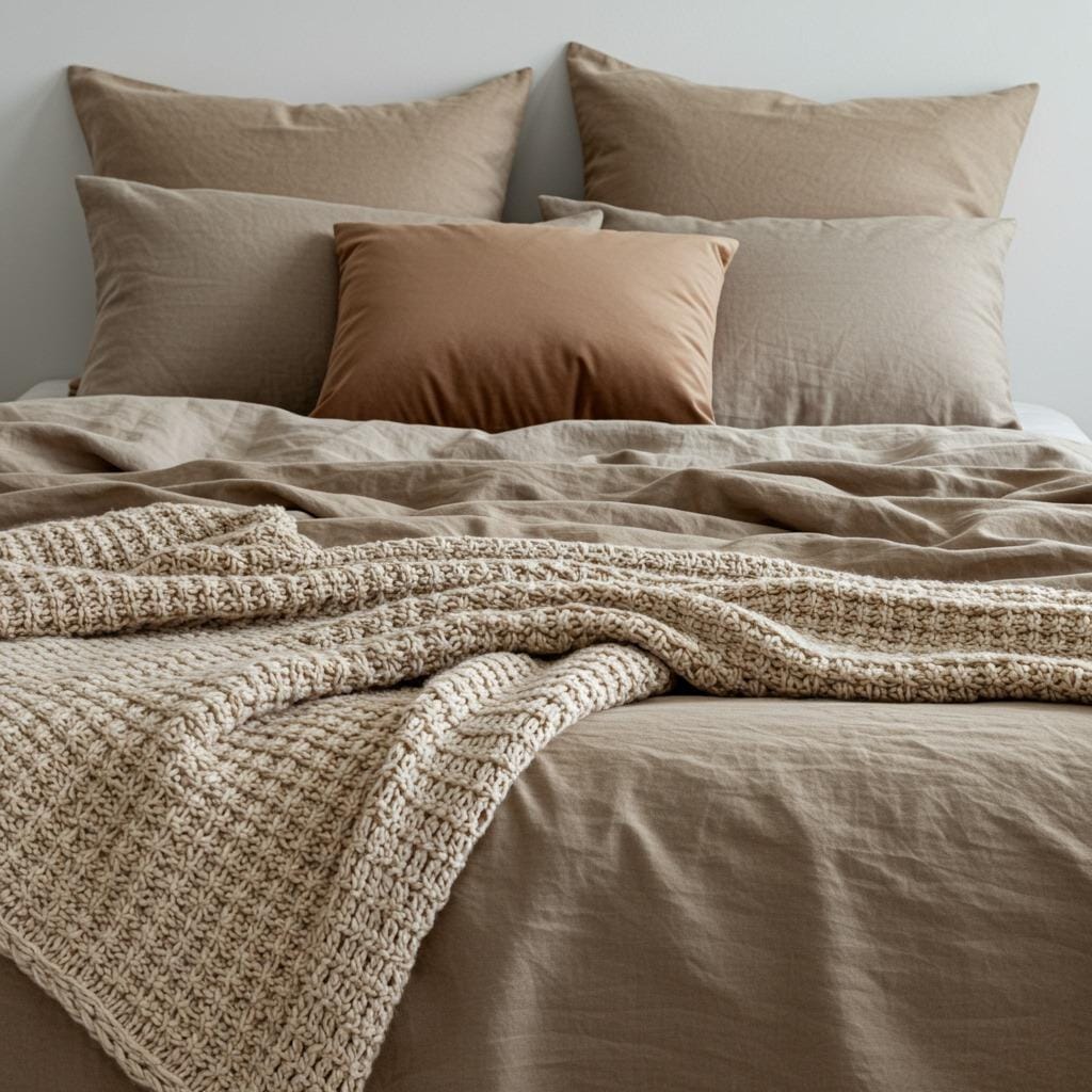
3. Taupe and Mushroom Palette
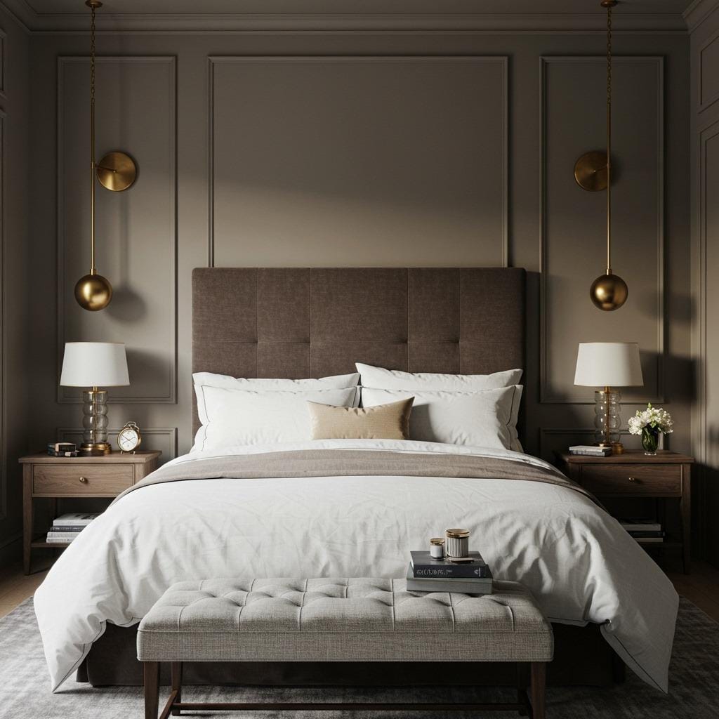
This is the palette for anyone who wants sophistication without pretension. Taupe and mushroom tones are incredibly elegant yet utterly approachable. There’s a subtle complexity to these colors – they’re not quite gray, not quite brown, but this perfect in-between that feels mature and calming.
The secret to making this palette sing is layering different textures. Since the colors themselves are subdued, you want variety in how things feel. Think velvet cushions, linen sheets, a chunky wool throw, smooth ceramic lamps. Each texture catches light differently, creating visual interest without relying on bold color.
What I appreciate most about taupe-based palettes is their ability to anchor a room. They provide structure and calm simultaneously, which is exactly what a bedroom needs. These tones also pair beautifully with both warm metals (brass, copper) and cooler ones (brushed nickel), giving you flexibility as your style evolves. This refined approach shares similarities with modern minimalist bedroom decor.
4. Dusty Rose and Greige Palette
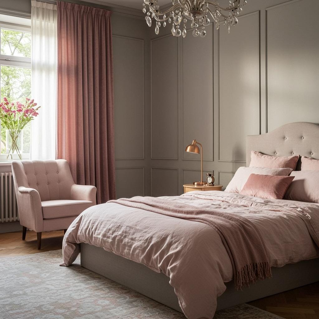
Who says earthy palettes can’t have a romantic side? Dusty rose brings just enough warmth and personality to keep things interesting, while greige (that perfect gray-beige hybrid) grounds everything beautifully. Together, they create something that’s both cozy and surprisingly sophisticated.
The dusty rose shouldn’t be bubble-gum pink – we’re talking about that muted, almost terracotta-pink that looks like it’s been softened by time and sunlight. Use it sparingly if you’re nervous about pink in general. A single accent wall, your bedding, or even just in artwork can be enough to shift the entire mood.
Greige walls are incredibly forgiving. They work with both cool and warm lighting, they hide imperfections, and they never compete with your furniture or decor. This makes them ideal for renters or anyone who wants a refined base to build upon. The combination feels decidedly grown-up without being stuffy. Similar soft sophistication can be found in cozy minimal bedroom designs.
5. Warm Gray and Olive Palette
This pairing has gained serious momentum lately, and for good reason. Warm gray provides that clean, contemporary feel people crave, while olive green adds an earthy richness that prevents the space from feeling cold or sterile. It’s modern but still deeply comfortable.
The trick with gray is ensuring it’s actually warm. Cool grays can make bedrooms feel uninviting, so look for grays with brown or beige undertones. Test your paint samples at different times of day – if it looks bluish or stark white in afternoon light, it’s probably too cool. You want something that feels soft and enveloping.
Olive brings depth without darkness. It’s sophisticated, gender-neutral, and endlessly versatile. Use it in your headboard, curtains, or a cozy reading chair. The contrast between the warm gray walls and olive accents creates visual interest while maintaining that calm, grounded feeling every bedroom should have. This modern earthiness aligns with organic modern living room aesthetics.
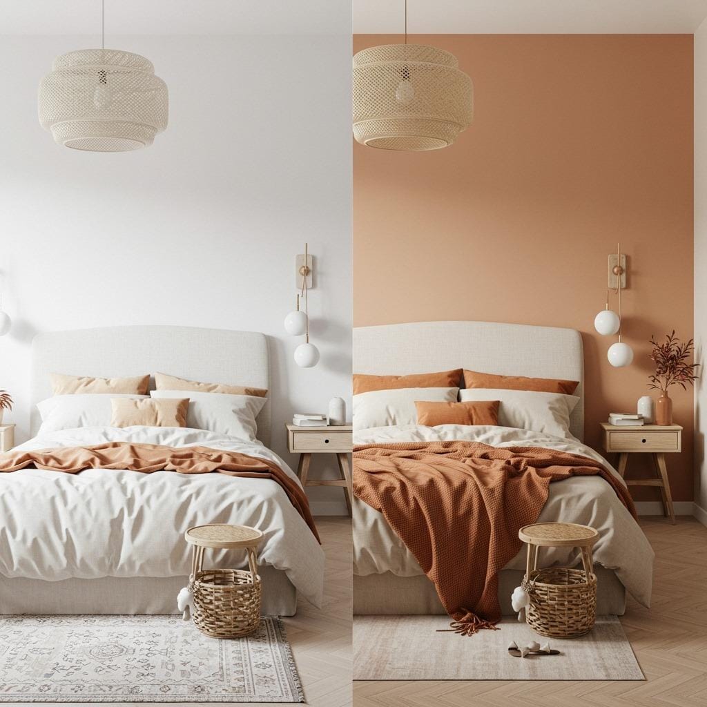
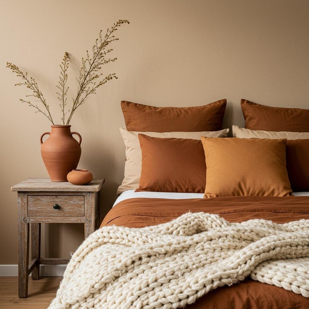
6. Oatmeal and Rust Palette
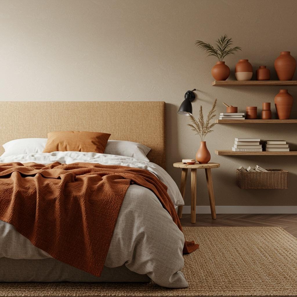
If warmth is your priority, this palette delivers in spades. Oatmeal is like a warmer, creamier version of beige – it has depth and richness without being dark. When you add rust orange as an accent, you get this beautiful, sunset-inspired combination that feels both energizing and restful.
Rust works particularly well in bedrooms with good natural light. It absorbs and reflects golden tones beautifully, making your space feel sun-soaked even on cloudy days. Use it boldly in a statement piece like an upholstered headboard, or sprinkle it throughout in smaller doses – pillows, artwork, a vintage rug.
The oatmeal backdrop lets the rust really shine while keeping the overall feeling grounded and serene. This palette pairs wonderfully with natural materials like wood, rattan, and stone. Everything feels connected to nature, which is exactly the vibe we’re after. For similar warm, inviting spaces, consider rustic bedroom decor elements.
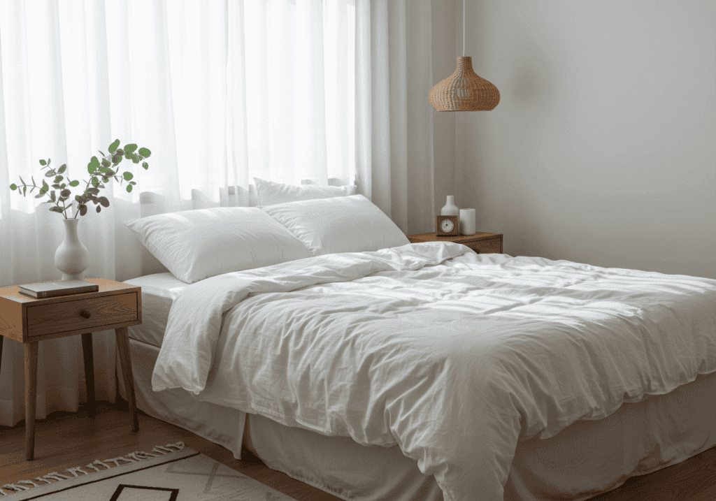
7. Soft White and Natural Linen Palette
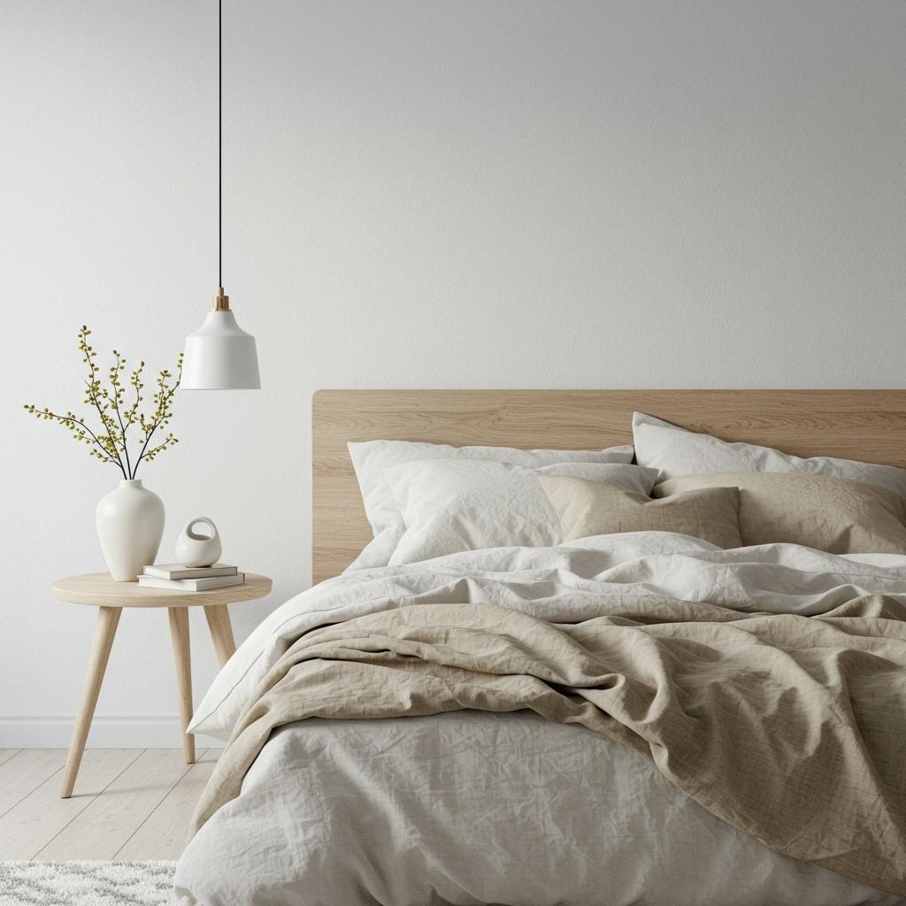
Sometimes the most impactful choice is restraint. A soft white and natural linen palette creates a sense of clean, breathable calm that’s hard to achieve with darker colors. It’s minimal without being cold, simple without being boring.
Soft white differs from stark white in that it has subtle warm undertones. It doesn’t glare or feel clinical. Instead, it creates this beautiful, almost cloud-like backdrop that makes everything else in the room feel more intentional. Your furniture, your art, even your books become focal points.
Natural linen brings texture and subtle variation that prevents the room from feeling too pristine or untouchable. Layer different shades – ivory, sand, pale gray-beige – in your bedding and curtains. The slight variations create depth while maintaining that cohesive, peaceful feeling. This stripped-back approach reflects Scandinavian bedroom color palettes beautifully.
8. Warm Beige and Charcoal Palette
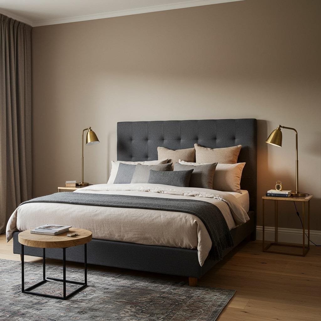
For those who want earthiness with a bit more contrast and drama, warm beige paired with charcoal creates sophisticated balance. The beige provides that grounding warmth we love, while charcoal adds definition and prevents the space from feeling too soft or undefined.
Use warm beige as your wall color and bring charcoal in through furniture pieces or textiles. A charcoal-upholstered bed frame, dark gray curtains, or a charcoal throw blanket can ground the space beautifully. The contrast creates visual interest without relying on bright colors.
What makes this palette work so well is that both colors are inherently calming. Charcoal isn’t harsh like true black, and when paired with warm beige, it feels elegant rather than heavy. Add brass or gold accents to warm things up even more, and you’ve got a bedroom that feels both contemporary and timeless. This balance of light and dark echoes principles found in bedroom lighting ideas.
9. Blush Beige and Soft Brown Palette
Blush beige is having a moment, and honestly, I understand why. It’s that perfect barely-there pink that reads more neutral than colorful, bringing warmth and softness without feeling overtly feminine. When paired with soft brown tones, it creates something that’s cozy, inviting, and surprisingly versatile.
The soft brown can come through in wood furniture, leather accents, or textiles. Think about incorporating a brown leather bench at the foot of your bed, or chocolate-toned woven baskets for storage. These deeper tones anchor the lighter blush beige, creating a balanced, grounded feel.
This palette works particularly well in bedrooms that get evening light. As the sun sets, the blush undertones catch that golden glow beautifully, making your bedroom feel like a permanent golden hour. It’s romantic without being over-the-top, warm without being dark. If you’re drawn to gentle, lived-in spaces, you’ll love cottage core bedroom vibes too.
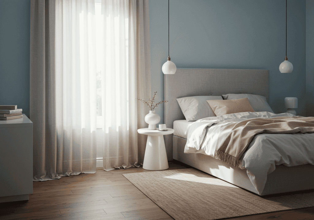
10. Misty Blue-Gray and Warm White Palette
This palette sits right at the edge of what we’d call “earthy,” but its calming properties are undeniable. Misty blue-gray has enough warmth to feel grounded while still providing that peaceful, airy quality that cooler tones bring. Paired with warm white, it creates a space that feels both restful and refreshing.
The key is choosing a blue-gray that leans more gray than blue. You want something that feels like morning fog, not a clear sky. Test it in your space – it should feel soft and enveloping, never cold or stark. If it looks too blue in your lighting, it might make the room feel chilly rather than calm.
Warm white bedding and accents keep everything balanced and prevent the cooler wall color from dominating. This palette is perfect for anyone who loves the idea of neutral bedroom colors but wants something just slightly different from beige. It’s unexpected while still being deeply peaceful. For more subtle paint ideas, check out approaches in bedroom storage ideas that complement various palettes.
How to Choose the Right Palette for Your Space
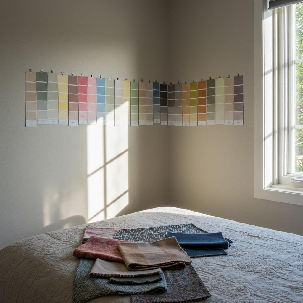
Here’s what I wish someone had told me before my first bedroom makeover: your room’s natural light is everything. A palette that looks stunning in a sun-filled west-facing room might feel completely different in a north-facing space with limited light. Before committing to anything, live with paint samples for at least a few days.
Consider what feeling you’re chasing. Do you want energized-but-calm (warmer tones like clay and rust)? Or deeply peaceful and still (cooler earth tones like sage and taupe)? Your answer will guide you toward the right end of the earthy spectrum. There’s no wrong choice, just different moods.
Also, think about your existing furniture and what you realistically want to change. If you’re keeping dark wood furniture, leaning into warmer beige and cream tones will create beautiful contrast. If you have lighter, more Scandinavian-style pieces, you can go darker with your walls without the room feeling heavy. Work with what you have before buying everything new.
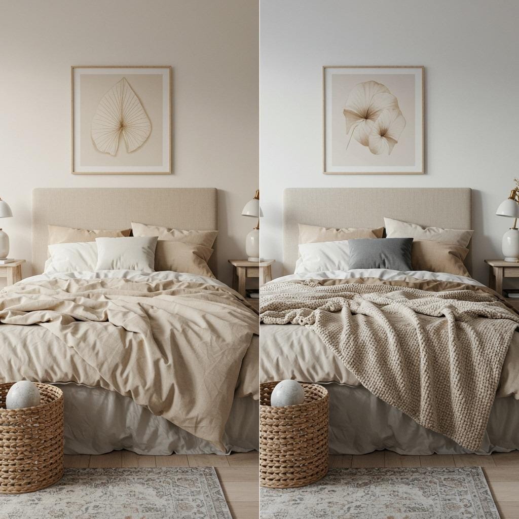
Layering Your Palette With Textures and Materials
Color is only half the story. With muted palettes especially, texture becomes your secret weapon for creating visual interest and depth. When everything is roughly the same tone, you need variety in how things feel and catch light. This is where your space goes from “nice” to “I never want to leave.”
Mix smooth and rough, soft and structured. Pair your soft linen bedding with a chunky knit throw. Add a velvet pillow next to a nubby cotton one. Place a smooth ceramic lamp on a textured wood nightstand. Each material interacts with light differently, creating subtle shadows and highlights that make the room feel dynamic rather than flat.
Natural materials work particularly well with earthy palettes because they reinforce that grounded, organic feeling. Wood, stone, rattan, jute, cotton, linen, wool – these materials were literally made to work together. According to interior design experts at Architectural Digest, layering natural textures is key to creating warmth in neutral spaces. Don’t overthink it; if it comes from nature, it probably belongs in your earthy bedroom.
Accent Colors That Complement Earthy Palettes
Even the most dedicated neutral lover usually wants a bit of contrast or personality somewhere. The good news? Earthy palettes play beautifully with strategic pops of color. The trick is choosing accent colors that feel natural and grounded rather than jarring.
Deep forest green works incredibly well – it’s still earthy but adds richness and life. Burnt orange or terracotta bring warmth and energy without being overwhelming. Even muted navy or charcoal can add sophistication and depth. The key is keeping these accents intentional and limited. One statement chair, a piece of artwork, a few carefully chosen pillows.
Metallics also count as accents, and they’re powerful ones. Warm metals like brass, copper, and antique gold complement earthy tones beautifully, adding just enough shine without feeling flashy. Matte black fixtures provide clean contrast if you prefer a more modern look. Both approaches work; it just depends on whether you lean traditional or contemporary.
Lighting Considerations for Muted Bedrooms
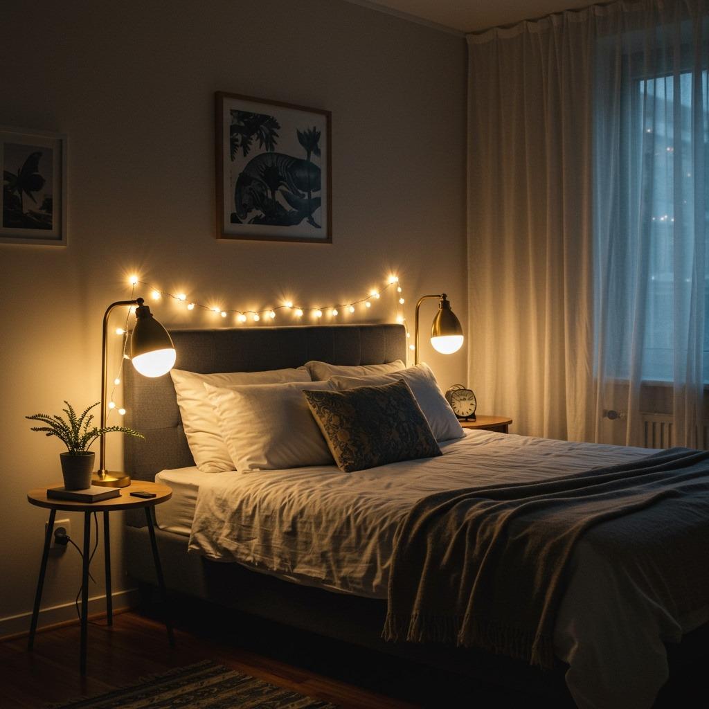
Lighting can make or break a muted color scheme. Since these palettes rely on subtlety and nuance, harsh overhead lighting will flatten everything and wash out those beautiful undertones you carefully selected. Instead, think about creating layers of warm, diffused light throughout the room.
Start with good ambient lighting – maybe a pendant with a fabric shade or recessed lights on dimmers. Then add task lighting where you need it: reading lamps beside the bed, a small desk lamp if you work in your bedroom. Finally, incorporate mood lighting – string lights, candles, or even LED strips behind floating shelves.
Warm light bulbs (2700K-3000K) are essential. Cool white bulbs will make your warm earth tones look muddy and uninviting. That warm golden glow enhances all those beautiful beige, taupe, and clay tones, making your room feel cozy and welcoming no matter the time of day. Proper lighting truly transforms these subtle paint ideas.
Seasonal Styling With Earthy Palettes
One of the best things about earthy and muted bedroom color palettes is how easily they transition through seasons. Your wall color stays the same, but by swapping textiles and accessories, you can shift the mood dramatically. It’s decorating flexibility at its finest.
For warmer months, lighten everything up. Swap heavy velvet pillows for lighter cotton or linen. Remove extra throw blankets. Bring in more plants and fresh greenery. The same warm beige walls that felt cozy in winter will suddenly feel airy and breezy when you strip away the layers.
As temperatures drop, add back that weight and warmth. Introduce wool throws, heavier curtains, maybe a faux fur rug at the foot of the bed. Deep burgundy or forest green accents feel especially appropriate in fall and winter. Your earthy palette provides the perfect neutral backdrop for these seasonal shifts.
Your bedroom should feel like the one place in your home where everything just exhales. Where the visual noise stops and something quieter takes over. Earthy and muted bedroom color palettes offer exactly that – they create spaces that don’t demand attention but instead invite rest, reflection, and genuine comfort.
Whether you’re drawn to the warmth of clay and rust or the softness of sage and cream, there’s an earthy palette that will transform your bedroom into the sanctuary it deserves to be. The beauty of these colors is they work with you, not against you. They age gracefully, adapt to your changing style, and create a backdrop that makes every other design decision easier.
So grab those paint samples, live with them for a few days, and trust your instincts. Sometimes the most peaceful spaces come from the simplest choices – a few soft tones, natural materials, and the courage to embrace calm over chaos.
Sanjai creates easy, affordable home decor ideas that anyone can try. Through simple tips and curated finds, he helps you style rooms you’ll love coming home to.