You know that feeling when you’ve moved your sofa for the third time and it still doesn’t look right? I’ve been there, staring at my living room like it’s a puzzle with pieces that don’t quite fit. The truth is, arranging furniture isn’t about luck or having a designer’s eye – it’s about understanding a few basic formulas that have worked for decades.
Whether you’re dealing with an awkward corner window, a narrow rectangle, or an open concept space that bleeds into your kitchen, there’s a proven layout waiting to solve your problem. Some rooms practically arrange themselves, while others need a bit more creativity. The layouts I’m sharing here aren’t trendy solutions that’ll look dated next year – they’re timeless arrangements that work because they respect how people actually use their living spaces.
I’ve pulled together nine reliable formulas that handle everything from intimate conversation areas to TV-centered setups. You’ll see exactly where each piece goes and why it works, so you can stop second-guessing every furniture move.
Why Living Room Layout Actually Matters More Than You Think

A poorly arranged living room doesn’t just look off – it changes how you use the space entirely. I’ve noticed that when the furniture placement feels wrong, people tend to avoid the room altogether. They’ll stand in the kitchen during parties or scroll their phones instead of settling in to watch a movie. The layout silently dictates whether your living room becomes the heart of your home or just a pass-through zone.
Traffic flow is one of those things you don’t think about until it’s broken. When you have to sidestep the coffee table every time you walk through, or when guests awkwardly squeeze past the sofa to reach a seat, the room stops feeling comfortable. Good layouts create natural pathways that let people move freely without thinking about it. It’s the difference between a space that welcomes you in and one that puts up invisible barriers.
The right arrangement also maximizes your room’s potential without requiring a single purchase. You might be surprised how much bigger a small living room can feel just by angling your furniture differently or floating your sofa away from the wall. Sometimes the pieces you already own just need to be repositioned to completely transform how the room functions.
The Classic Conversation Layout: When Talking Matters Most
This is probably the oldest trick in the decorating playbook, but it works because it prioritizes human connection. You arrange seating in a U-shape or around a central coffee table, making sure no one is more than eight to ten feet away from anyone else. That distance matters – it’s close enough for comfortable conversation without feeling crowded.
I like placing a sofa on the longest wall, then adding two chairs facing it at slight angles. The coffee table sits in the middle, anchoring everything together. This setup naturally draws people toward each other rather than facing outward toward the walls. If you’ve got a fireplace, position the seating to include it as a focal point, but don’t let it dominate so much that people have to crane their necks to talk.
The beauty of this layout is its flexibility. You can adjust it for both small living rooms and larger spaces by scaling the furniture size or adding an extra chair. Just keep that conversation distance in mind – too far apart and people will naturally raise their voices or disengage.
The TV-Focused Formula: For Serious Screen Time

Let’s be honest – most of us spend more time watching TV than hosting formal conversations. This layout acknowledges that reality without apologizing for it. The television becomes your primary focal point, and everything else arranges around optimal viewing angles and distances. A good rule is sitting about 1.5 to 2.5 times your TV’s diagonal screen size away from it.
Your sofa should face the TV directly, and if you’re adding extra seating, angle chairs so no one has to twist uncomfortably to see the screen. I’ve seen people try to serve two masters – the fireplace and the TV – and it rarely works well. Pick one focal point and commit to it, or mount the TV above the fireplace if that’s your only option (though it’s not ideal for neck comfort during long viewing sessions).
Storage becomes crucial in TV-centered layouts. You need somewhere to tuck away remotes, gaming controllers, and all those cables. A media console that’s proportional to your TV size helps ground the setup visually. For more ideas on balancing function and style in living room furniture arrangement, there are practical approaches that keep both priorities intact.
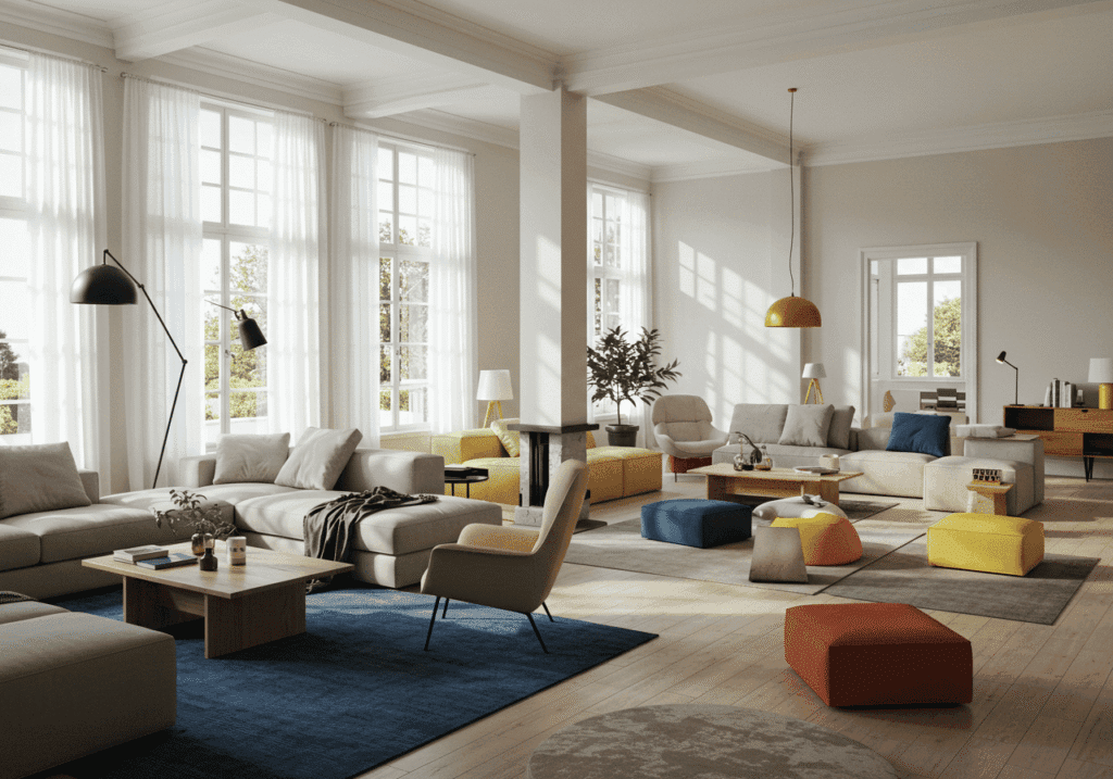
The Floating Furniture Approach: Breaking the Wall-Hugging Habit
This one feels counterintuitive, especially if you’re working with limited square footage. But pulling your furniture away from the walls can actually make a room feel more spacious and intentional. When everything’s pushed against the perimeter, you create a bowling alley effect down the middle – not exactly inviting.
Floating your sofa creates a natural room division and instantly makes your space feel more sophisticated. Leave about 12 to 18 inches between the sofa back and the wall – enough to walk behind if needed, or to tuck a console table for extra storage and display space. This works especially well in open concept living rooms where you need to define zones without building actual walls.
The key is making sure your floating pieces still relate to something – a rug, a coffee table, or other seating. You’re not randomly dropping furniture in the middle of the room. You’re creating purposeful groupings that feel anchored even without touching the walls. This approach particularly shines in larger spaces where wall-bound furniture would leave a vast, awkward expanse in the center.
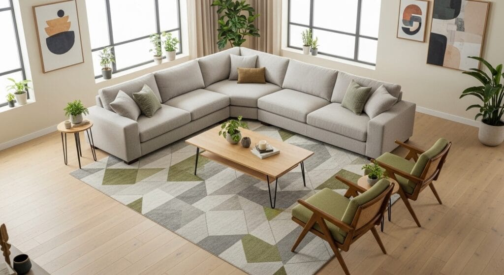
The L-Shaped Sectional Solution: Maximizing Corner Real Estate
Corners are tricky. They often become dead zones where you stick a plant and hope for the best. An L-shaped sectional solves this by turning that awkward corner into prime seating real estate. This layout works beautifully in both square rooms and longer rectangular spaces where you want to create a cozy enclosure.
Position the sectional so it faces your main focal point – whether that’s a TV, fireplace, or a great window view. The perpendicular section naturally defines the space without blocking sightlines through the room. I’ve found this setup particularly effective in small living room layouts because it provides substantial seating without the visual weight of multiple separate pieces.
One thing to watch: sectionals are commitment pieces. Make sure you measure carefully and consider whether you might move in the next few years. Hauling a sectional up narrow stairs or around tight corners has defeated more than one ambitious decorator. Also think about the chaise orientation – you want it on the side that makes sense for traffic flow and TV viewing.
The Symmetrical Setup: When Balance is Everything

There’s something deeply satisfying about perfect symmetry. Two matching chairs flanking a fireplace, identical table lamps on either side of a sofa – it creates a sense of order that feels both formal and restful. This layout works particularly well in traditional homes or when you want to highlight a strong architectural feature.
The formula is straightforward: find your room’s central axis (usually a fireplace, large window, or TV), then mirror your furniture on either side. Matching pairs of chairs, end tables, and lamps create rhythm and coherence. Even your accessories should follow suit – if you put a plant on one side, consider adding something of similar visual weight on the other.
But perfect symmetry can feel a bit rigid if you’re not careful. I like to introduce subtle variations – maybe the lamps match but sit on different styles of side tables, or you use similar chairs in complementary fabrics rather than identical upholstery. This gives you the calm of symmetry without making your living room feel like a hotel lobby. You can see this principle applied beautifully in beautiful living room layouts that balance order with personality.
The Asymmetrical Mix: Creating Visual Interest Through Imbalance
Sometimes the most interesting rooms are the ones that deliberately break the rules. Asymmetrical layouts mix different furniture pieces, sizes, and heights to create movement and personality. Instead of matching everything, you’re balancing visual weight – a large sectional on one side might be counterbalanced by a tall bookshelf and chair on the other.
This approach requires a slightly more developed eye because you’re working with intuition rather than formula. But it’s also more forgiving of real-world furniture collections where you’ve accumulated pieces over time rather than buying a matching set. The trick is making sure both sides of the room feel equally “heavy” even if they look completely different.
Odd numbers work better than even in asymmetrical arrangements. Three throw pillows look more natural than four. A single oversized chair can balance a loveseat. I’d suggest starting with one substantial anchor piece, then building around it with smaller elements until the room feels balanced when you stand in the doorway. According to research from the American Society of Interior Designers, asymmetrical balance creates more dynamic, memorable spaces that reflect individual personality better than rigid symmetry.
The Multi-Zone Layout: Defining Different Activity Areas

If your living room pulls double duty – maybe it’s also your home office, reading nook, or kids’ play area – you need a multi-zone approach. This layout divides one room into distinct areas that serve different purposes without physically walling them off. Furniture placement and area rugs do the heavy lifting here.
Start by identifying your zones: primary seating area, workspace, reading corner, whatever applies to your life. Each zone should have a clear purpose and its own visual boundary. A sofa and rug might define the main seating area, while a desk and task lamp clearly mark the work zone. The key is making sure these areas relate to each other while still feeling separate.
Traffic patterns become extra important in multi-zone layouts. You need clear paths between different areas that don’t require climbing over furniture or disrupting someone else’s activity. This is where floating furniture really earns its keep – using a sofa or bookshelf as a room divider creates separation while maintaining openness. For more strategies on maximizing space efficiency, check out these storage and organization ideas that work alongside your layout.
The Narrow Room Strategy: Working With Challenging Proportions
Long, narrow living rooms are probably the most complained-about layout challenge. They feel like hallways or train cars – all length and no width. The biggest mistake is lining everything up along the long walls, which only emphasizes the tunnel effect. Instead, you want to visually widen the space and break up that endless corridor.
One effective approach is creating two separate seating areas rather than one stretched-out arrangement. Place a conversation grouping at one end and a reading nook or small workspace at the other. This breaks the room into more manageable proportions. You can also position furniture perpendicular to the long walls – floating a sofa out from the wall helps interrupt that railway car feeling.
Rugs become your secret weapon here. Use them to define zones and draw the eye across the width of the room rather than down its length. Paint color matters too – darker shades on the shorter end walls can visually pull them closer, making the room feel more balanced. I’ve found that narrow rooms actually force you to be more creative with your layout, which often results in more interesting arrangements than predictable square rooms. For additional approaches to tight spaces, these small living room layout ideas for two people offer practical solutions.
The Open Concept Challenge: Defining Space Without Walls
Open floor plans sound wonderful until you actually have to furnish them. Where does the living room end and the dining area begin? How do you create intimacy in a vast, undefined space? The answer lies in using furniture as architecture – your sofa becomes a wall, your rug becomes a floor, and your lighting defines a ceiling zone.
The back of your sofa is your most powerful tool for dividing space. Position it to face away from the kitchen or dining area, creating a clear psychological boundary without blocking light or sightlines. An area rug that fits all your front furniture legs helps anchor the living zone and distinguishes it from adjoining spaces. Make sure the rug is large enough – too small and it looks like a bath mat floating in the middle of the room.
Consistency matters in open concepts, but so does variety. You want the living area to relate visually to the rest of the space through color palette and style, while still having its own distinct identity. Maybe your living room uses the same wood tones as the dining table but in different furniture forms. Or your throw pillows echo the kitchen’s color scheme in different patterns. You’re looking for that sweet spot between cohesive and monotonous. The principles from kitchen living room open concept designs show how to maintain flow while creating definition.
Quick Tips for Any Living Room Layout

Scale is non-negotiable. I can’t stress this enough – a sofa that’s too small for your room looks like dollhouse furniture, while one that’s too large eats up all your breathing room. Before you buy anything substantial, tape out its dimensions on your floor. Live with that outline for a few days and see if it feels right.
Lighting layers transform mediocre layouts into great ones. You need ambient light (overhead or recessed), task light (reading lamps, picture lights), and accent light (table lamps, sconces). This three-layer approach lets you adjust the mood and functionality of your room throughout the day. A layout that works beautifully in natural daylight might feel completely different at night if you only have one harsh overhead fixture.
Leave enough space between pieces – about 18 inches between a coffee table and sofa, 30 to 36 inches for major walkways, 14 to 18 inches between a sofa and side table. These measurements aren’t arbitrary designer preferences. They’re based on how humans actually move and use furniture. Too tight and everything feels cramped; too loose and your groupings lose their cohesion.
Making Your Layout Work for Your Real Life
Here’s what nobody tells you about furniture arrangement: the “perfect” layout that looks amazing in a magazine might be completely wrong for how you actually live. If you have kids who need floor space to play, that carefully styled coffee table situation isn’t going to survive. If you work from home and need a laptop spot every evening, your layout needs to accommodate that reality.
I’ve learned to prioritize function over form, even though it sometimes means making choices that wouldn’t photograph well. An extra ottoman for feet-up relaxation might disrupt your pristine symmetry, but if it makes the difference between using your living room and avoiding it, that’s an easy call. The same goes for adding a side table within arm’s reach if you’re a compulsive tea drinker or need a spot for your reading glasses.
The best layout is the one that makes your daily life easier and more enjoyable. That might mean one of these nine formulas fits perfectly, or it might mean taking elements from several and creating something uniquely suited to your space. Pay attention to how you naturally move through and use the room, then adjust accordingly. Your living room should work for you, not the other way around.
The formulas in this guide give you solid starting points, but they’re not rigid rules. Rooms are as individual as the people who live in them, and sometimes the most successful layouts are the ones that break conventional wisdom in service of real comfort and functionality.
Sanjai creates easy, affordable home decor ideas that anyone can try. Through simple tips and curated finds, he helps you style rooms you’ll love coming home to.