Creating a beautiful open concept space can feel overwhelming when you’re staring at one giant room that needs to serve multiple purposes. The secret to making it all work? Choosing the right color palette that ties everything together without making your space feel flat or boring.

Open plan kitchen dining room color schemes require a delicate balance – you want each area to have its own personality while maintaining a cohesive flow. Think of it like conducting an orchestra where every instrument plays its part, but they all create one harmonious melody.
Why Color Flow Matters in Open Concept Spaces

When walls don’t separate your kitchen from your dining room, color becomes your invisible architect. The right open concept color ideas can make a 1,200-square-foot space feel like a sprawling estate, while poor color choices can make even a large area feel cramped and chaotic.
Your eye naturally seeks connections and patterns. In an open floor plan, it travels freely from the kitchen island to the dining table to the living area beyond. If colors clash or compete, that visual journey becomes jarring instead of pleasant.
The beauty of a well-planned color scheme lies in its ability to create distinct zones without physical barriers. You might use deeper tones in the dining area to create intimacy, while keeping the kitchen bright and energizing – all within the same cohesive palette.
The Foundation: Neutral Base Colors That Work

Starting with a solid neutral foundation gives you the flexibility to layer in personality later. Warm whites like Benjamin Moore’s Cloud White or Sherwin Williams’ Pure White create that coveted airy feeling while providing enough depth to avoid looking sterile.
For those who find pure white too stark, consider soft grays with warm undertones. Colors like Agreeable Gray or Classic Gray offer sophistication without feeling cold. These kitchen and dining room colors work beautifully because they complement both natural and artificial light throughout the day.
Cream and off-white tones are making a comeback too. They bring warmth that pure white sometimes lacks, and they’re incredibly forgiving with different lighting conditions. Swiss Coffee or Vanilla Milkshake can make your space feel instantly more inviting.
Creating Zones with Subtle Color Variations

Even within a cohesive palette, you can define different areas using subtle color variations. Think of it as painting with different shades of the same family – maybe your kitchen walls are in the lightest tone, while your dining area uses a shade that’s two steps deeper on the same paint strip.
This technique works particularly well when you want to make your dining area feel more intimate. A slightly deeper version of your main color behind the dining table creates a cozy backdrop without breaking the visual flow from the kitchen.
Another approach is using the same base color but varying the finish. Eggshell in the kitchen might transition to satin in the dining area, creating subtle shifts in how light reflects off the walls throughout the day.
Bold Accent Colors That Tie Everything Together

Once you have your neutral foundation, strategic pops of color can bring your open concept to life. The key is repetition – your accent color should appear in both areas, creating visual bridges that connect the spaces.
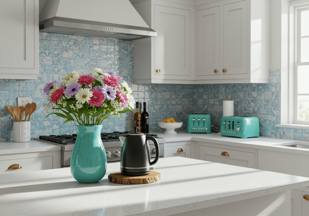
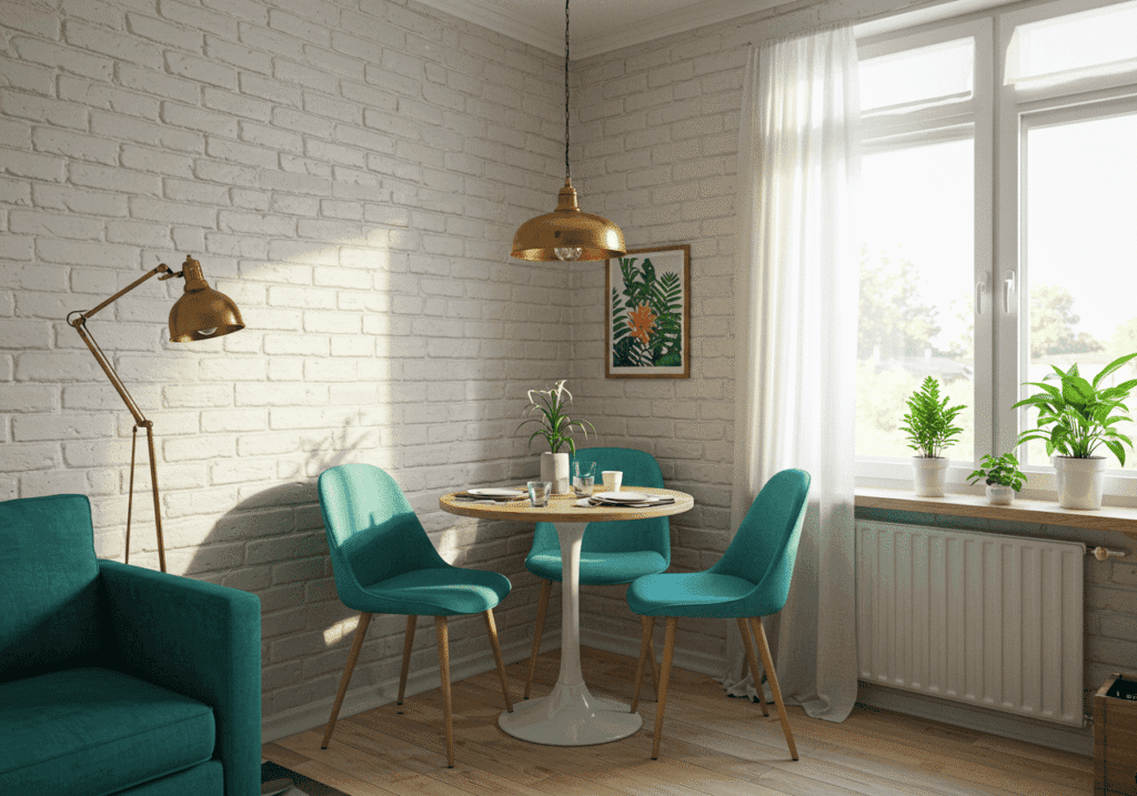
Consider navy blue as an accent – it might appear in your kitchen through cabinet hardware and bar stools, then echo in the dining room through chair cushions and artwork. This creates a sophisticated thread that runs throughout your space.
Warm earth tones like terracotta or deep forest green are having a moment right now. These colors feel both current and timeless, and they pair beautifully with the natural materials often found in open concept living spaces.
Natural Material Colors as Your Color Palette

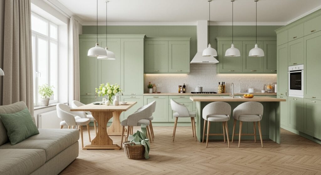
Sometimes the most stunning open plan designs let natural materials do the color work. Rich wood tones, natural stone, and metals can serve as your primary palette, creating warmth and texture without competing paint colors.
Imagine walnut kitchen cabinets paired with a live-edge dining table in the same wood family. Add in some brass fixtures and natural stone countertops, and you’ve created a sophisticated, cohesive look that feels both modern and timeless.
This approach works especially well if you’re drawn to Scandinavian kitchen decor principles. The focus on natural materials and minimal color creates a serene, uncluttered feeling that’s perfect for open concept living.
The Psychology of Color in Dining Spaces

Understanding how different colors affect mood and appetite can help you make smarter choices for your open plan space. Warm colors like soft reds, oranges, and yellows are known to stimulate conversation and appetite – perfect for dining areas.
But in an open concept, you need to balance this with colors that energize you for cooking tasks. Cool blues and greens can feel refreshing in a kitchen, but they might make your dining experience feel less inviting.
The solution? Use warm neutrals as your base and bring in those appetite-enhancing colors through accessories, artwork, and textiles that can easily be changed with your mood or the seasons.
Lighting Considerations for Color Success

Your carefully chosen color scheme can look completely different under various lighting conditions. Natural light changes throughout the day, and your artificial lighting choices can either enhance or clash with your colors.
Test your paint colors at different times of day and under your planned lighting. That beautiful sage green might look muddy under cool LED bulbs, while it glows under warm incandescent lighting.
Consider how pendant lights over your kitchen island and chandelier dining room fixtures will cast light on your chosen colors. Warm brass fixtures tend to make colors feel cozier, while chrome or nickel can make colors appear cooler and more crisp.
Small Space Color Strategies

If you’re working with a smaller open concept area, color becomes even more crucial for creating the illusion of space. Light, cool colors reflect more light and can make areas feel larger, while dark colors absorb light and can make spaces feel smaller – though not necessarily in a bad way.
Monochromatic schemes work particularly well in smaller spaces. Using different shades and tones of the same color family creates depth without visual fragmentation. Think of various shades of blue-gray flowing from light to medium throughout your space.
Vertical color strategies can also help. Painting your kitchen cabinets the same color as your walls creates a seamless look that makes the room feel larger. This technique is especially effective in small dining space decor.
Seasonal Color Flexibility

One advantage of thoughtful color planning is the ability to refresh your space seasonally without major changes. If your base palette is neutral, you can easily swap out textiles, artwork, and accessories to reflect different seasons or your evolving taste.
Spring might bring in fresh greens and soft pinks through throw pillows and table linens. Summer could introduce crisp blues and whites, while fall welcomes deeper oranges and burgundies. Winter might call for rich jewel tones and cozy textures.
Common Color Scheme Mistakes to Avoid

The biggest mistake in open concept color planning is treating each area as completely separate. While you want some variation, too many different colors can make your space feel choppy and disjointed.
Another common error is ignoring the color of your flooring. Your floor is the largest color element in your space, and your wall colors need to work harmoniously with it. Cool-toned floors pair better with cool wall colors, while warm wood floors are enhanced by warm paint tones.
Don’t forget about the color of your kitchen appliances either. Stainless steel reads as a cool neutral, while black appliances can anchor a space with dramatic flair. White appliances are making a comeback and can feel fresh when paired with the right colors.
Bringing It All Together
The most successful open plan kitchen dining room color schemes feel intentional but not overly planned. They create a sense of flow and connection while allowing each area to serve its unique function.
Start with your lifestyle and preferences. Do you love entertaining and want a space that feels lively and energetic? Or do you prefer quiet family dinners and need a more calming environment? Your color choices should reflect how you actually live in your space.
Remember that paint is relatively inexpensive to change, so don’t be afraid to experiment. Test large swatches of your potential colors in different areas of your open concept space and live with them for a few days before making your final decision.

Your open concept space should feel like a seamless extension of your personality and lifestyle. With thoughtful color planning, you can create a home that’s both beautiful to look at and wonderful to live in. The right cohesive color palettes will make your kitchen and dining areas feel like they were always meant to be one gorgeous, flowing space.Whether you choose soft neutrals with natural accents or embrace bolder colors with careful repetition, the key is creating visual connections that guide the eye naturally from cooking zone to dining area. Take inspiration from beautiful living room layouts and apply those same principles of flow and function to your open concept kitchen and dining space.
Sanjai creates easy, affordable home decor ideas that anyone can try. Through simple tips and curated finds, he helps you style rooms you’ll love coming home to.