Walk into any Pinterest-worthy kitchen these days, and you’ll likely spot a color pairing that’s impossible to miss. Upper cabinets in one shade, lower cabinets in another. It’s called a two-tone kitchen, and it’s quickly become one of the most popular ways to add personality and depth to what used to be a sea of matching cabinetry.
So what is a two-tone kitchen exactly? At its core, it’s a design approach where you intentionally use two different cabinet colors or finishes within the same space. This could mean pairing white uppers with navy lowers, mixing natural wood with painted cabinets, or even creating contrast between the island and perimeter cabinets. The result? A kitchen that feels custom, layered, and far more interesting than a single-color setup.
Designers have embraced this trend because it solves several decorating challenges at once. It breaks up visual monotony, allows you to experiment with bolder hues without overwhelming the room, and creates natural zones within an open-concept layout. Whether you’re planning a full renovation or just dreaming about your next kitchen refresh, understanding this trend can help you make smarter, more stylish choices.
Why Two-Tone Kitchen Cabinets Are Having a Moment

There’s a reason this look keeps popping up on inspiration boards. Two-tone kitchen cabinets offer something that monochromatic designs simply can’t match – visual interest without clutter. When you introduce a second color, you’re essentially creating dimension and flow in a space that’s often dominated by flat surfaces and repetitive elements.
From a practical standpoint, this approach lets you test out trending colors without fully committing. Maybe you love the idea of dark green cabinets but worry an entire kitchen in that shade might feel too heavy. Going two-tone means you can use that moody green on lower cabinets while keeping upper cabinets light and airy. You get the drama without the overwhelm.
There’s also something psychologically grounding about this design choice. Darker tones on the bottom create a sense of stability and weight, while lighter tones up top keep the space feeling open and bright. It mimics patterns we see in nature – earth below, sky above – which might explain why so many people find this layout instinctively appealing.
How to Choose the Right Color Pairings for Your Space
Picking colors for a two-tone kitchen isn’t about grabbing two random paint chips and hoping they work together. The best combinations have a clear relationship, whether that’s through contrast, tone, or finish. One of the most foolproof approaches? Pair a neutral with a statement color. Think white uppers with charcoal lowers, or cream cabinets with a rich navy island.
Temperature matters more than you might expect. Warm neutrals like beige or greige tend to play nicely with warm accent colors such as terracotta, olive, or honey-toned wood. Cool neutrals like true white or pale gray pair beautifully with blues, blacks, and cooler greens. Mixing warm and cool tones can work, but it requires a more experienced eye to pull off successfully.
Don’t forget about your existing finishes when planning your palette. If you have stainless steel appliances and chrome fixtures, cooler cabinet colors will feel more cohesive. Brass hardware and wood floors? That’s your cue to lean into warmer shades. And if you’re working with modern kitchen design goals in mind, consider high-contrast pairings like black and white or deep charcoal with light oak for maximum impact.
The Most Popular Two-Tone Combinations Right Now

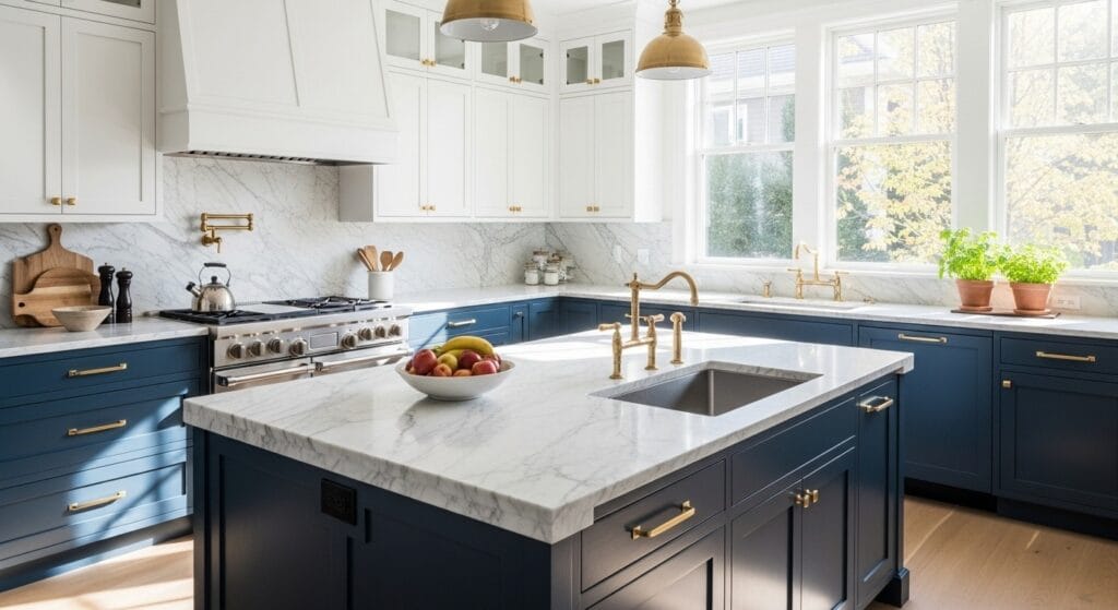
Some color pairings have proven themselves as classics in the world of contrasting cabinetry. White and navy remains a perennial favorite, offering a crisp, almost nautical feel that works in both traditional and contemporary spaces. The high contrast keeps things interesting while still feeling safe enough for most homeowners.
Natural wood paired with white is another combination that’s everywhere lately, and for good reason. This pairing brings warmth through the wood element while maintaining brightness with the white. It’s particularly effective when you use wood on lower cabinets or an island, as it adds an organic, grounding quality that painted cabinets can’t quite replicate. Many homeowners exploring kitchen color trends are gravitating toward this natural-plus-neutral approach.
Then there’s the moody-meets-light option – think charcoal or forest green lowers with off-white or light gray uppers. This combination has become a signature of modern farmhouse and transitional styles, offering depth without sacrificing the airy feeling most people want in their kitchens. According to House Beautiful, these darker saturated colors paired with lighter neutrals create a sophisticated balance that appeals to a wide range of design aesthetics.
Where to Place Each Color for Maximum Impact
The placement of your two tones matters almost as much as the colors themselves. The most common approach puts the darker or bolder color on lower cabinets, with a lighter shade up top. This creates visual weight at the bottom and prevents the space from feeling top-heavy or cave-like. It’s a formula that works in most kitchens, regardless of size.
Islands are another natural spot to introduce your second color. Even if your perimeter cabinets are all one shade, painting the island differently instantly makes it a focal point. This works especially well in open-concept layouts where the island serves as a transition piece between the kitchen and living areas. If you’re considering an eat-in kitchen setup, a contrasting island can help define the cooking zone from the dining space.
Some homeowners get creative by using color to highlight specific features. Glass-front cabinets in a different finish than the rest, a contrasting pantry door, or open shelving in natural wood while the rest of the kitchen is painted – these unexpected touches can make your kitchen feel truly custom without requiring a massive renovation.
How Two-Tone Designs Work in Small Kitchens

You might assume that using two colors would make a small kitchen feel even more cramped, but that’s not necessarily true. The key is being strategic about which color goes where. Keeping upper cabinets (or removing them entirely in favor of open shelving) in a light color helps maintain that crucial sense of airiness, while darker lowers add character without closing in the walls.
In a compact space, consider using your second tone sparingly. Maybe it’s just the lower cabinets on one wall, or perhaps only the base of your small kitchen island. You don’t need equal amounts of both colors to achieve the two-tone effect – sometimes a 70/30 or 80/20 split is exactly what a smaller kitchen needs to feel intentional rather than chaotic.
Reflective surfaces become your best friend when working with darker cabinet colors in tight quarters. Pair deep-colored lowers with light countertops, add under-cabinet lighting, and consider a glossy finish on darker cabinets to bounce light around the room. These small choices can make the difference between a space that feels cozy and one that feels cramped.
Mixing Finishes: Beyond Just Paint Colors
Two-tone doesn’t have to mean two paint colors. Some of the most striking kitchens mix painted cabinets with natural wood, creating a material contrast that feels organic and timeless. This approach is particularly popular in modern farmhouse kitchen ideas, where the warmth of wood balances the crispness of painted surfaces.
Texture and sheen also play into the two-tone concept. You might use the same color in two different finishes – matte on some cabinets, high-gloss on others – or mix smooth painted doors with textured wood grain. These subtle variations create depth without introducing multiple colors, which can be ideal if you want interest but prefer a more restrained palette.
Glass-front cabinets offer another way to break up solid cabinetry. Even if they’re painted the same color as the rest of your uppers, the transparency creates a visual break that serves a similar function to using a second color. This is especially effective when the inside of the cabinet is painted a contrasting shade, adding yet another layer to your design.
Hardware Choices That Tie It All Together
Once you’ve settled on your cabinet colors, hardware becomes the thread that connects everything. In a two-tone kitchen, your pulls and knobs can either blend seamlessly or create a third accent point. Using the same hardware finish throughout – whether that’s matte black, brushed brass, or polished chrome – helps unify cabinets in different colors.
That said, some designers are now mixing hardware finishes intentionally. You might see brass on upper cabinets and black on lowers, or vice versa. This only works if there’s a clear reason for the choice (such as coordinating with other fixtures in the room), otherwise it can read as indecisive rather than designed.
The style of hardware matters too. Sleek, minimal pulls emphasize a modern minimalist approach, while ornate knobs lean traditional. In a two-tone kitchen, keeping hardware style consistent across both colors helps maintain cohesion, even when the cabinet colors themselves are quite different.
Common Mistakes to Avoid with Two-Tone Cabinets

Not every two-tone attempt lands successfully. One of the biggest missteps? Choosing colors that compete rather than complement. If both shades are fighting for attention – say, a bold red paired with a vibrant turquoise – the kitchen can feel chaotic rather than curated. One color should typically take the lead while the other supports.
Another issue is ignoring the undertones in your chosen colors. A “white” upper cabinet might have warm beige undertones, while your “gray” lower cabinet leans blue. Put them together, and suddenly neither looks quite right. Always test large paint samples in your actual kitchen lighting before committing, checking how they look at different times of day.
Proportion problems also plague some two-tone kitchens. If you only have a tiny sliver of one color and masses of another, the effect can seem accidental rather than intentional. Generally, you want enough of each color that the choice feels deliberate – whether that’s a 60/40 split, a dramatic 80/20, or something in between depends on your space and goals.
Styling Your Two-Tone Kitchen for Pinterest-Worthy Photos
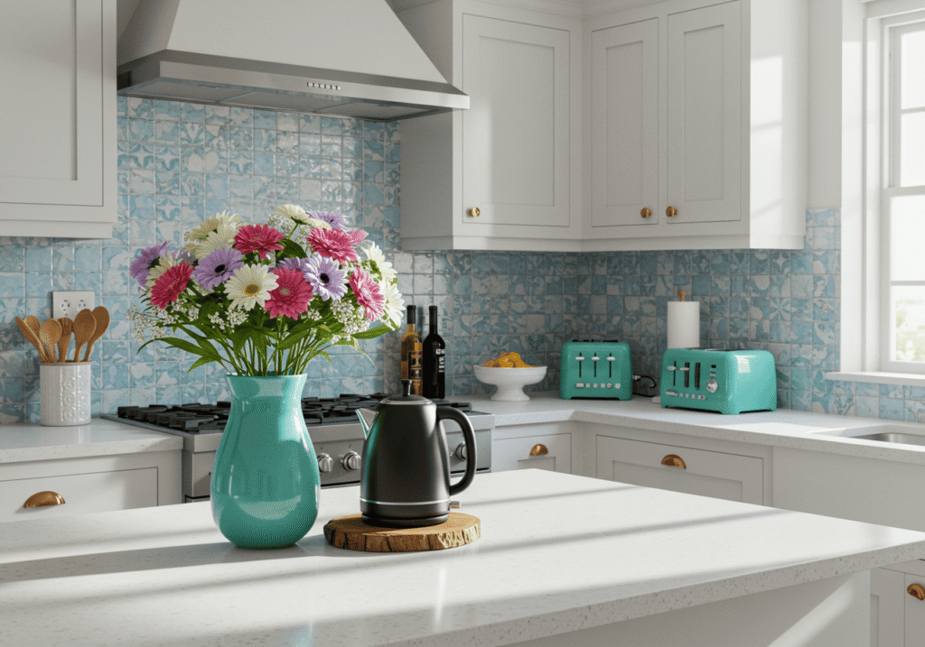
Once your two-tone cabinets are in place, the styling begins. The beauty of this design approach is that it creates natural focal points you can play up with thoughtful decor. If your island is a different color, that’s where you might place a beautiful bowl of fresh produce, a vase of flowers, or your most attractive countertop appliances.
Open shelving in your lighter cabinet areas gives you a chance to bring in additional colors and textures through dishes, glassware, and decorative objects. Keep the overall palette cohesive by pulling accent colors from your darker cabinets. If you have navy lowers, for instance, blue and white ceramics on open white shelves create a pleasing echo without feeling matchy-matchy.
Backsplash selection becomes particularly important in a two-tone kitchen. You want something that complements both cabinet colors without perfectly matching either one. White subway tile is a classic choice that lets the cabinets take center stage, while a green tile backsplash or patterned cement tile can add another layer of interest if your cabinet colors are relatively neutral.
Two-tone kitchens aren’t just a passing trend – they represent a shift toward more personalized, layered design in a space that was once dominated by matching sets and safe choices. Whether you’re drawn to the classic elegance of white and navy, the warmth of wood and paint, or something more unexpected, this approach offers flexibility and visual interest that single-color kitchens simply can’t match.
The best part? You don’t need a complete renovation to test this look. Start small with a painted island or refresh just your lower cabinets while leaving uppers unchanged. Sometimes the most impactful design choices are the ones that break from convention just enough to feel fresh without alienating anyone who might walk through your front door.
That’s the magic of contrasting cabinetry – it pushes boundaries while still feeling approachable, proving that you can have personality and practicality in the same beautifully designed space.
Sanjai creates easy, affordable home decor ideas that anyone can try. Through simple tips and curated finds, he helps you style rooms you’ll love coming home to.